Track 56: The Universal Chemical Elements of the Human Body

What are we made of?
What are the elements that make up the human body?

The first question sounds a little metaphorical and will probably be addressed sometime in the future. But for now, the latest uchi track addresses the physical, or, more accurately, the chemical. I’m a science geek and a T shirt showing the chemical elements that make up the human body has been on the back burner of my mind for some time. It felt right to follow the last uchi T-shirt “Stereotype” with another typography design – contrasting, but also related. Think of it as the B Side to Stereotype.

The Brief

A T-shirt displaying the chemical elements of the human body.

The research

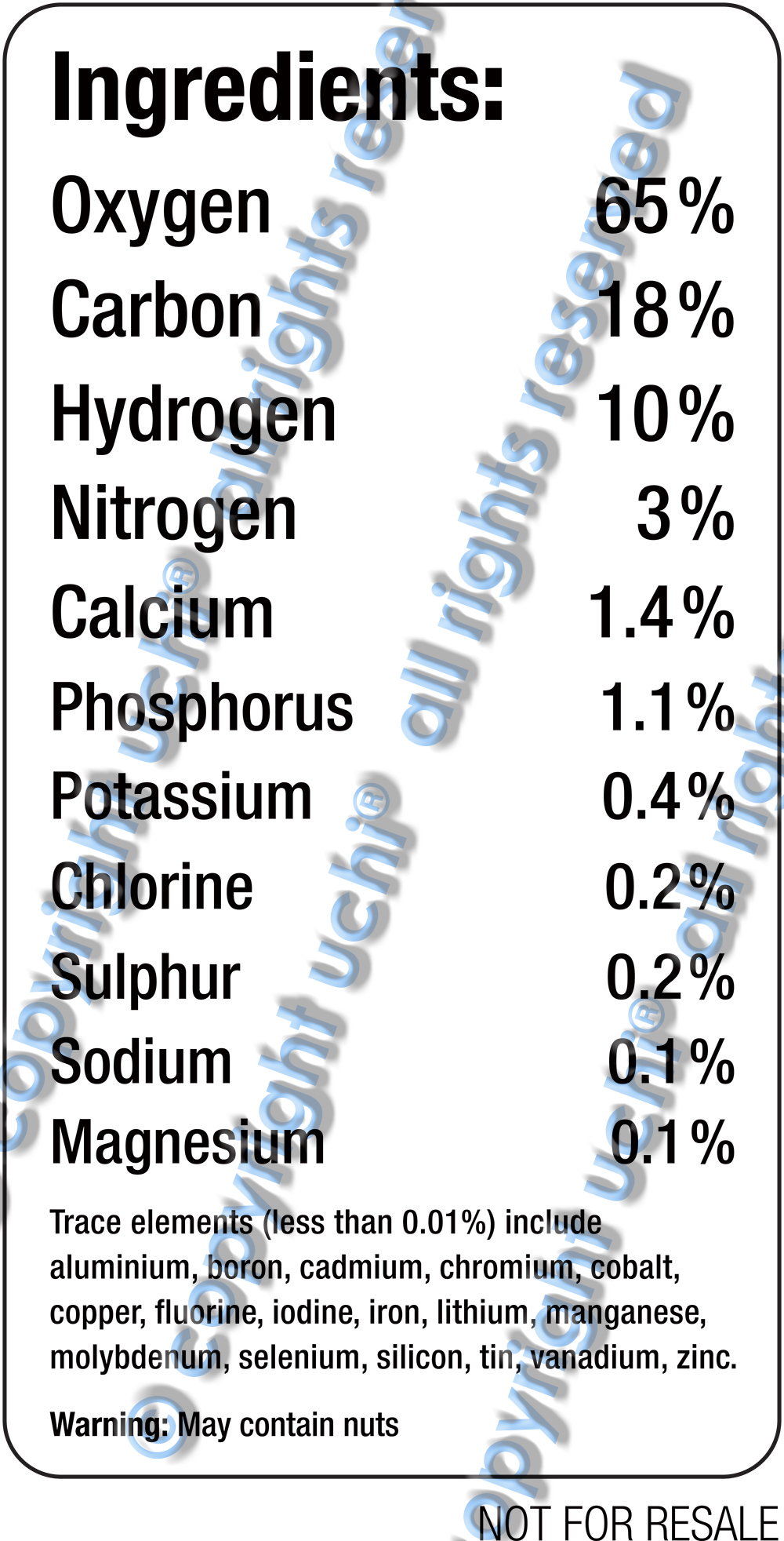
A bunch of stats from various academic websites to get the elements as well as each element’s mass (all with slightly varying approximations). I’ve since learnt that the exact amounts vary from person to person.

The design process

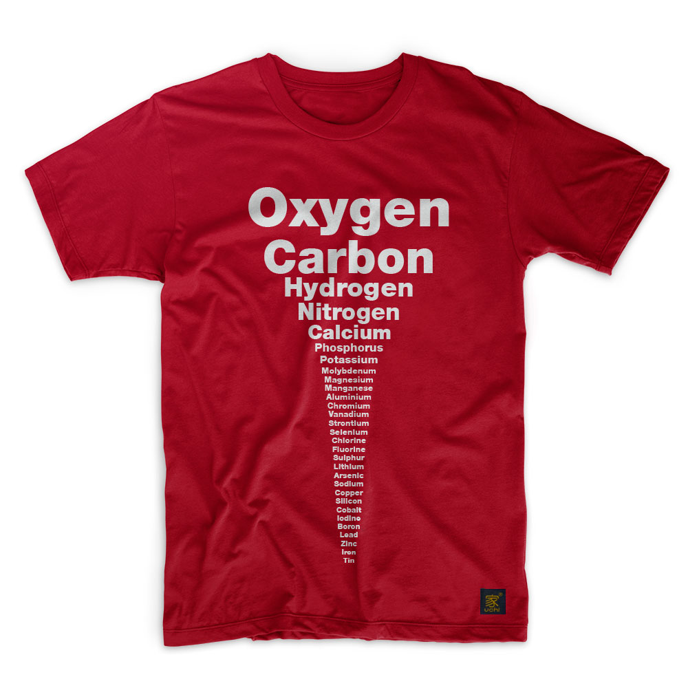
So how do you display the elements of the human body in a simplistic design? A graphical, infographic design? Maybe a pie chart or graph? Following on from ‘Stereotype‘, I thought “simple is best” and decided to rely solely on text and my typographical training to communicate the idea.

I wanted the names of each element to be printed in proportion to each other’s relative size. But this proved problematic, in terms of both design and print.

I’ve got about 99 elements but gold isn’t one of them

The human body is composed of 11 main elements, with six of these (oxygen, hydrogen, carbon, nitrogen, calcium and phosphorus) making up almost 99% of us. In fact we’re all mostly oxygen (65%), carbon (18%) and hydrogen (10%). The other eight elements that are vital to life, include calcium, potassium and molybdenum. But they amount to such small amounts, that by the time you reach magnesium (0.1%) the text would be unreadable on a T-shirt.

So I ditched the ratio idea in favour of a more aesthetically pleasing design. Starting with oxygen and ending with tin, each element’s representation would be slightly smaller than the one before it. I liked it. However, though simple, it wasn’t technically accurate. That was because the order of the trace elements was determined by the size of the word representing them – not by their mass. This bugged me.

Despite this, I was satisfied enough to show it to a couple of friends. Based on their well-rounded criticism (and approval), I thought about the challenge some more; that was when the ‘food label’ idea hit me.

Imagine a food ingredients label listing the constituents – the ‘ingredients’ of us. Clever and intelligent, I thought. I’ve typeset hundreds of food and drug labels in my time. So again, this should be easy enough.

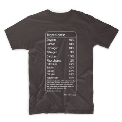
Ingredients of the human body

Track 56 - Helvetica

Once the ingredients label design was finished, I still wasn’t entirely happy. Composition wise, everything was fine. All the relevant information was there and nothing more. Plus, the ingredients label premise allowed me to add a couple of extra touches that worked.

I’d used Helvetica Condensed for the ‘Stereotype’ T shirt, so it seemed right to use the same typeface on the B-side. However, at the last minute I decided to revisit my phototypesetting roots and changed the typeface from Helvetica to Univers. In doing so, I realised what had been bugging me.

About the Univers Typeface family

The Univers typeface family was developed by Adrian Frutiger for the French type foundry Deberny & Peignot. Like Helvetica, it’s based on the 1898 Akzidenz-Grotesk typeface family. However, it lacks Helvetica’s superfluous features and has a more uniform stroke and balance that makes it a perfect typeface for tabular data and forms. Univers also has cleaner lines and better legibility at great distances. On it’s release in 1957, the marketing for Univers deliberately referenced the periodic table to emphasise its scope.

Though its popularity peaked in the 60s and 70s, Univers is stll widely used. Past and present corporate IDs using it include those of General Electric, Deutsche Bank and eBay, while Audi uses a modified version of Univers called Audi Sans. Apple keyboard key-caps before 2003, Ordnance Survey maps, a host of transport systems (including Frankfurt International Airport) and Walt Disney World, are among many other high-profile users.

So, pun intended, Univers was the perfect universal typeface choice for a universal design.

error: Content is protected !!