No Results Found
The page you requested could not be found. Try refining your search, or use the navigation above to locate the post.
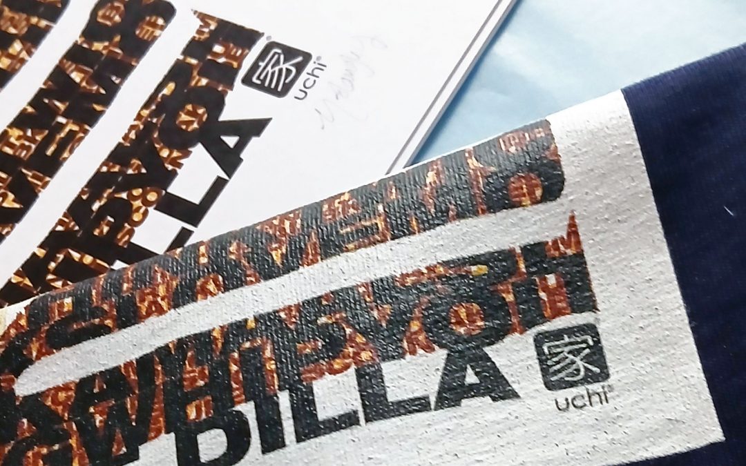
In October 2023 Hip Hop producer Vice Beats began his first 3 city tour called “An Afternoon of Dilla”, an annual event that celebrates the life and music of the late great Detroit based producer J Dilla through live performances, DJ sets, talks, and a Dilla-themed cypher. The tour is in support of the James Dewitt Yancey Foundation; which was setup in his name by his family to support community music projects and access to music technology for young people.
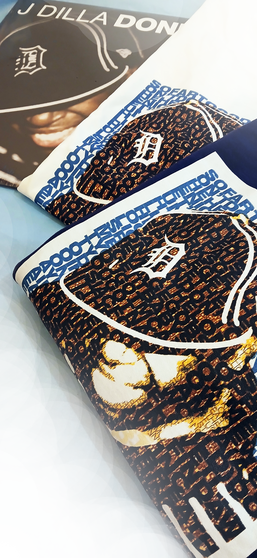
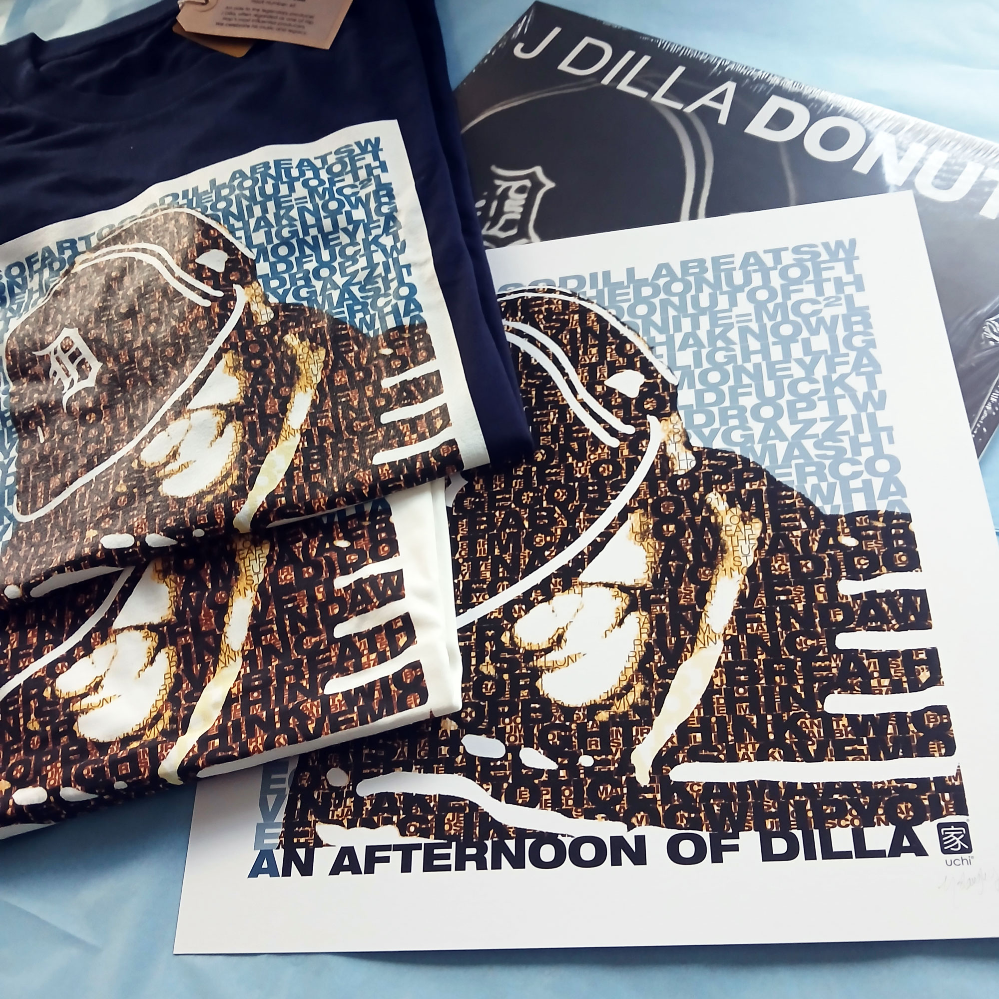
For the 2025 tour Vice Beats got together with uchi to create a J Dilla T shirt for the events held in Bristol and London. The design is layered and complex, much like Jay Dee’s music. The background text features the names of Dilla’s tracks, including production and remixes. The smaller, darker layers of text feature his collaborators, including early career artists.
The t-shirts, sweatshirts and art prints as with the events, are an official collaboration with Ma Dukes (Maureen Yancey) Jay Dee’s mum, who developed the James Dewitt Yancey Foundation. Each item sold donates profit to the foundation to further support their work.

So, after a long wait for sunflower yellow T shirts, the Trojan T shirt reprints are done. I had created an ‘artist’s impression’ of the new yellow T shirts, thinking red and green print on yellow would not only look great, it’d be perfect for a reggae based T shirt. However, the mock-up posted on the product page suggested otherwise. I dismissed this and put it down to it being a mock-up and not a picture of an actual real printed T shirt! I was confident that when actually printed, the colours “will look dope on that colour T shirt!”.
They didn’t. It did remind me of having an eye test. On the yellow T shirts, the depth of the red and green colours was two close. The whole print was too dark to show the Trojan emblem prominently enough through the text – the opposite of what I wanted. The mock-up turned out to be accurate after all.
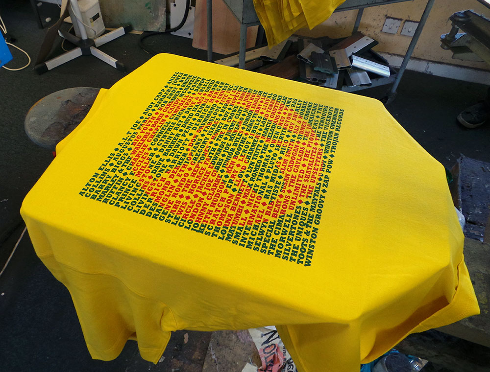
Trojan men’s T shirt – Red Gold and Green?
I was a little disappointed, but (and you have to stay on your feet in this game), I remembered that the last yellow uchi T shirt was printed using a dark golden yellow and the same green we were using, so…
We overprinted the poorly chosen red with the dark yellow and this is what we got.
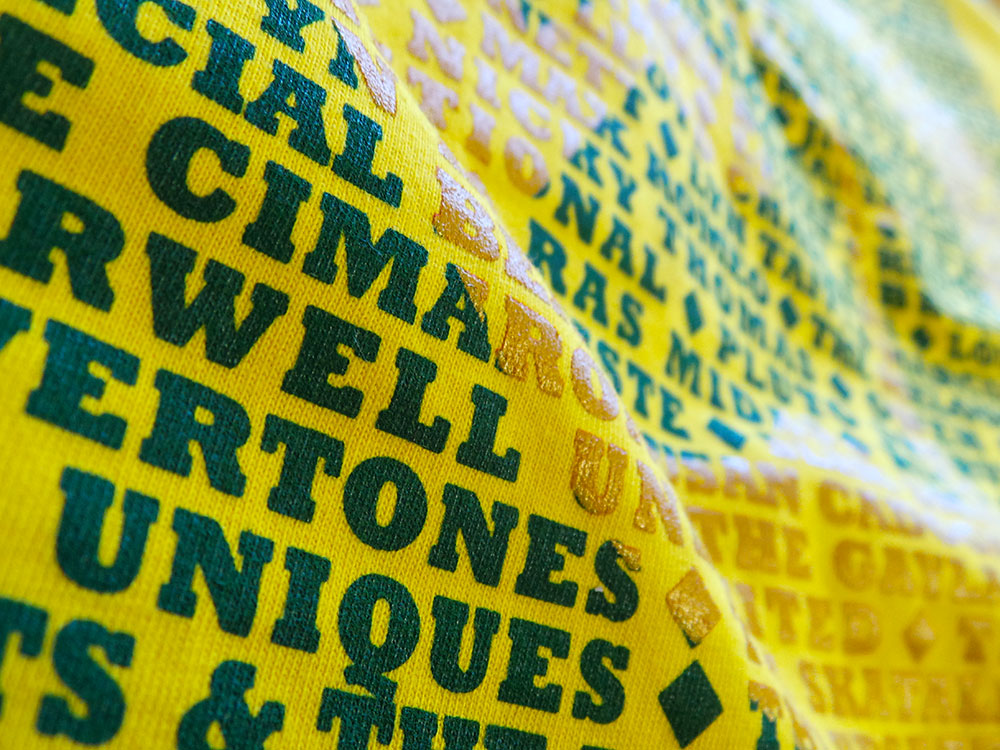
Trojan men’s T shirt – Sunflower Yellow
They say hindsight is a beautiful thing. And with further hindsight, or, by paying attention to the rules of colour instead of getting sentimental about red, gold and green combos, maybe even these current colour ways could be better? If instead, green and gold were printed on the cream and the yellow T shirt had the green/orange combo. Perhaps? It is a very limited run, so the next cream and yellow Trojan T shirts will probably see a reversal of colours… maybe clear and red inks?
Feel free to let me know what colour combo you’d like to see on a future uchi Trojan T shirt.
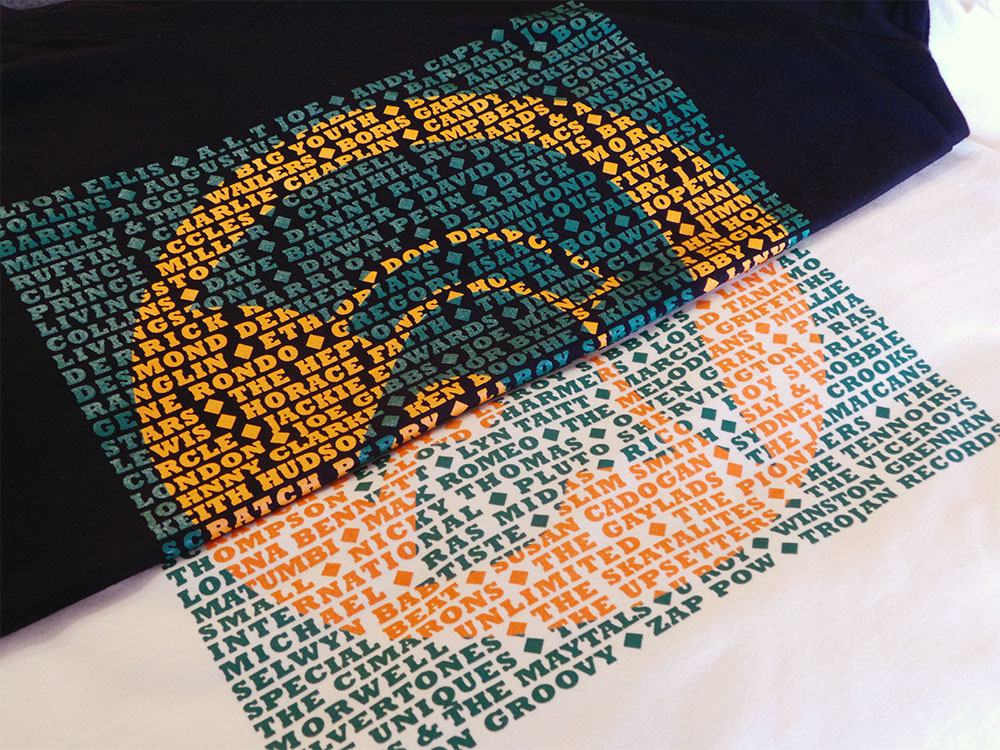
Trojan men’s T shirt – Black and Cream
The page you requested could not be found. Try refining your search, or use the navigation above to locate the post.
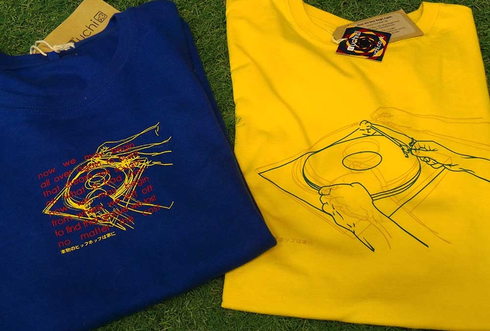
Here’s some old and new. A look back at the original uchi classic T shirt No 18 – Now We May Begin and the 2016 remix, Now We May Begin Again.
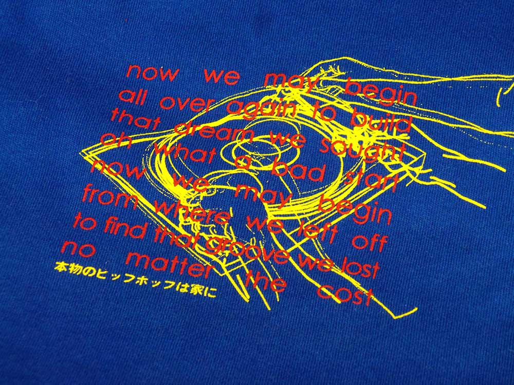
Although the original T shirt design uses four overlaid images and the remix only three, there were originally 36 photographs shot in sequence documenting the vinyl selection process (Natural Selection), to the needle dropping on the record, as shown on Always Use Clean Needles. The remix is more subtle – the “sample” – the first verse from Randy Crawford’s song of the same name has been removed and the lines redrawn for a bigger print.
