%20Art%20print&url=https://uchi.co.uk/shop/limited-edition-artprints/soundwave-off-kanagawa-art-print/&media=https://uchi.co.uk/wp-content/uploads/2019/01/Soundwave-framed-1024x1024.jpg)
No Results Found
The page you requested could not be found. Try refining your search, or use the navigation above to locate the post.
After a few years of being in the horology art game with the uchi horology series, I got together with copywriter Al Hidden to discuss the journey so far, future projects and in particular about printing the latest lumed T-shirts…
‘As you may have noticed from my clothing and artworks,’ explains Michael, ‘I’ve always been inspired by mathematics, astronomy, science, Hip Hop and Japanese culture. Time and watches fascinate me too. Even though, until recently, my ‘watch collection’ only consisted of a single titanium Seiko that went unworn for years because of its broken bracelet.’
When the time for further exploration of horology art and watches arrived, it’s no surprise that Michael turned to Omega for inspiration. After all, he’s long identified with the Biel/Bienne brand’s Speedmaster Moonwatch Professional. Maybe his love for this legendary watch has more than a little to do with him being born during Apollo’s 1969 Moon mission. Whatever the reason, watches and horology art have gestated in Michael’s creative consciousness for decades. ‘And, yes,’ he says, ‘I wouldn’t mind owning a 1969 Speedmaster ST105.012 one day.’

So what finally inspired The Uchi Horology Series? It was meeting UK-based Geckota Ltd that kick-started today’s flourishing horology art collection. It also got Michael back into wearing watches again…
After meeting the Gloucestershire, UK-based watch and strap business, Michael discussed the possibility of getting some of his designs onto NATO straps. That was several years ago. For whatever reason, maybe the right idea at the wrong time, that particular project didn’t come to fruition.
‘However, Geckota gave me a couple of their watches and straps,’ explains Michael. ‘They made me a brand ambassador and gave me the kick I needed to explore watches and art in more depth and realise my ideas.’
Those first horological designs saw Michael experimenting with ideas based on the Steve McQueen Le Mans Heuer Monaco. To this he added some Bauhaus, Max Bill ‘root 2’ proportions (à la konkrete kunst 1944) and Porsche 917 references. The result was a popular first collection. The Uchi Horology Series was up and running faster than a 917 fishtailing away from the Le Mans starting grid in 1970.

By July 2019, approaching the fiftieth anniversary of Apollo 11, he’d added his first Omega Speedmaster creations to the collection. It was perfect timing, inspired by receiving a copy of Moonwatch Only: The Ultimate Omega Speedmaster Guide as an early birthday gift.
The result, as with the Heuer Monaco pieces, was a collection of tees and art prints, including the ‘Omega Speedmaster Professional Apollo XI Moon Landing Horology Print’. Another popular seller on the Uchi website and Etsy, this features a Moon-surface dial and accurate star map as viewed from the Sea of Tranquillity at exactly 20:17:39 (UTC) on 20 July 1969. It’s just another example of the creativity and attention to detail that’s defined Michael’s work over the years.

‘Like so many of my creations,’ he says, the Apollo XI art avoids the simple photorealistic depictions that characterise some horology art. I prefer storytelling and communicating concepts rather than just illustrating products.’
So it was with the first Heuer and Speedmaster works. Realising how many photorealistic watch illustrations there were only affirmed Michael’s desire to add something more sophisticated, cerebrally challenging and different.
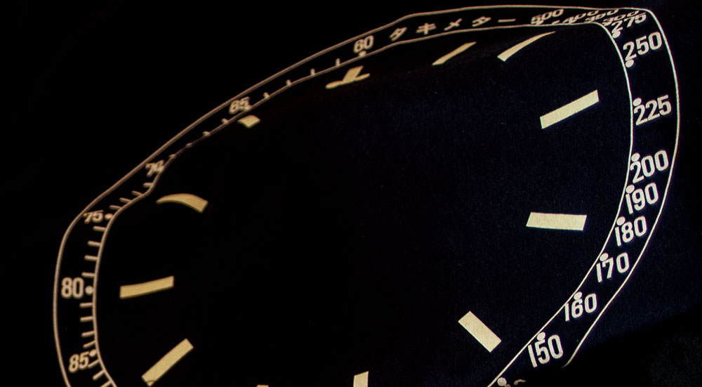
That’s not to say that projects have never featured accurate representations of the Speedmaster’s bezels, indices and tachymeter scales on a series of products that make the perfect gift for a watch lover. In turn, these inspired further experimentation with watch dial features. From these came new artworks, not only for the Omega, but for another icon loved by watch fans. That was when he turned to the SKX diver’s watch for his first Seiko artwork. What could be better than an accessible timepiece that punches way above its weight, a watch that Hodinkee described as ‘probably the single best value at any price point, in an automatic watch’?
Michael elaborates: ‘Inspired by the SKX, my interest in Seiko’s watches and typography converged in several tracks combining the functionally minimalistic SKX dial, bezel and day-date ring. For further variation, I also drew inspiration from Katsushika Hokusai’s iconic ‘Great Wave off Kanagawa’ (aka ‘The Great Wave’ or ‘The Wave’) woodblock print. It’s a motif that had already inspired other projects, including my “Soundwave off Kanagawa art print”. I was in my element.’
A year on, Michael was ready for a new collection. Back in the UK after collaborating on an article about visual design at Baselworld for Geckota’s online magazine, he developed more ideas inspired by the Speedmaster and SKX.
By now, Michael was again exploring possibilities for working with Geckota. This time it was the management of outsourced printing for their promotional apparel – with designs to their brief as well as co-promotion of his prints and horology clothing. Conversations with the team also prompted exploration of themes inspired by the classic Rolex Explorer ‘Everest watch’. And then there’s Patek Philippe’s Calatrava Weekly Calendar (Ref. 5212A-001) with its cursive dial lettering, and the sublimely skeletal Zenith Defy range, that so excited him in Basel. They’re more ideas for the future.
Meanwhile, there was another more pressing aspect of horology art to address…
To bring light to the end of a Covid-19-dominated year, and encouraged by conversations with Jon Quinn and his Geckota team, it was time to take the Seiko SKX and Omega Speedmaster-inspired designs further.
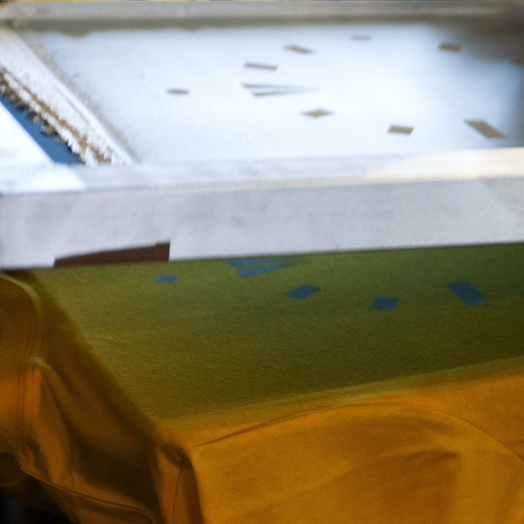
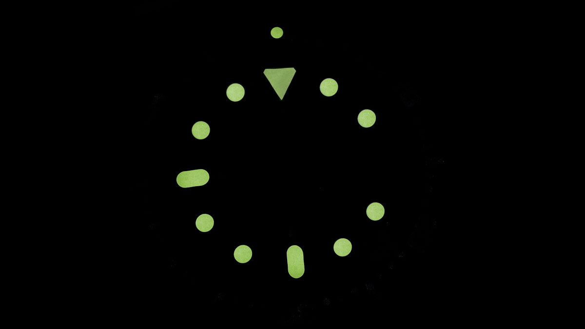
Michael explains: ‘The idea of trying to print some seriously good glow-in-the-dark watch lume came from Ben, my go-to screen printer and owner of Screen One Printers in Bristol, England. I was at Screen One when Ben described some glow-in-the dark screen printing he’d done for another customer. The job had nothing to do with watches or horology, but Ben thought it would be good to try the techniques with my watch joints. As he described what he’d done for the other customer with luminescent inks, I was sold.’
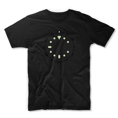
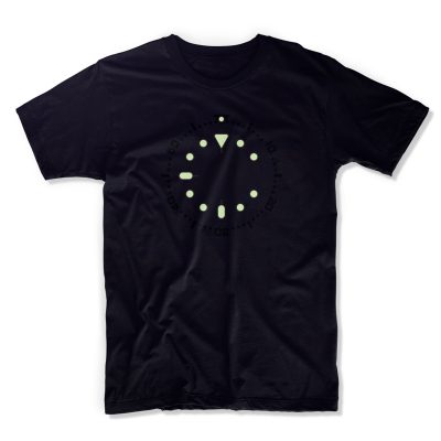
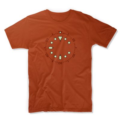
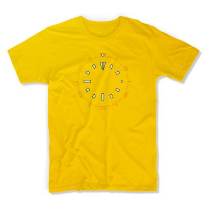
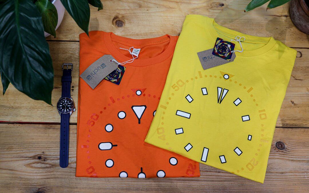
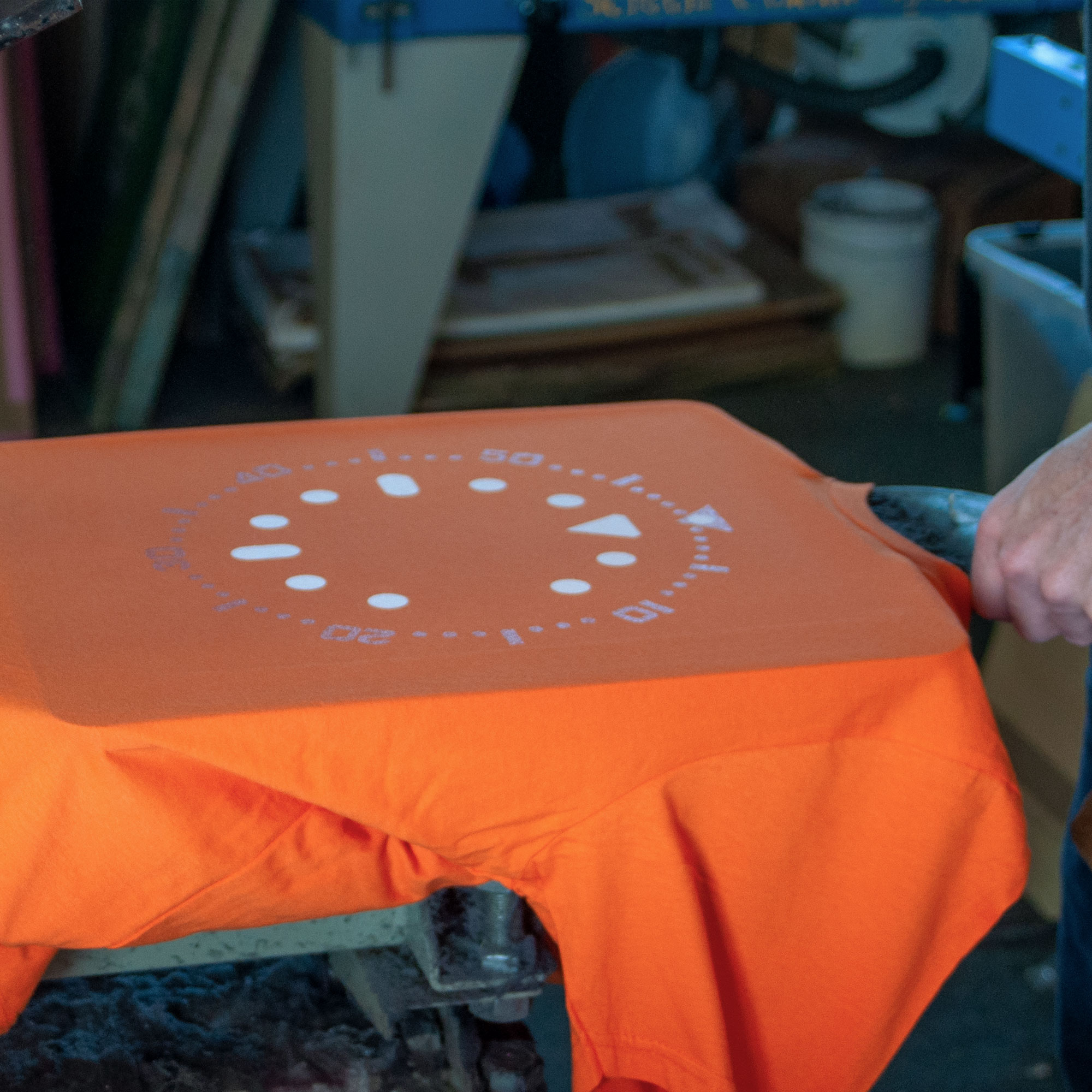
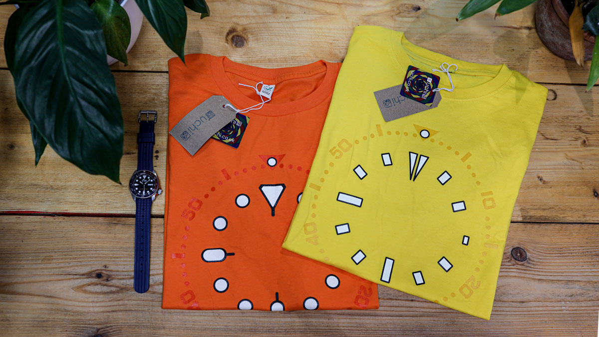
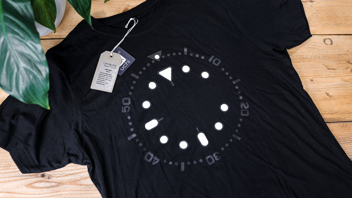
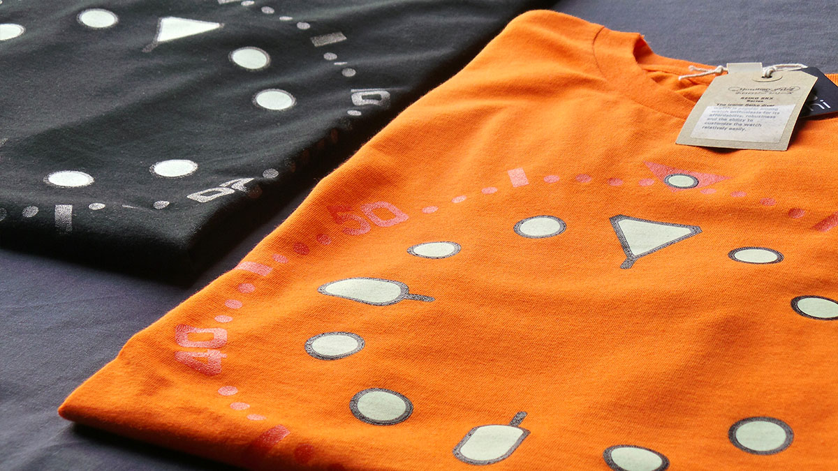
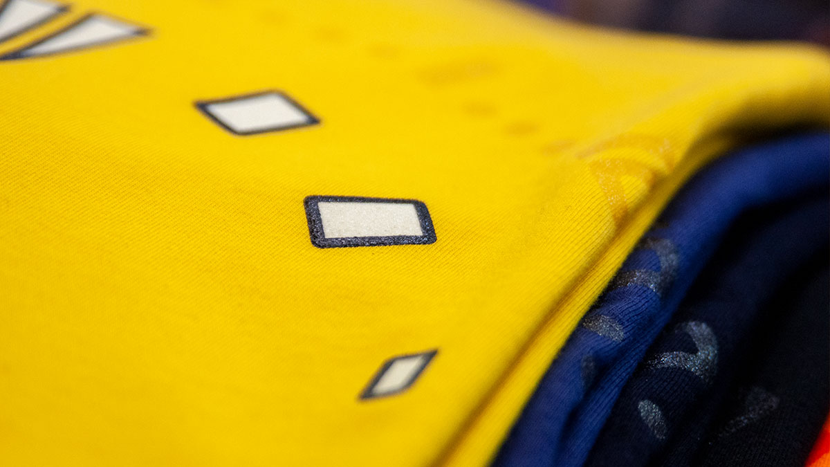
Alongside the Speedy, Michael had the perfect candidates for The Uchi Horology Collection’s first ‘lume’ works. So it was that he set his creative sights on Seiko’s classic black-dial SKX007, ‘Pepsi’ bezel SKX009 and love-or-hate-it orange-dial SKX011. And, of course, the yellow-dial Seiko SKXA35 coveted by many SKX fans.

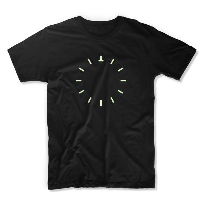
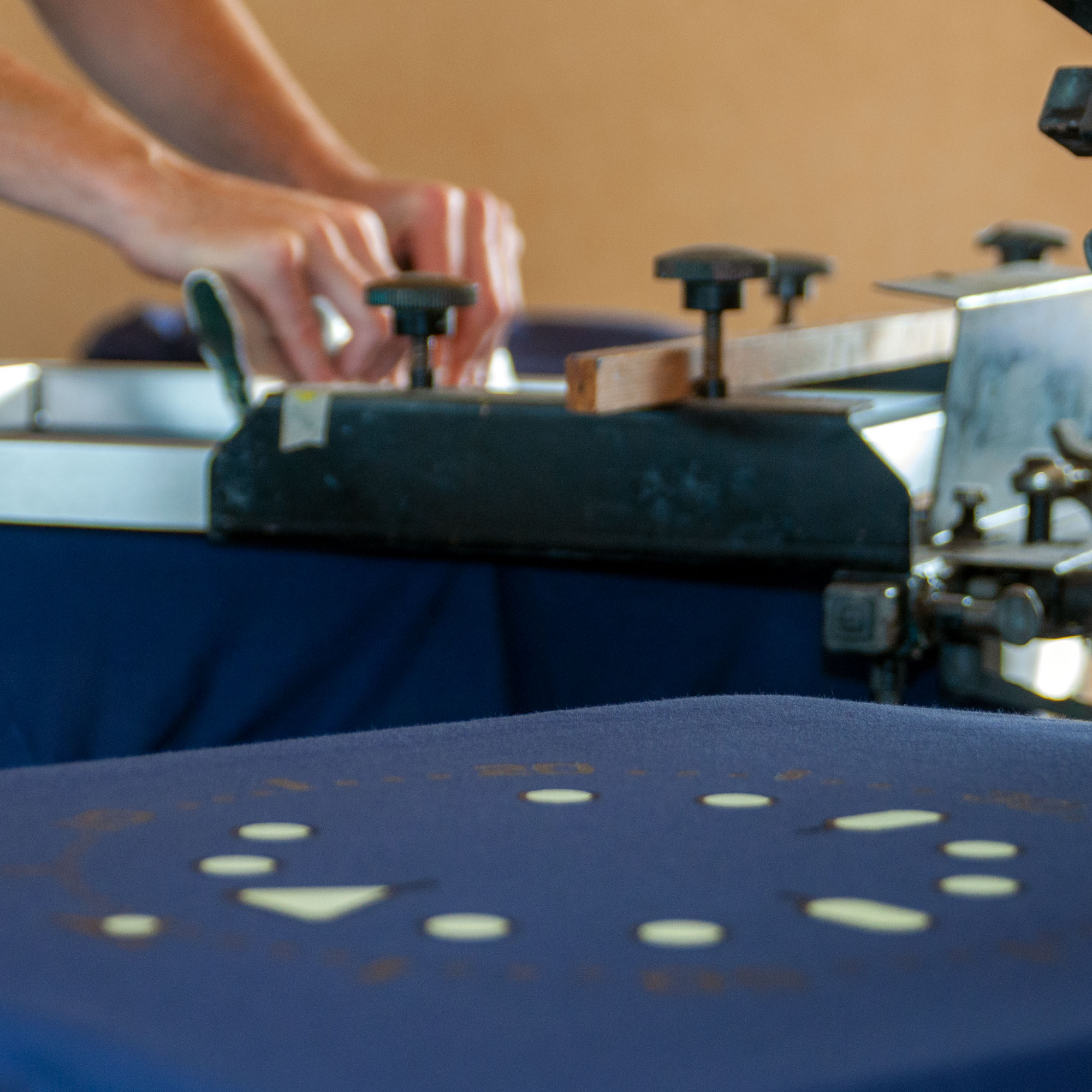
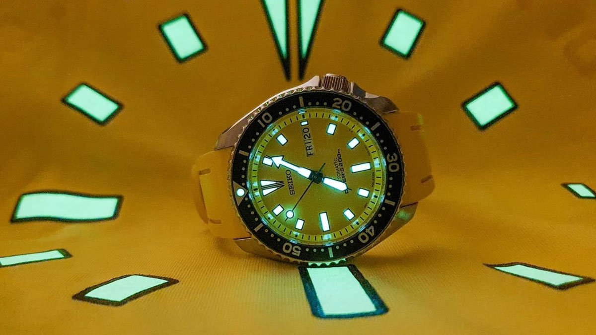
Speedmaster Lume T shirt – Image Credit: WatchGecko Online Magazine
On-site at Screen One with another set of timepiece artwork ready for printing, Michael and Ben started experimenting with combinations of T-shirt colour and base ink layers. Their objective was to find combinations that would work well with printed lume so it glows as impressively as the Seiko lume itself. They weren’t the first to try this, but some lume T-shirts underwhelm because they simply don’t capture the design of the SKX’s dial detail as accurately as they could.
‘Instead of ‘just another lume watch T’,’ explains Michael, ‘I wanted to create a Seiko T-shirt that faithfully captured the SKX’s detail including the delicate “tails” on the 12 o’clock delta and oval-lume markers’.
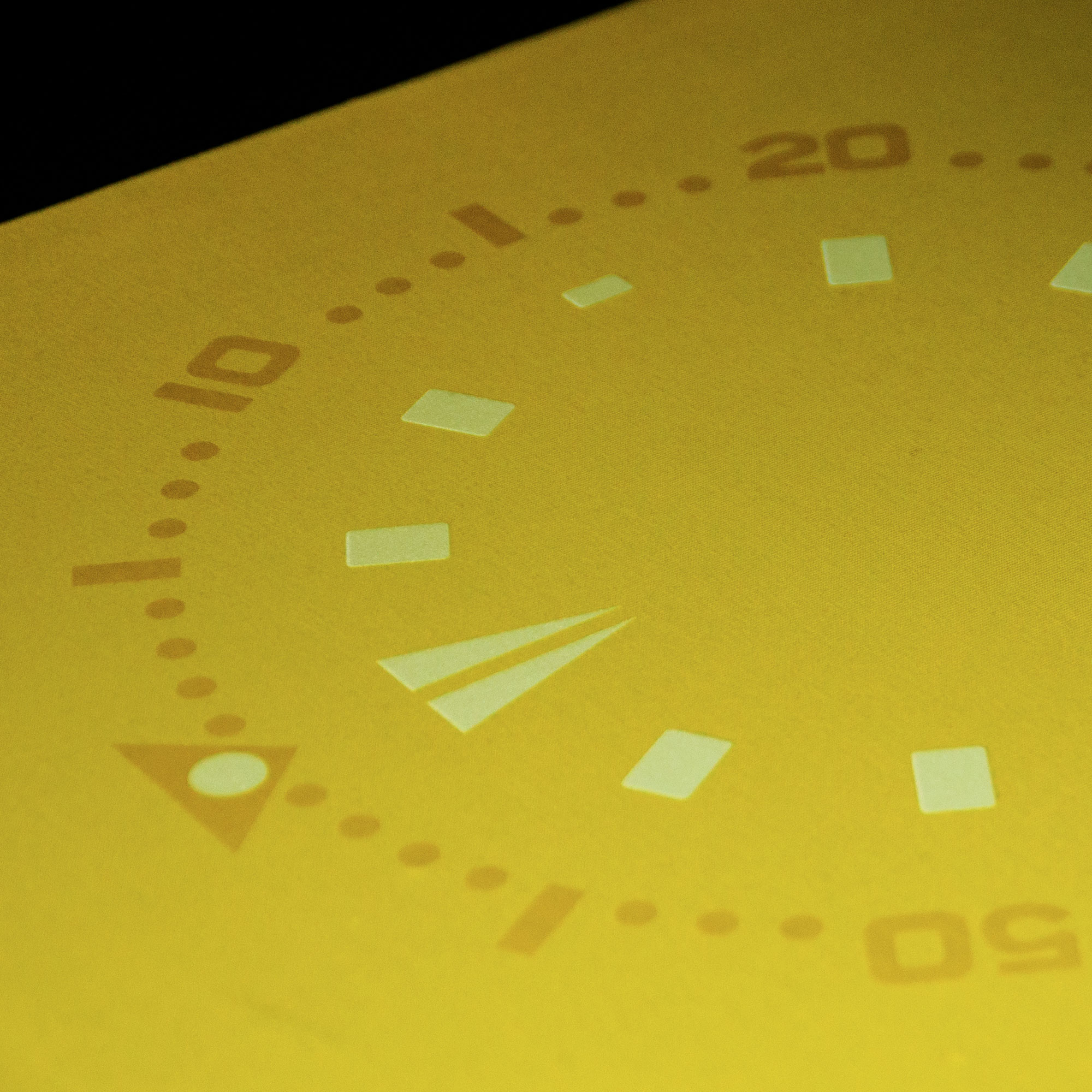
And then there’s the Seiko SKXA35 ‘Bumblebee’ with its distinctive yellow dial. It’s an ISO 6425 dive watch that’s up there with other yellow-faced timepieces such as the Breitling Superocean, DOXA Sub 200 Divingstar, Scurfa Diver One D1-500 and Helson Turtle.
Michael again: ‘What particularly interested me, alongside the SKXA35’s growing collectability and borderline cult following, is how its indices differ from those on the 007, 009 and 011. In particular, I like how the ‘inverted split delta’ at 12 o’clock, rectangular indices and small lumed 3 o’clock index work so well together to complement the rest of the dial’s lume.’

Seiko SKXA35. Image credit: Al Hidden
Make no mistake; the lume pattern of the Seiko SKX007, 009 and 011 is great. But the SKXA35 offers something more with the subtle asymmetric lume balance that its stablemates lack. The Uchi Horology Series treatment of the ‘Bumblebee’ dial does full justice to the original. It’s a stunner, but we digress. Let’s get back to the printer’s…
Around the same time Michael was continuing his experiment with Speedmaster-inspired designs.
‘I’d originally envisaged doing the lume and bezel as two different artworks in the collection. However, when we did a test, Ben and I realised how well the lume and bezel worked together on the same print.’
At the time of writing, that trial Speedmaster T-shirt remains a one-off, but maybe not for so long. Watch this space….
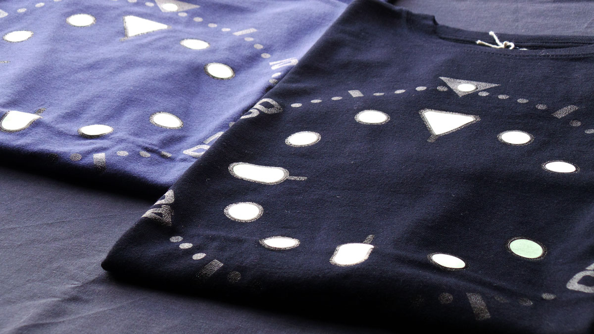
Michael and Ben also knew from previous experience that using transparent ink directly onto clothing can darken or lighten the base fabric colour appealingly.
‘It isn’t particularly hard to do,’ explains Michael, ‘but it is time consuming, needs careful control and takes a lot of skill to get just right.’
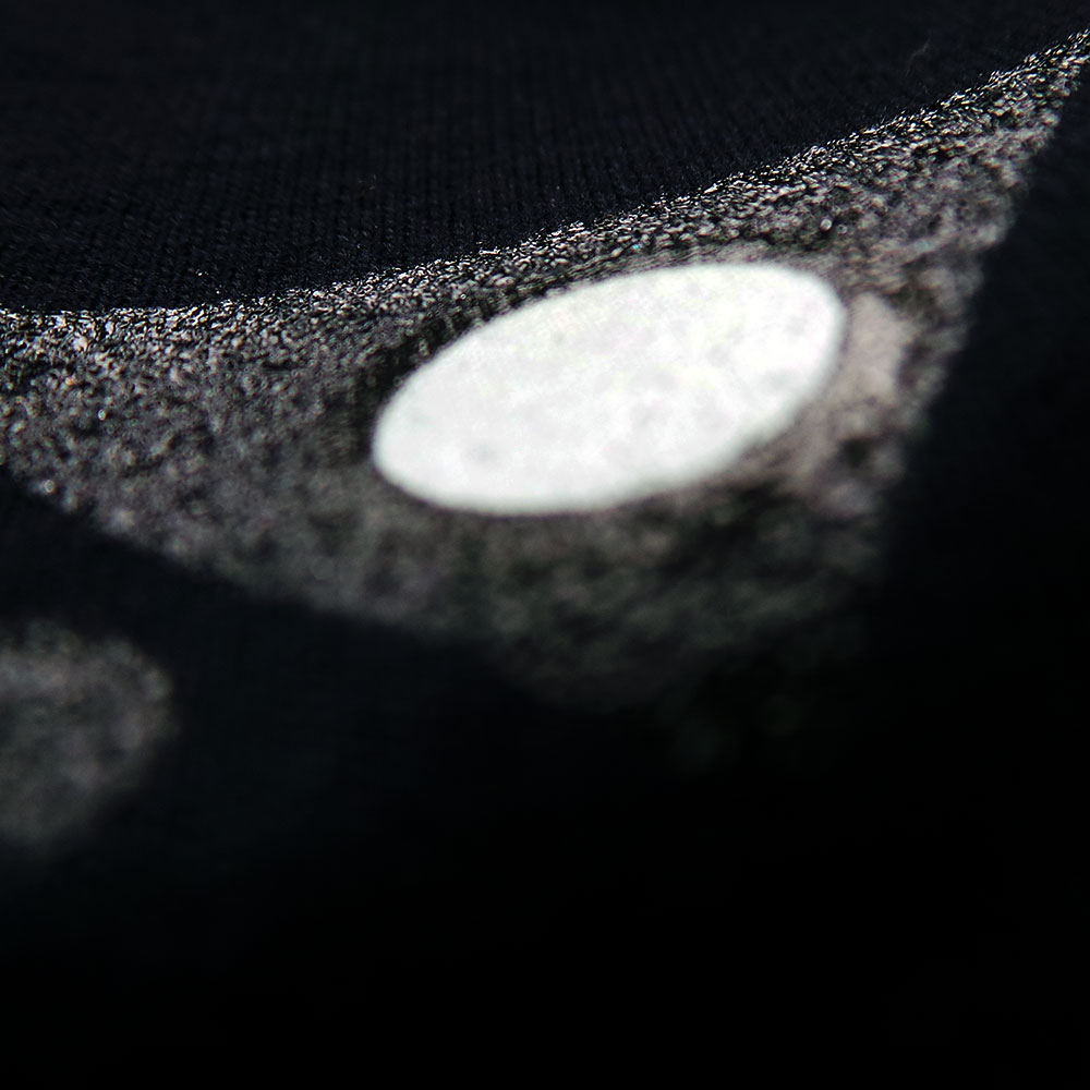
So what does ‘right’ mean? In this case it’s the ‘horology art magic’ that results when two professionals painstakingly combine a lot of technical stuff to perfection. Even the best pictures can’t do full justice to how the lumed SKX graphics appear subtle and understated in a way that belies the complexity of the work put into them. Michael sums up the experience: ‘Perfecting this was a real High Five moment that afternoon at Screen One!’
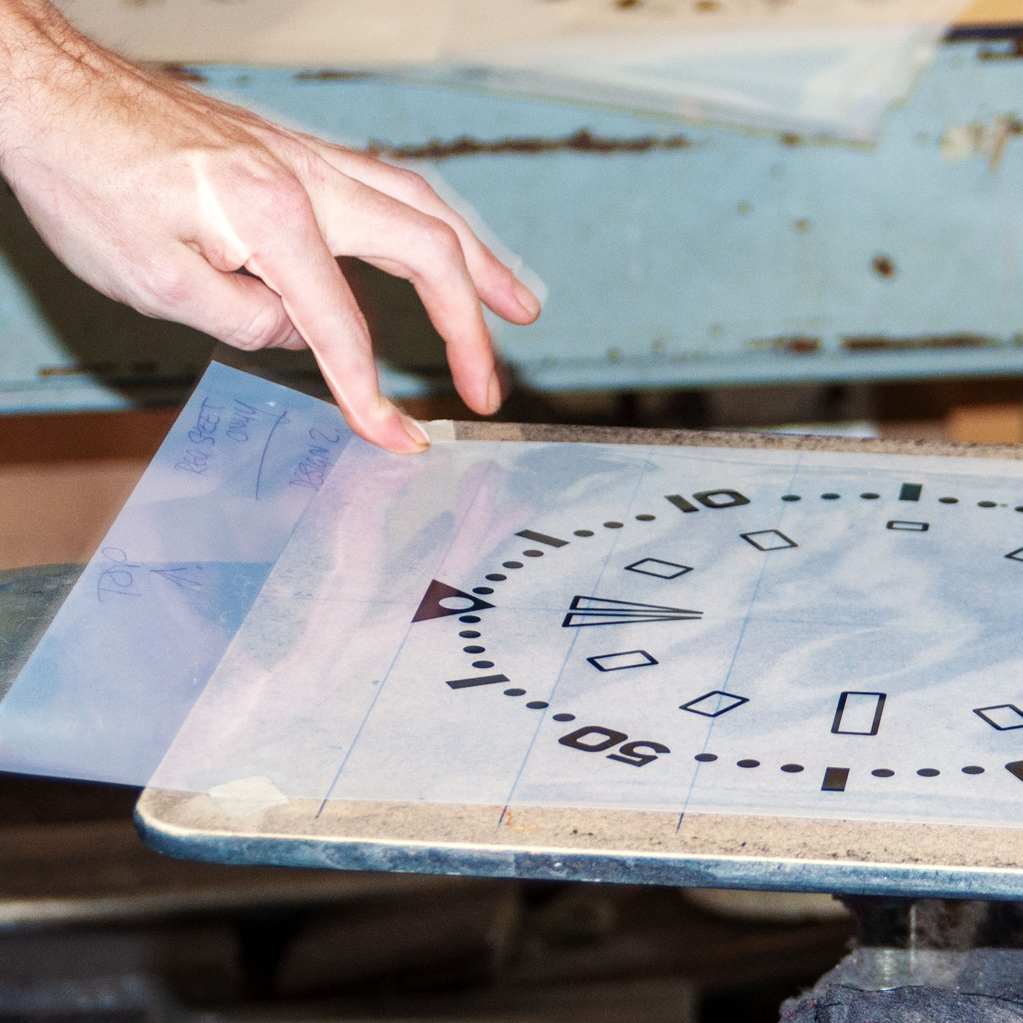

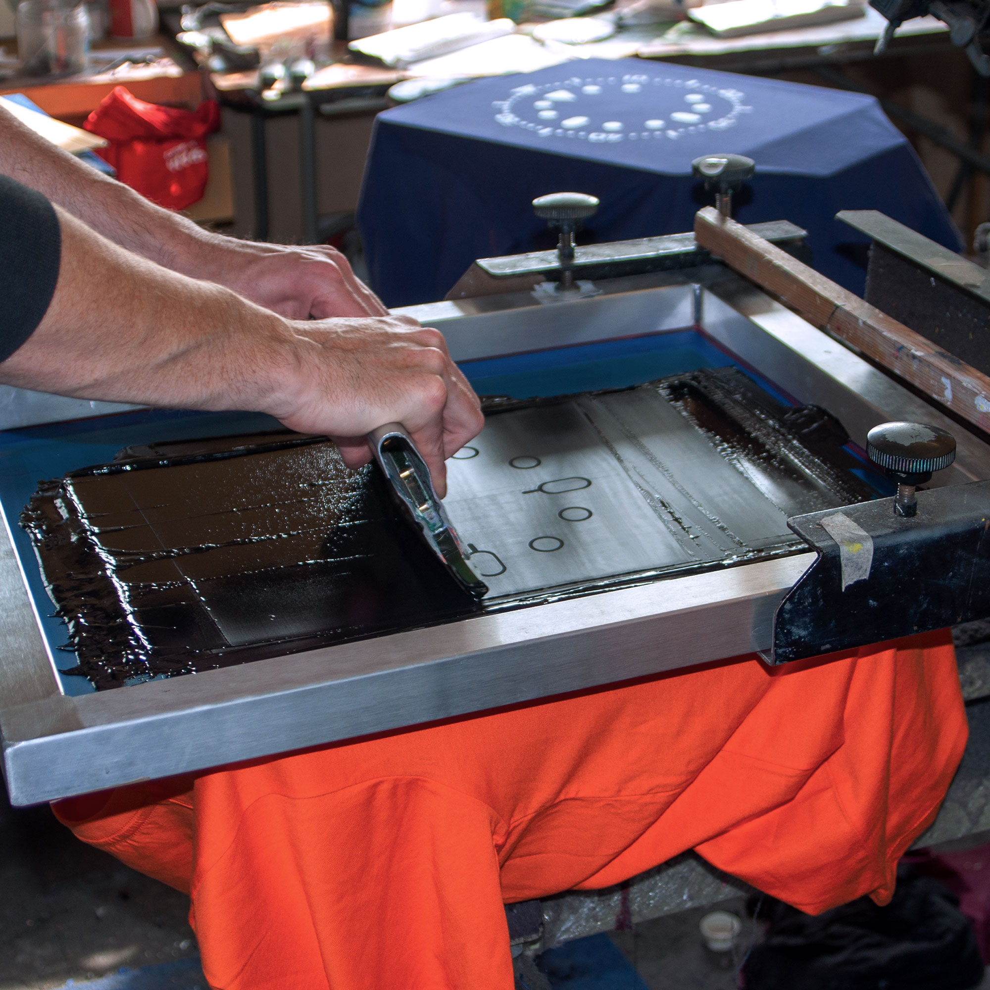
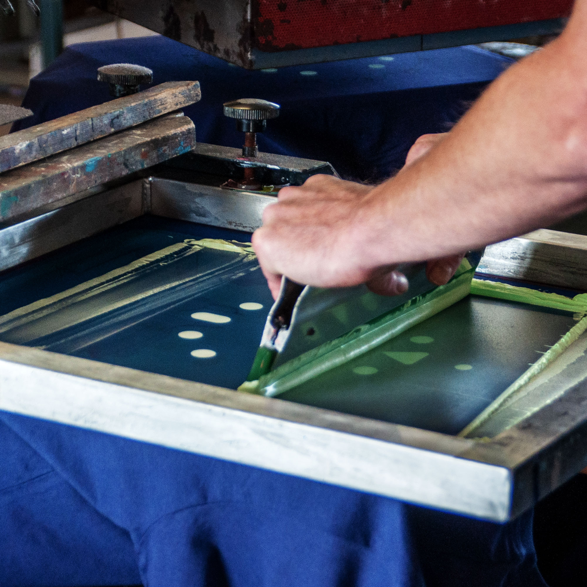
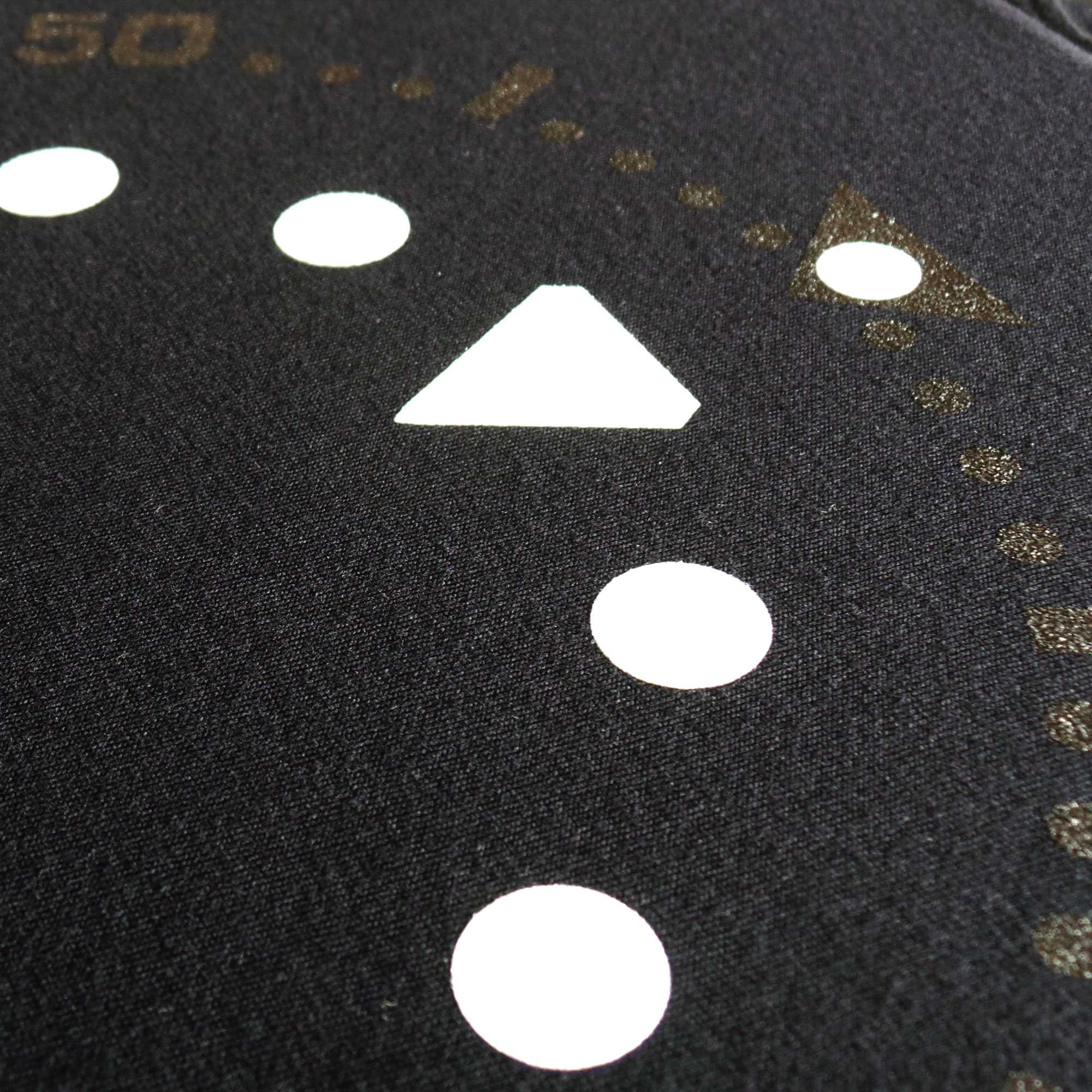
His work on the combined bezel print and fluorescing lume of the Speedmaster T-shirt set the scene for perfecting these latest Seiko SKX-inspired designs. Originally, they were only going to feature the lume. But now Michael is confident about reproducing those lovely SKX details more accurately, including the fine edge lines defining the lumed indices and bezel markers on one of Seiko’s most revered entry-level dive watches.
If they’re being completely honest, any screen printer will admit that maintaining perfect register when hand printing detail on fabric such as that of a tee shirt is virtually impossible. So it proved with the SKX tees. Not only does reproducing the original’s fine edge line around the lume (‘it’s not as easy as you’d think.’) give authenticity, but it’s a neat way to ‘trap’ or ‘seal’ any misregistration between, say, the silver bezel print and the lume’s white base layer.
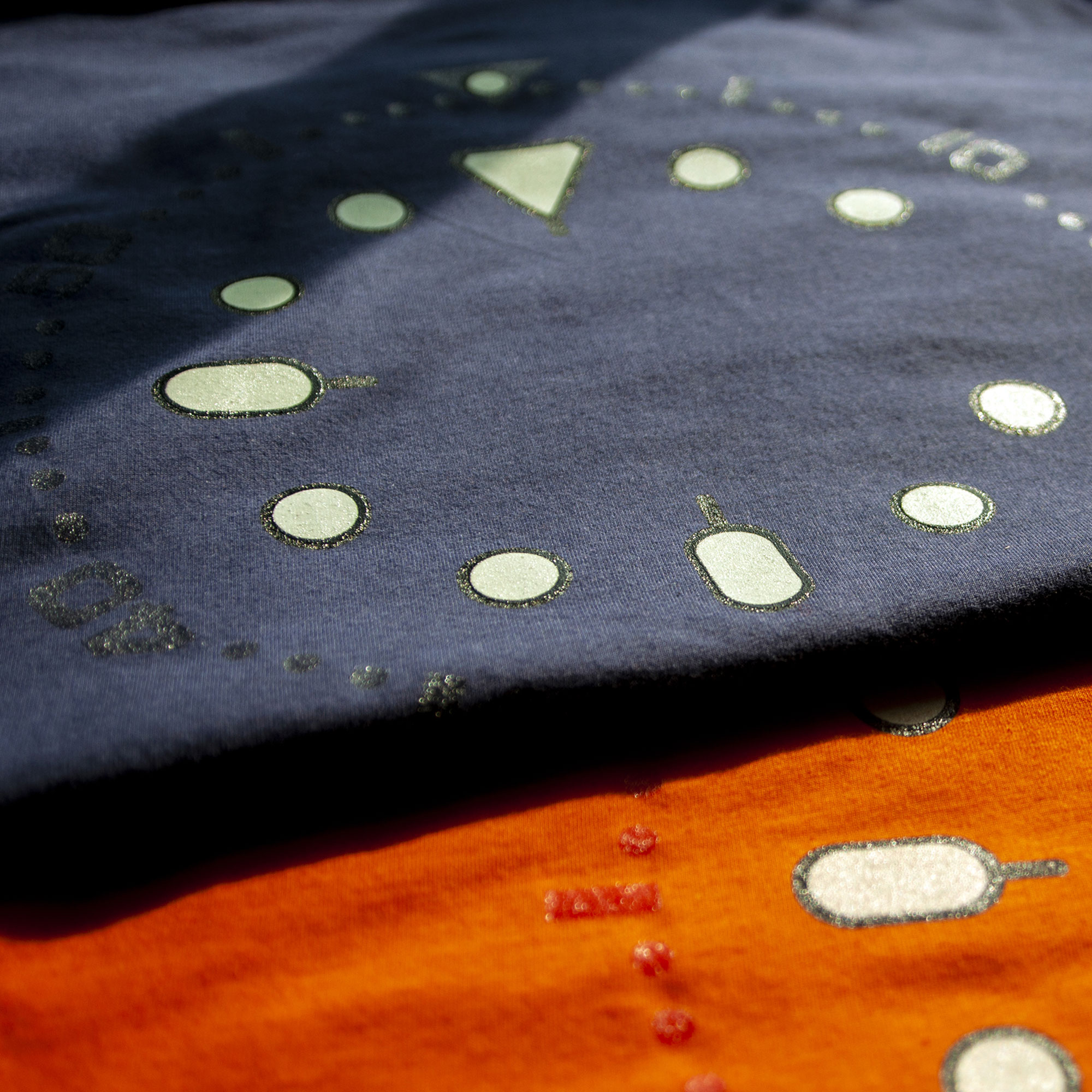
Another challenge involved the effect of interaction between black, blue, orange and yellow base T-shirt colours, and the silver or grey inks planned for the SKX007/009 and SKX011/A35 bezels. The effort required to achieve the desired result shows how much more there is to screen printing lumed horology art clothing than ‘just printing’.
As experienced printers, Michael and Ben understood how excessively shiny some silver inks appear on black – and how visually distracting grey ink could be on the orange 011 and yellow SKXA35 designs. Importantly, given the subtle result required, they decided that using silver and glow-in-the-dark ink was overkill. So they settled on transparent clear ink for all four Seiko SKX prints. A benefit is how nicely the clear ink plays with the light and adds to the subtle visual effect with certain lighting angles. This draws the eye to focus on the lume – the tee shirt’s main attraction – while the clear bezel adds further sophistication.
The finished tee shirts capture the simple clarity of the original Seiko dials beautifully. However, it takes no less than seven screens (and the acrylics used for setup and to achieve register on the printing platen) to get the desired effect. There’s one screen for all the bezel details, a base screen for the SKXA35 and another for the other three versions. Add two more screens to achieve the same for the lume; and two more for the edge detail that ‘seals’ any minute misregistration. The latter is also critical for aligning the all-important lume pip within its inverted delta on the SKX bezel. It’s this attention to detail that distinguishes the most appealing horology art clothing. You can see the SKXA35 horology art T shirt here. And the collection’s other luminescent SKX T-shirts too.

So what follows the latest ‘lume’ collection? As you can imagine, there’s still plenty of inspiration left for Michael in the Moonwatch. And in other Omegas too, such as the Seamaster Chrono Diver with its skeletonised plongeur hands. As Michael says, ‘That’s the beauty of getting ideas from watches with such illustrious heritage. Honestly, given how I identify with the Omega Speedmaster, I can’t imagine ever getting bored and lacking ideas.’
Who knows where Michael will take The Uchi Horology Collection next? After seeing his reaction to Zenith’s products and stand design at Baselworld, who’d rule out an exploded deep-dive – Zenith Defy-style – into the mechanism of Omega’s Moonwatch? Only time will tell.
Geckota remains another important source of ideas too. There’s a definite liking for the Rolex Explorer at Geckota HQ. And I’m always nudging Michael to create something based on the classic Universal Genève Polerouter with its signature trapezoidal date window and playful font choice.
Then again, there’s inspiration from his own modest watch collection and a couple of watches he’d like to own alongside that birth-year Speedy. I referenced Patek Philippe’s Calatrava 5212A-001 earlier. There’s also the whole Max Bill Junghans thing led by the Bauhaus-inspired watches, with sublime open-countered ‘4’ numeral, that the Swiss genius designed for the brand.
Whatever Michael does next, it’ll involve much more than just watch-themed T-shirts. The Uchi Horology Series will continue to be true to his belief that there’s more to the art of horology than just reproducing classic watches in technical illustration style. As ever, expect his horology art to keep invoking wider concepts and multiple facets of watches’ stories.
‘Thinking ahead,’ says Michael, ‘there’s huge potential to do more with birth-year star maps like the one on my Speedmaster Apollo Moon landing prints. I want to address more Japanese themes too. This might include combining Japanese scenes and seasons with Seiko’s day-date graphics and inspiration from Patek Philippe’s exquisite Baselworld Haute Horlogerie. Taking horology art a stage beyond just the art of watches, I’d like to explore horology in its broadest historical sense. So don’t be surprised to see themes as diverse as Stonehenge, timekeeping in Aztec and Mayan culture, and the Egyptian merkhet.’
Reviewing Michael’s watch artwork, from the Heuer Monaco Ref. 1133B, to the Moon and back to lumed Seiko T-shirts is fascinating. So’s the thought of where his talent will take him next. Perhaps we’ll see his designs on Uchi-branded watch straps. Or maybe he’ll emulate American typeface designer Jonathan Hoefler and create an Uchi typeface for watch dials.
‘Whatever the future holds for me in horology art,’ says Michael, ‘It’ll be interesting. I hope my customers enjoy the results as much as I enjoy designing them. And of course, they also make great gift ideas for watch enthusiasts too!’
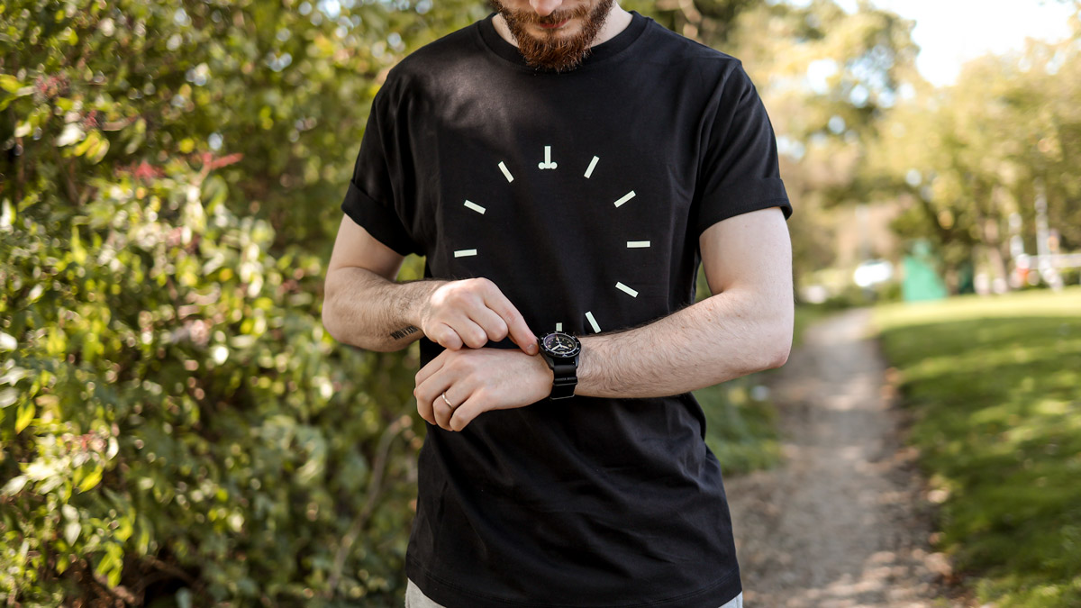
Omega Speedmaster Lume T shirt – Image Credit: WatchGecko Online Magazine
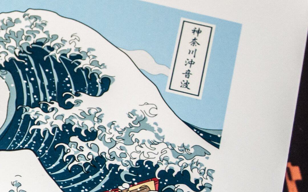
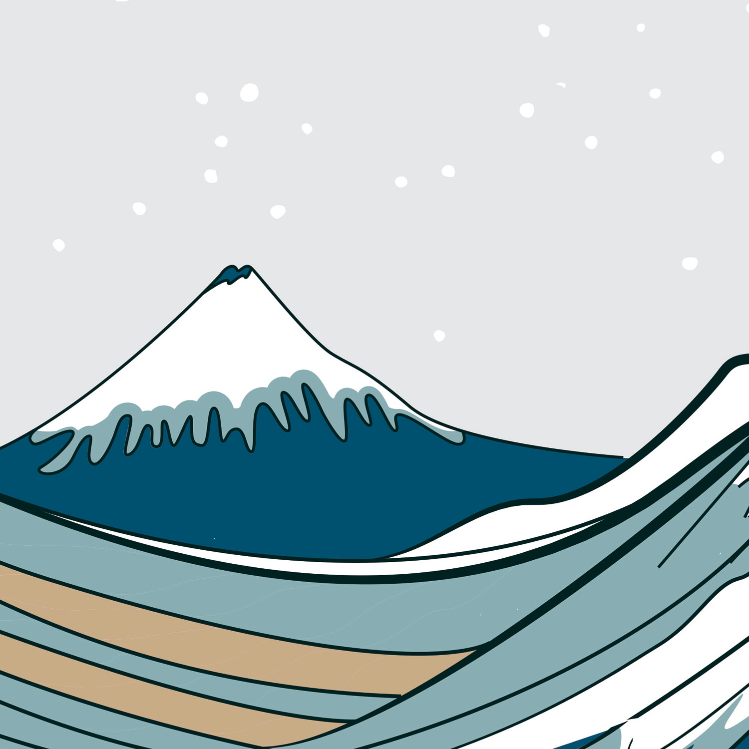
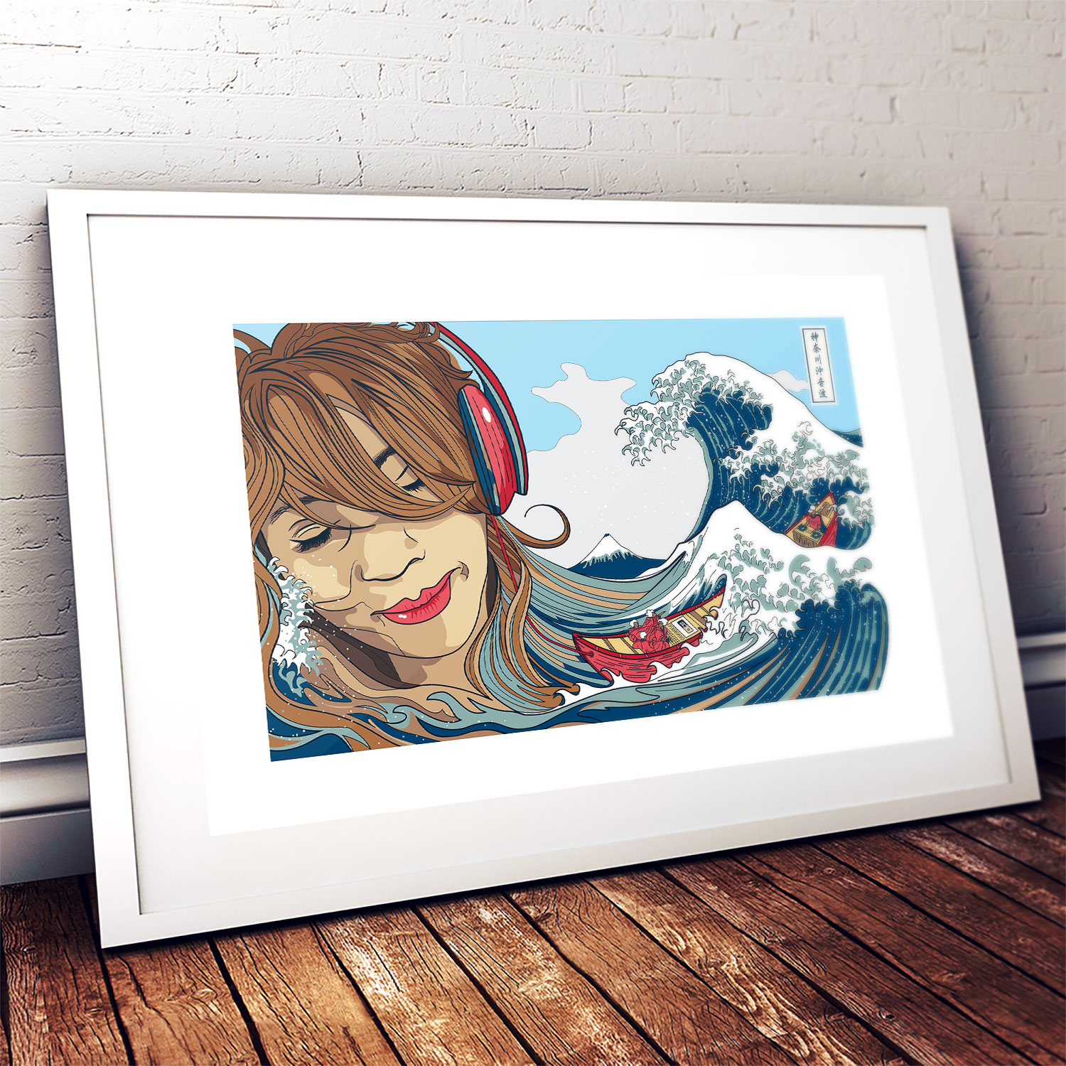
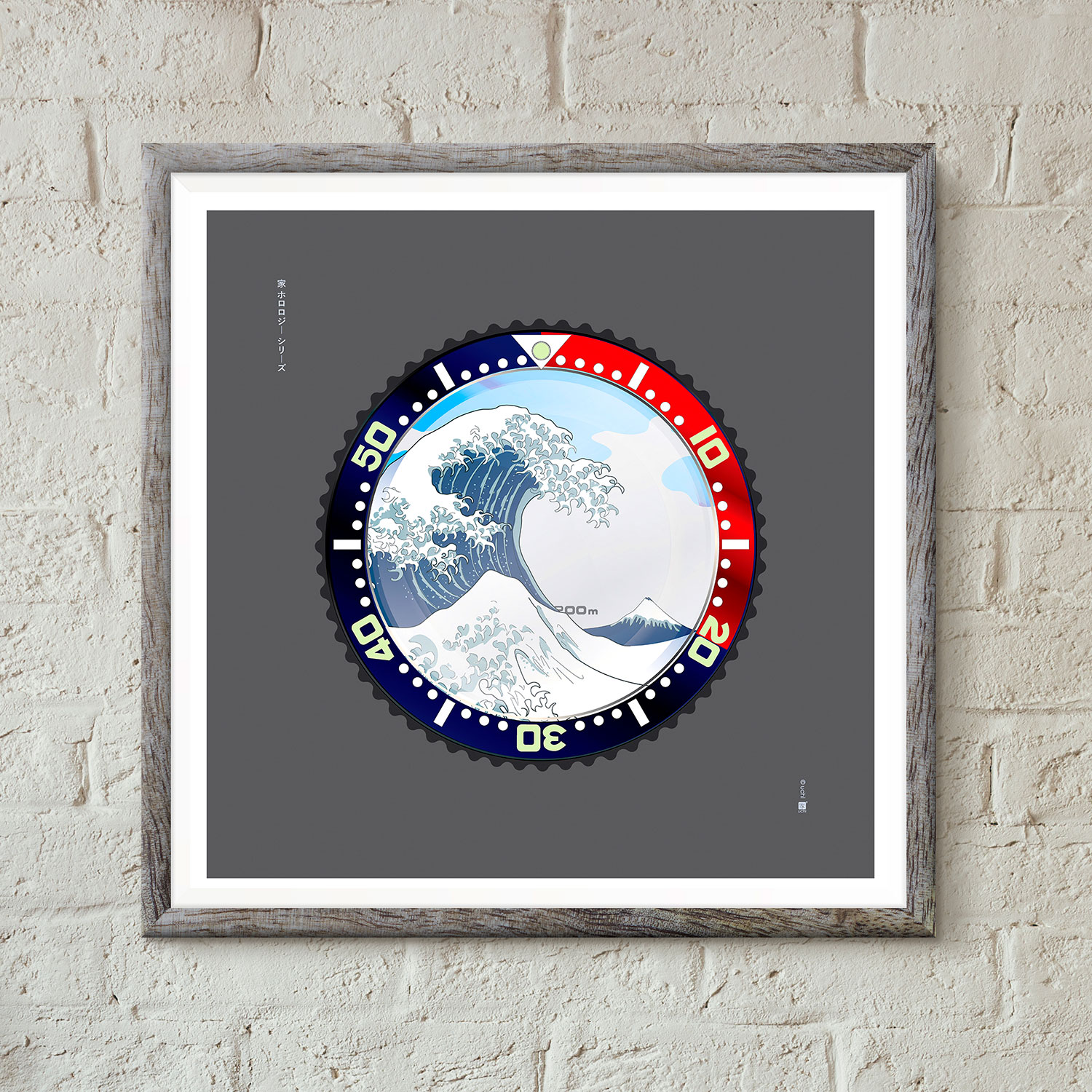
A fine art print of an original illustration based on The Great Wave off Kanagawa (神奈川沖浪裏) Japanese woodblock print by ukiyo-e artist Katsushika Hokusai.
Available in A3, A2 and A1 fine art paper prints. Signed by the artist.
")
Ukiyo-e refers to the Japanese paintings and woodblock prints that emerged in Japan’s Edo period (1615-1868). These affordable prints captured everyday Japanese life; stylish courtesans, kabuki theatres, sumō wrestlers, historical events, landscapes and erotica. Ukiyo-e (浮世絵), although often translated as “pictures of the floating world,” literally means “Pictures of the fleeting world”, that is the fleeting secular world. As such, the paintings and prints were more appealing and diverse than art of the ruling Shōgun class.

Not only did the ukiyo-e prints document the leisure activities and climate of the era, they also showcased Japanese aesthetics of beauty, nature and spirituality to the outside world and was central to forming the West’s perhaps misleading perception of Japanese culture. The development of multicoloured printing led to mass-marketing and increased popularity, and by the mid-19th century a print could run into the thousands. At this time the Japanese arts were ‘trending’ in Western culture and had a strong influence on early Impressionists and Art Nouveau artists such as Monet, Vincent van Gogh and Toulouse-Lautrec. Today, ukiyo-e is still the best know style of Japanese painting.
Born in what is known now as Tokyo in 1760 Katsushika Hokusai began painting early in life. His name as a child was “Tokitarō” and at 14 began honing his skills as an apprentice wood-carver. He then studied under the ukiyo-e artist Katsukawa Shunshō who would give him a new name “Shunrō” and from whose school he would eventually be expelled. An inspiring time for an artist, he is quoted as saying “What really motivated the development of my artistic style was the embarrassment I suffered at Shunkō’s hands.” He now had a new focus. Instead of the usual courtesans and Kabuki images practiced by artists like his former master, he focused on landscapes and the portrayal of everyday Japanese society, changing both his career and ukiyo-e art.

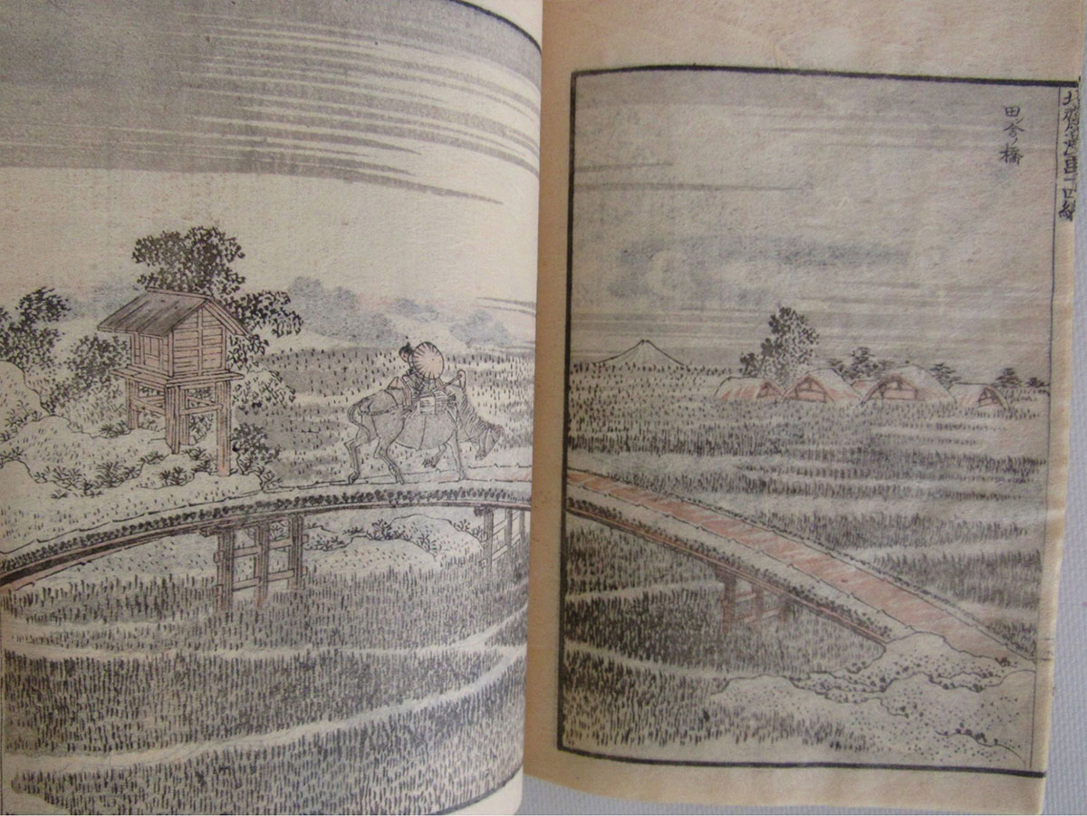
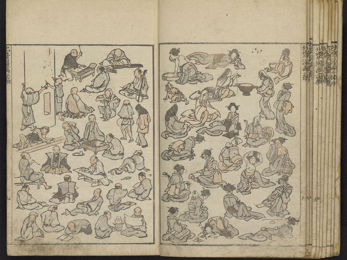
In 1811 at the age of 51, Hokusai changed his name to “Taito” and begun his largest body of work, Hokusai Manga (北斎漫画). This was a 15-volume collection of sketches featuring animals, religious figures, everyday people, objects, landscapes, dragons, the list goes on. They have been compared to Rembrandt and Van Gogh’s work, for “the thrilling panorama they provide both of the world and of Hokusai’s imagination”.
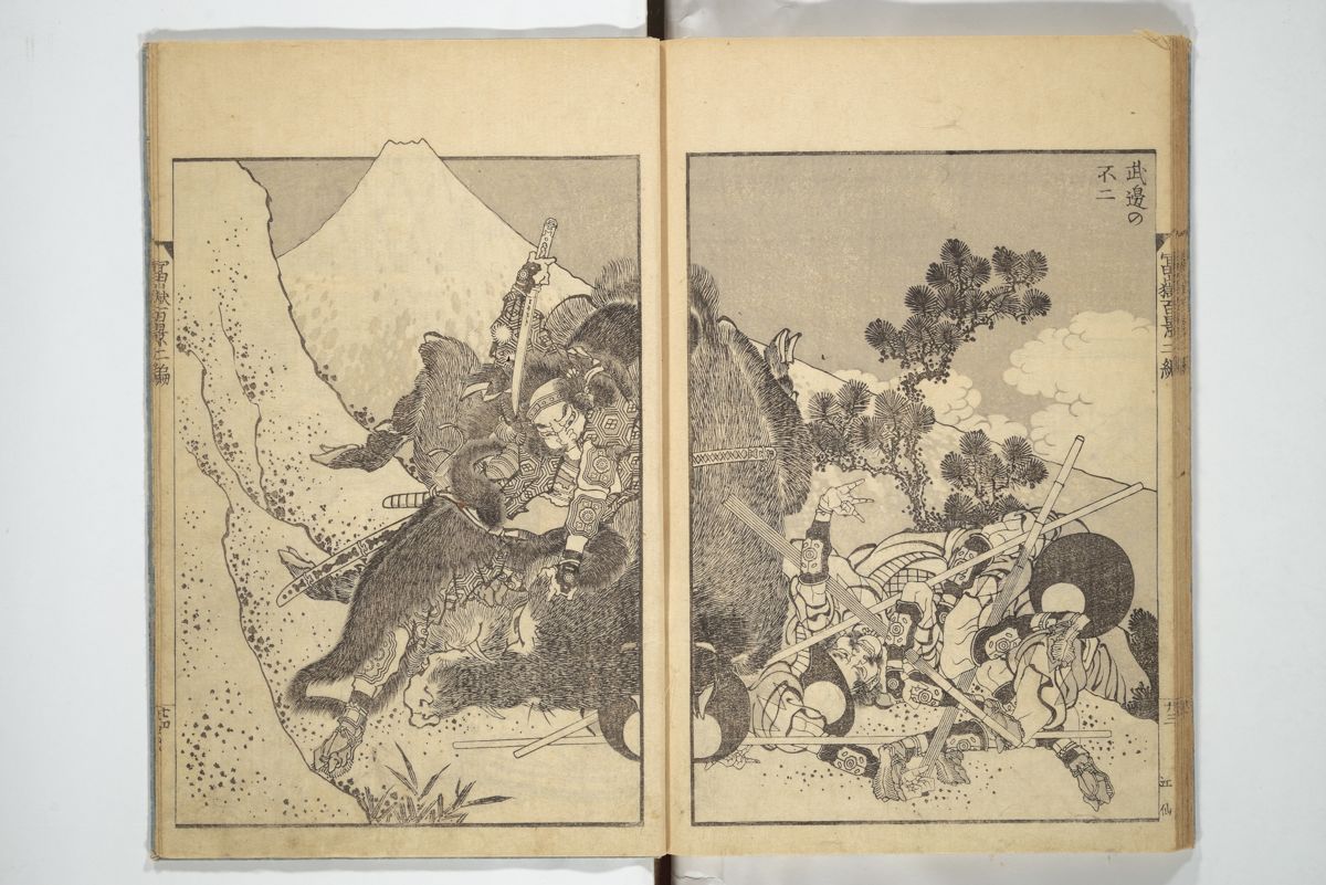
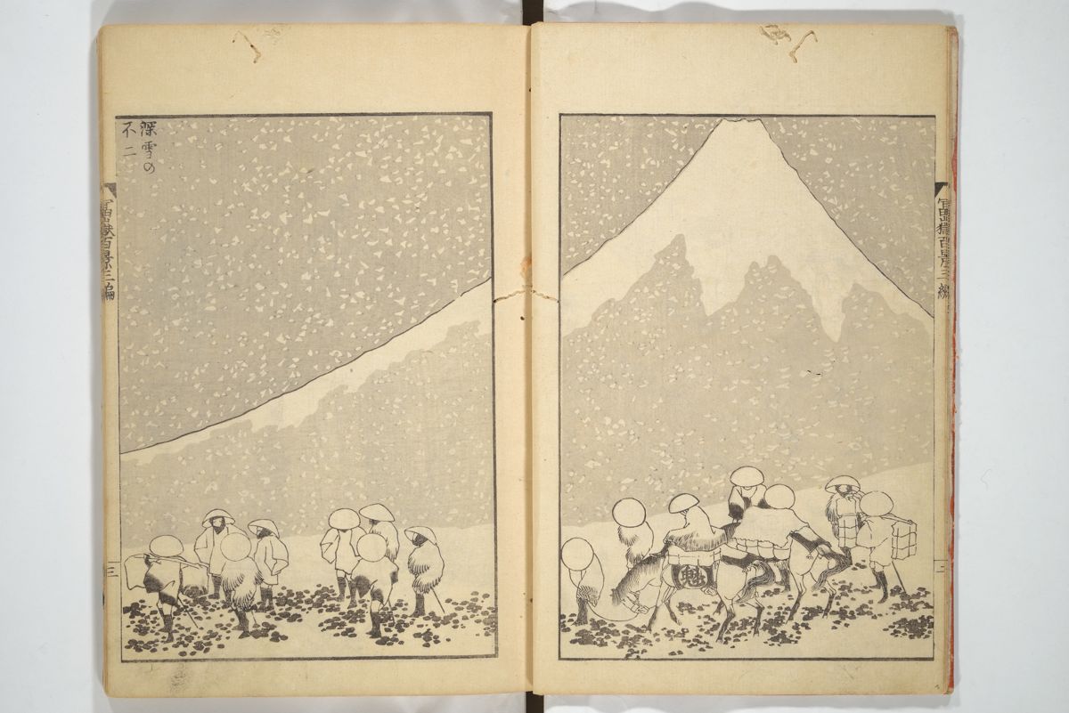
On his sixtieth birthday in 1820, Hokusai changed his name to “Iitsu” meaning “one again”. It was during this period he would make one of his most celebrated print series, Thirty-Six Views of Mount Fuji. Published between 1830 and 1832, this series included the famous Great Wave off Kanagawa. Due to it’s popularity, ten more prints were later added. And then, in 1834 under the new pseudonym “Gakyō Rōjin Manji” (The Old Man Mad About Art) he published One Hundred Views of Mount Fuji (富嶽百景 Fugaku Hyakkei), a work which “is generally considered the masterpiece among his landscape picture books”.

Among the other popular series of prints he published during this time are A Tour of the Waterfalls of the Provinces and Unusual Views of Celebrated Bridges in the Provinces. He later began producing a number of detailed individual images of flowers and birds, including the extraordinarily detailed Poppies and Flock of Chickens. He died after a short illness in 1849, aged 90.

From the age of six I had a mania for drawing the shapes of things. When I was 50 I had published a universe of designs. But all I have done before the age of 70 is not worth bothering with. At 75 I’ll have learned something of the pattern of nature, of animals, of plants, of trees, birds, fish and insects. When I am 80 you will see real progress. At 90 I shall have cut my way deeply into the mystery of life itself. At 100, I shall be a marvellous artist. At 110, everything I create; a dot, a line, will jump to life as never before. To all of you who are going to live as long as I do, I promise to keep my word. I am writing this in my old age. I used to call myself Hokusai, but today I sign my self ‘The Old Man Mad About Drawing’.
Woodblock printing in Japan (木版画, mokuhanga) was also used for printing books long before the advent of movable type. Woodblock printing had been used in China for centuries but was widely adopted in Japan during the Edo period. Although similar to woodcut in Western printmaking in some regards, the mokuhanga technique uses water-based inks as opposed to oil-based inks primarily used in western woodcuts. The Japanese water-based inks provide a wide range of vivid colors, glazes, and transparency.
I am a huge fan of woodblock prints, especially those by Japanese artists, past and present. Coming from a print background myself, I’ve always admired the results of fine draftsmanship and quality that relief printing can achieve. Woodblock printing involves carving the desired pattern onto a large block, covering that design in ink or dye, and stamping it onto the fabric. I only wish I had the skill and patience that woodblock artists have. As a screen printer however, I am looking forward to screen printing the Soundwave off Kanagawa and seeing the difference between the digital version and a woodblock print.
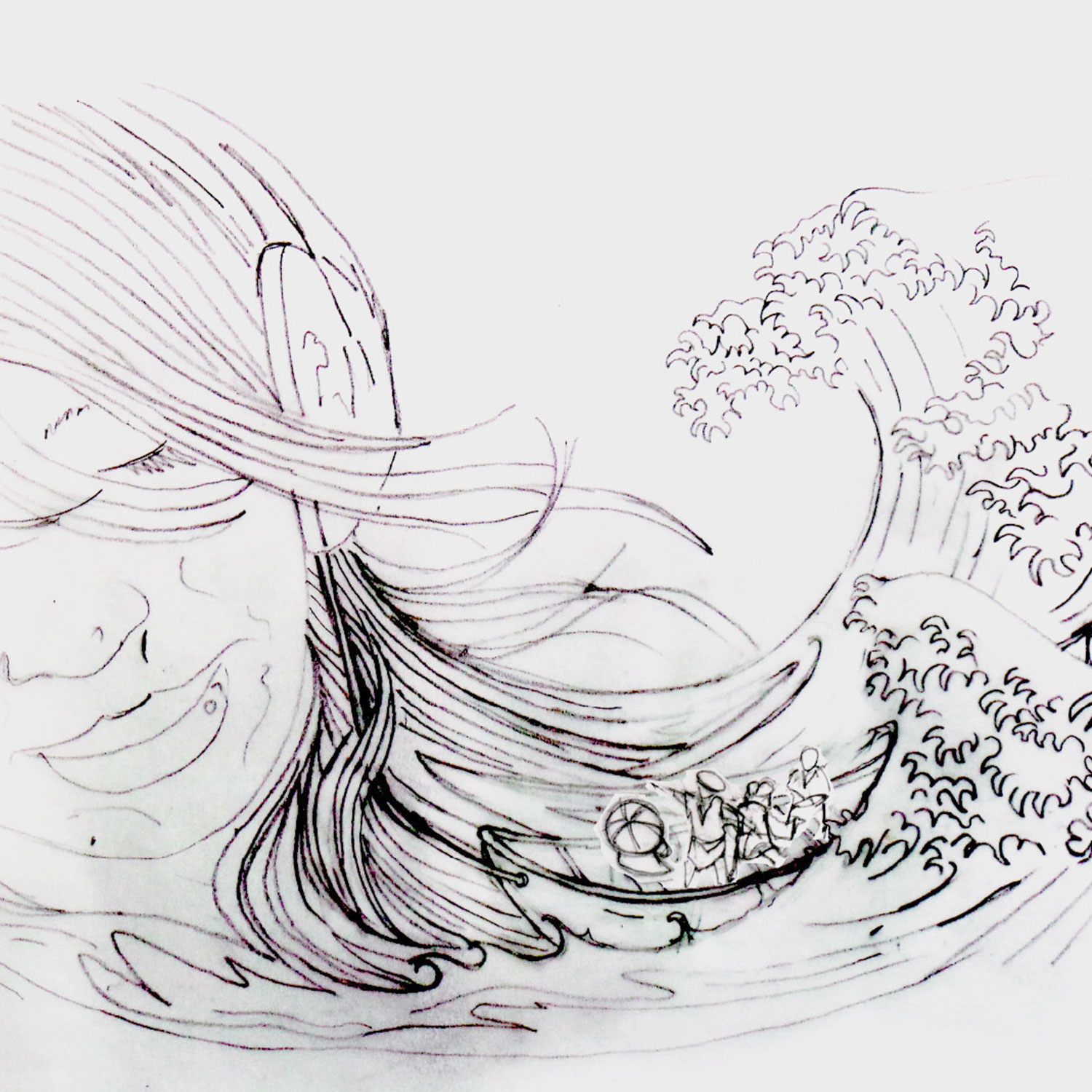
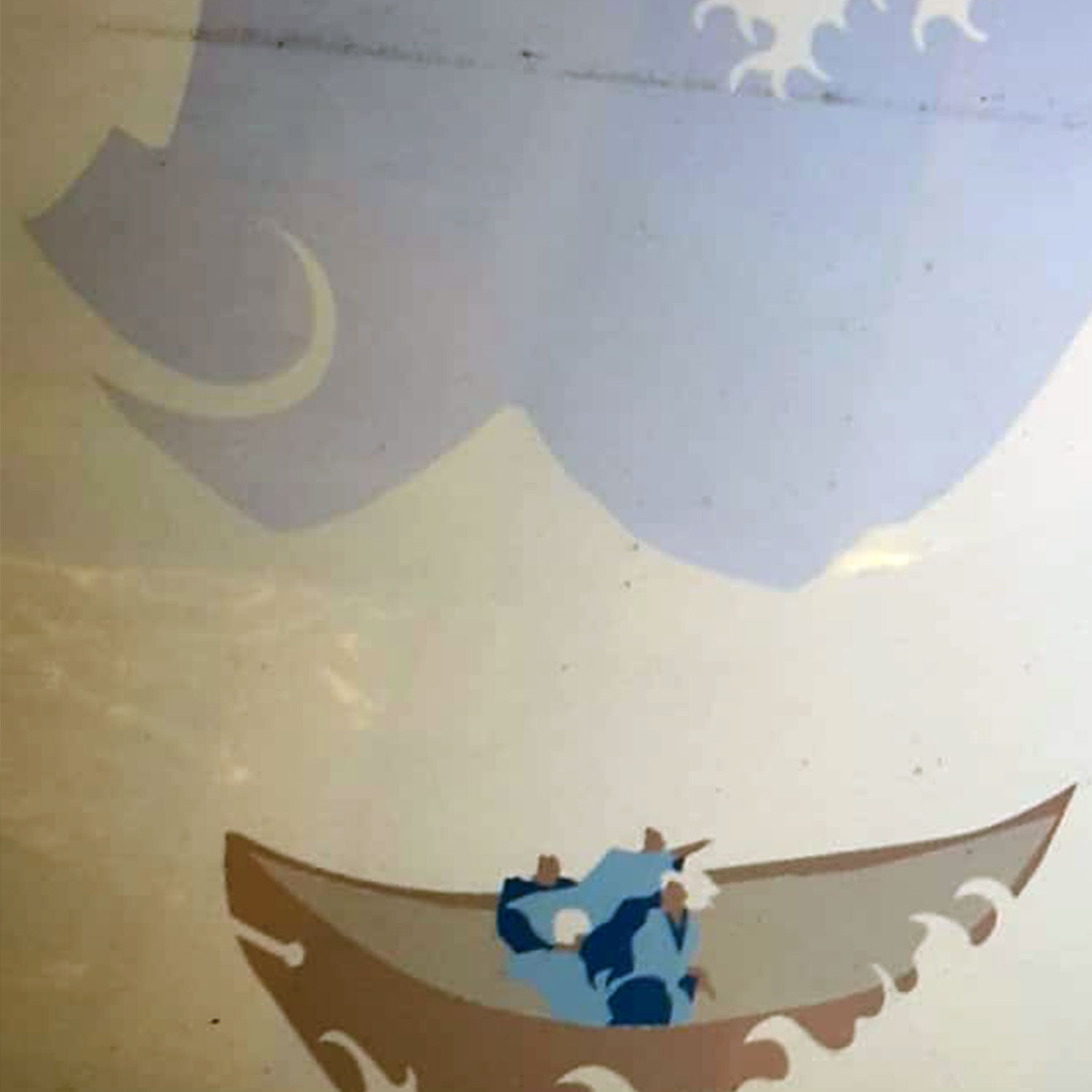
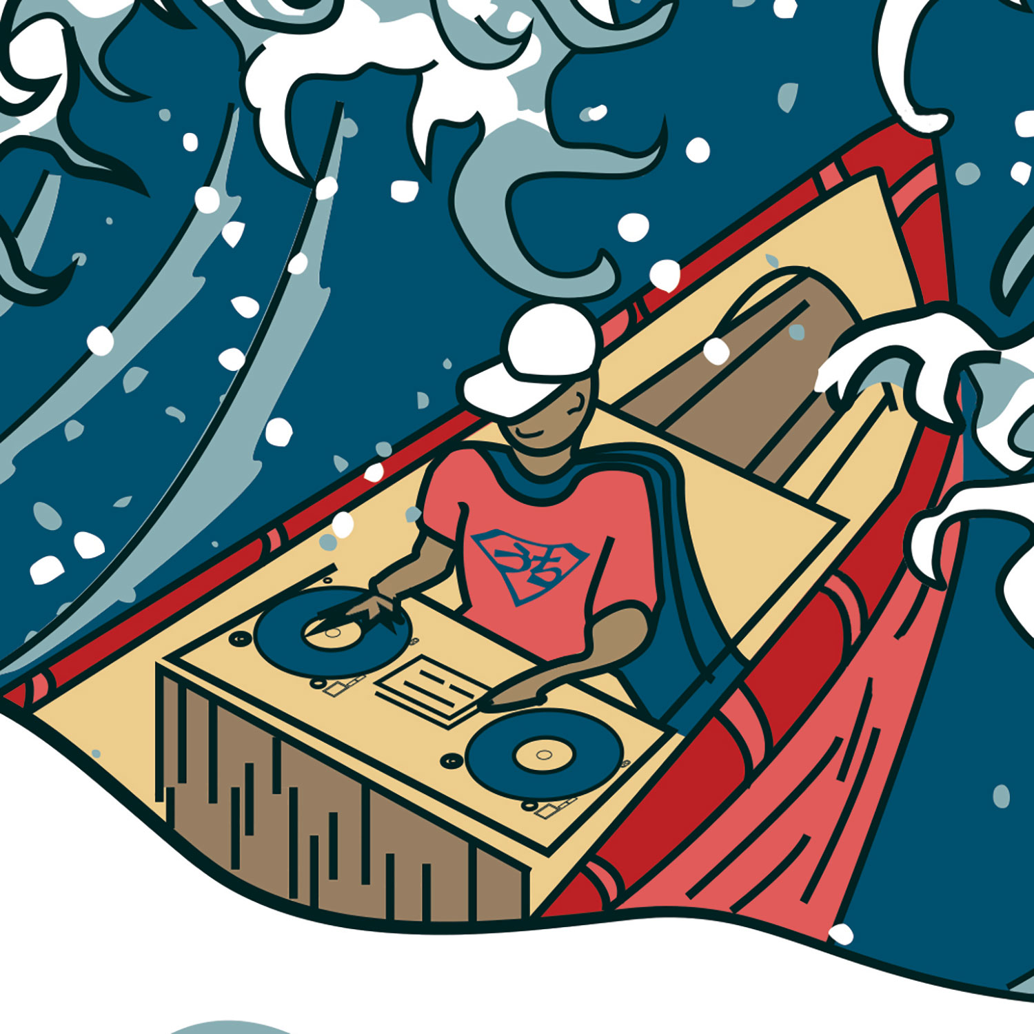
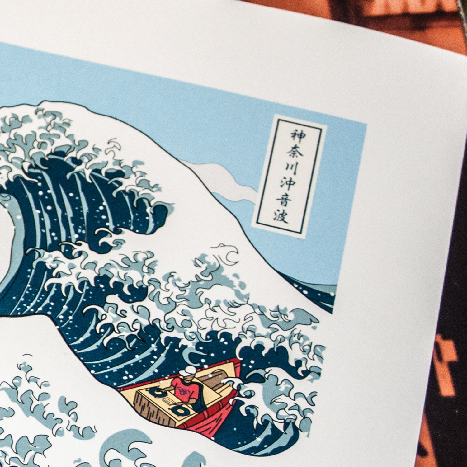
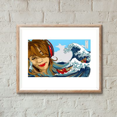
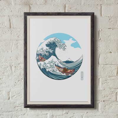
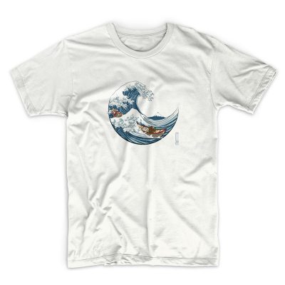
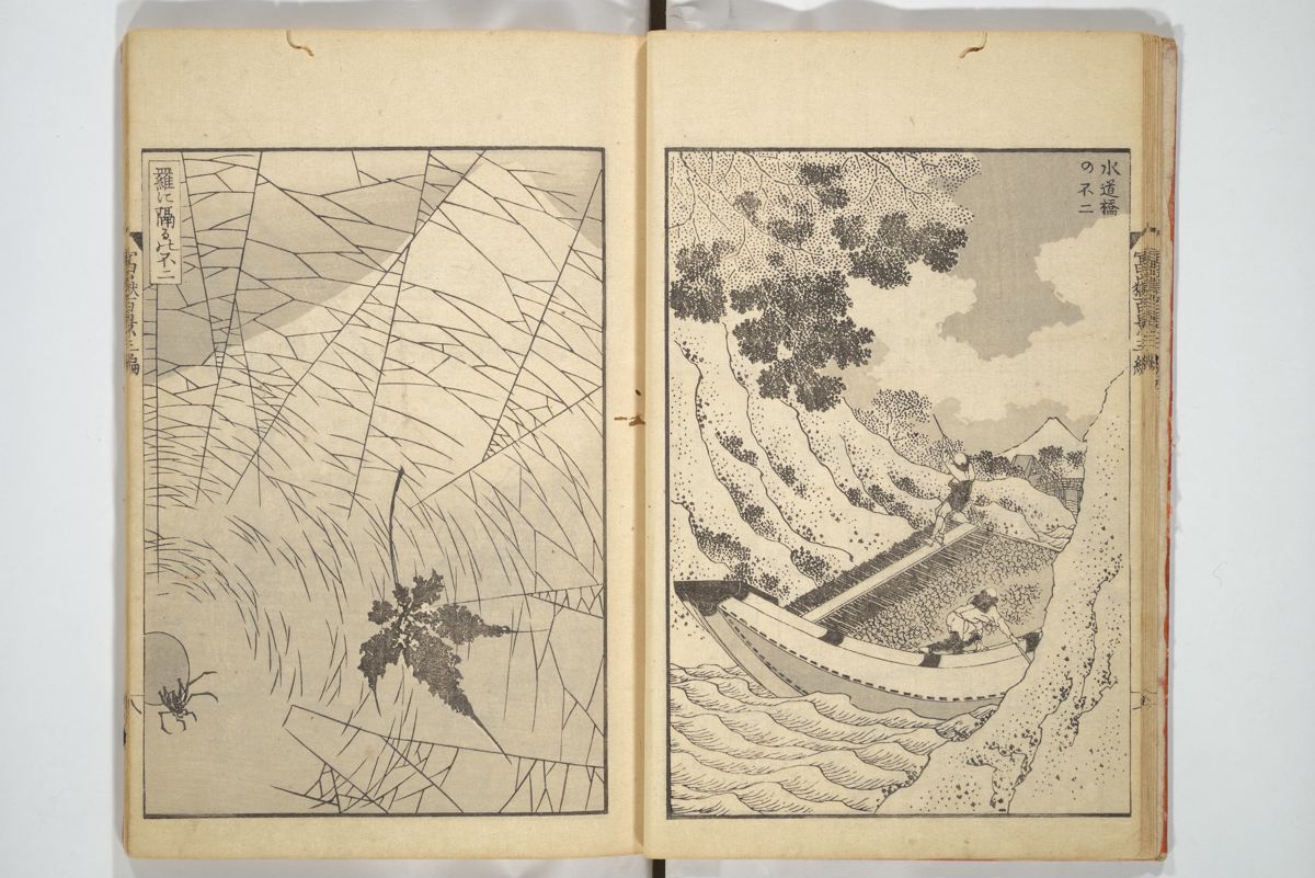
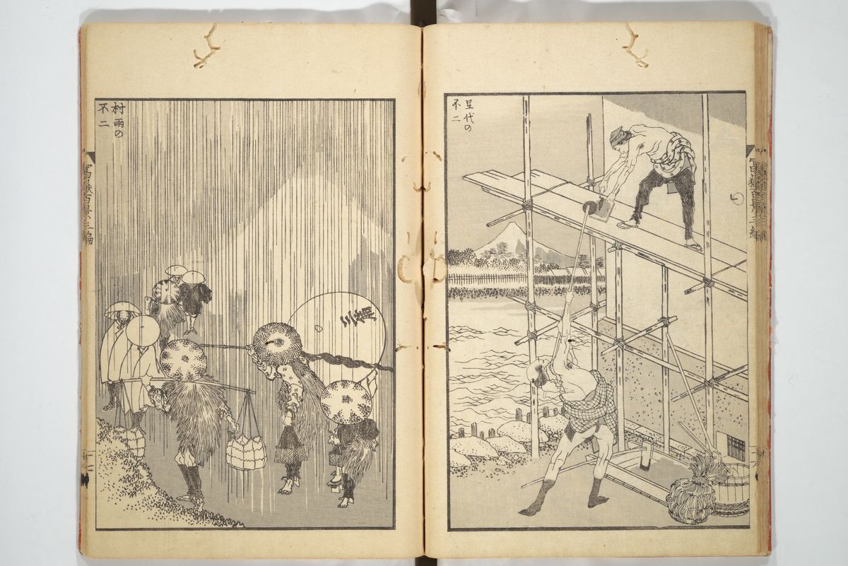
This latest uchi art print, entitled ‘Soundwave off Kanagawa‘ (神奈川沖音波) features a redrawn Hokusai Wave with Mount Fuji in the background. The drama unfolding in the sea has been changed form the original. Instead of three “fast boats” in the sea there is one boat with a deejay at the helm. The people in the boat are based on figures depicted in the ukiyo-e print “Tea house at Koishikawa. The morning after a snowfall” (礫川雪の旦).
I like the idea of a synergy between all the different elements and how they could be affecting each other. How the waves might be responding to the sound from the boat. Are the people in the boat responding to what the deejay is playing or the approaching wave? And, on a science geek tip, I also like the idea of symbolizing sound waves (longitudinal waves) and sea waves (transverse waves).

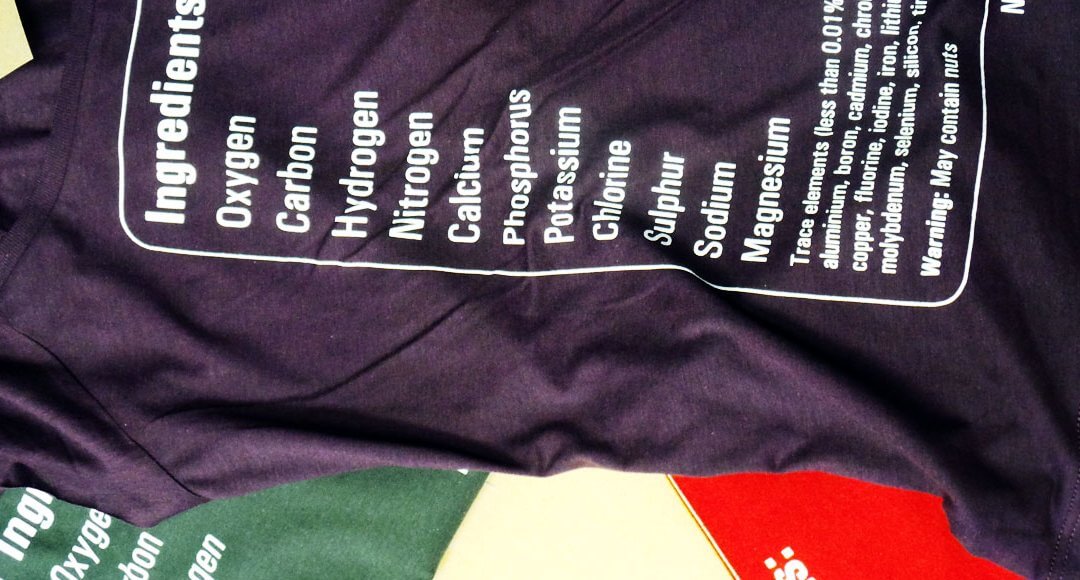
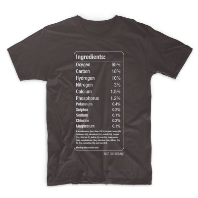
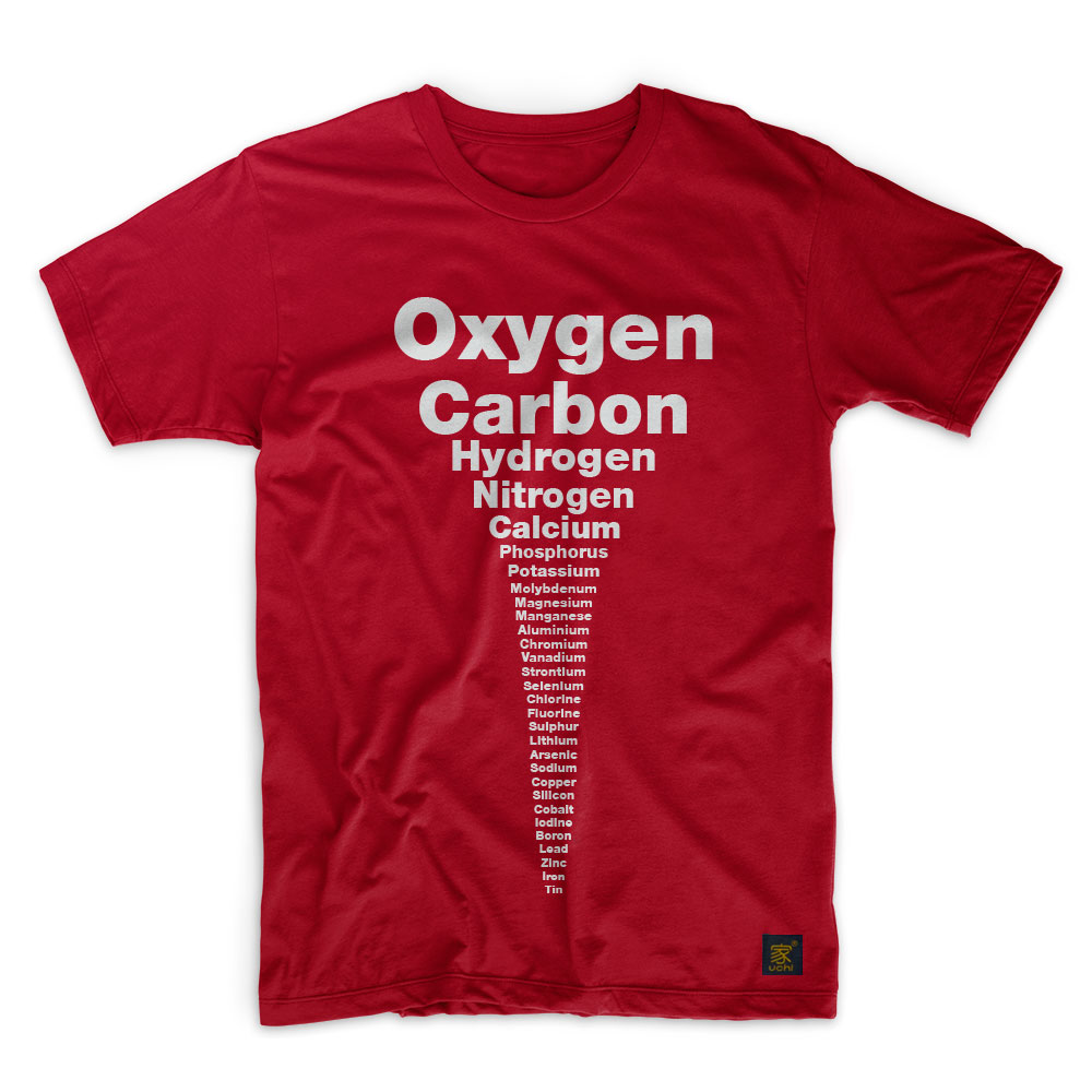
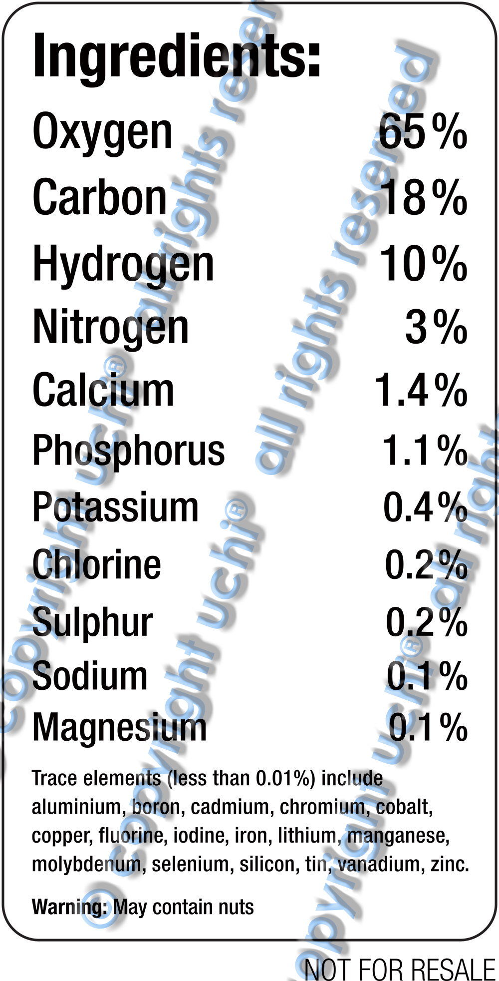
The first question sounds a little metaphorical and will probably be addressed sometime in the future. But for now, the latest uchi track addresses the physical, or, more accurately, the chemical. I’m a science geek and a T shirt showing the chemical elements that make up the human body has been on the back burner of my mind for some time. It felt right to follow the last uchi T-shirt “Stereotype” with another typography design – contrasting, but also related. Think of it as the B Side to Stereotype.
A T-shirt displaying the chemical elements of the human body.
A bunch of stats from various academic websites to get the elements as well as each element’s mass (all with slightly varying approximations). I’ve since learnt that the exact amounts vary from person to person.
So how do you display the elements of the human body in a simplistic design? A graphical, infographic design? Maybe a pie chart or graph? Following on from ‘Stereotype‘, I thought “simple is best” and decided to rely solely on text and my typographical training to communicate the idea.
I wanted the names of each element to be printed in proportion to each other’s relative size. But this proved problematic, in terms of both design and print.
So I ditched the ratio idea in favour of a more aesthetically pleasing design. Starting with oxygen and ending with tin, each element’s representation would be slightly smaller than the one before it. I liked it. However, though simple, it wasn’t technically accurate. That was because the order of the trace elements was determined by the size of the word representing them – not by their mass. This bugged me.
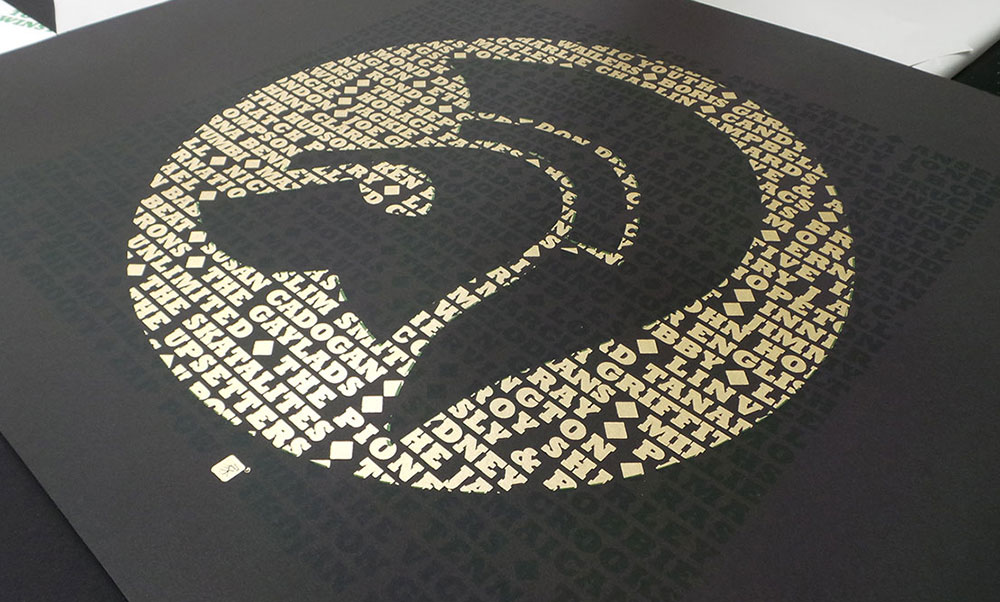
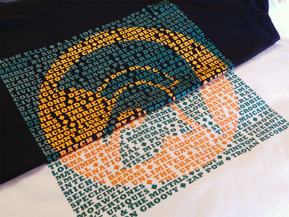
It’s no secret that I love typography and screen printing. So, after the success of the Vinyl Records based T shirts and the Gil Scott Heron limited edition art print, I decided to produce a series of limited edition prints of the Trojan design…
From reggae, ska, rock steady and dub, Trojan Records logos’ endurance is a testament to the music and culture. We haven’t included the complete list of all the artists that appeared under Trojan Records, but hope we’ve caught a few of everybody’s favourites.
Growing up in a house full of reggae records has made the Trojan logo as recognisable to me as the Nike swoosh. It’s no coincidence that the typeface Trojan Records uses is a robust and solid one. Like them, Rockwell Bold evokes strength and stability. They chose well.
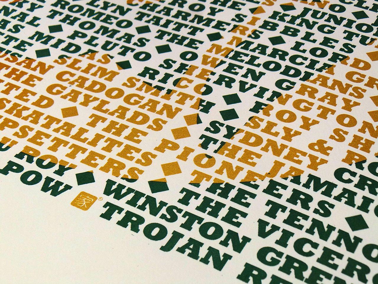
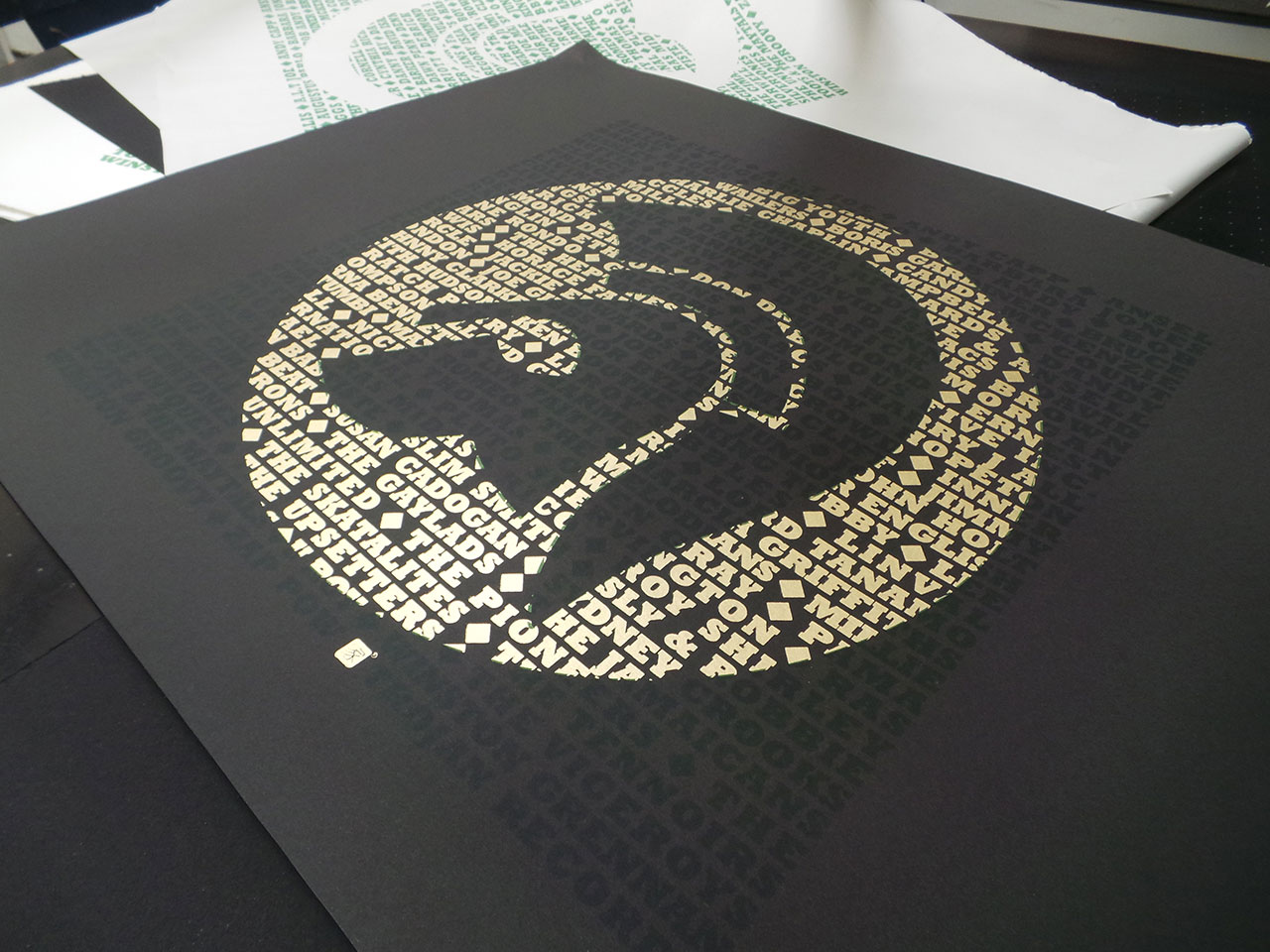
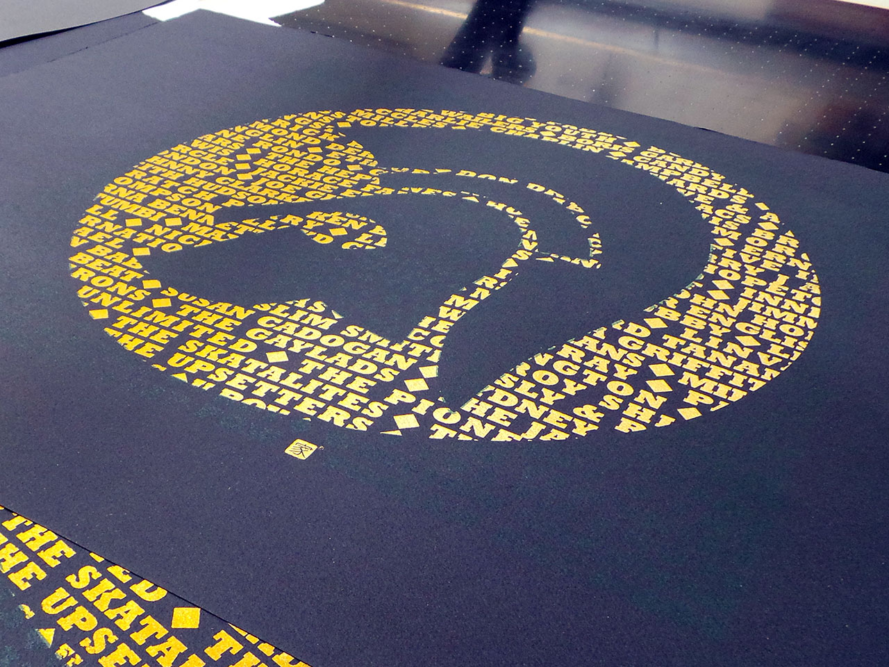

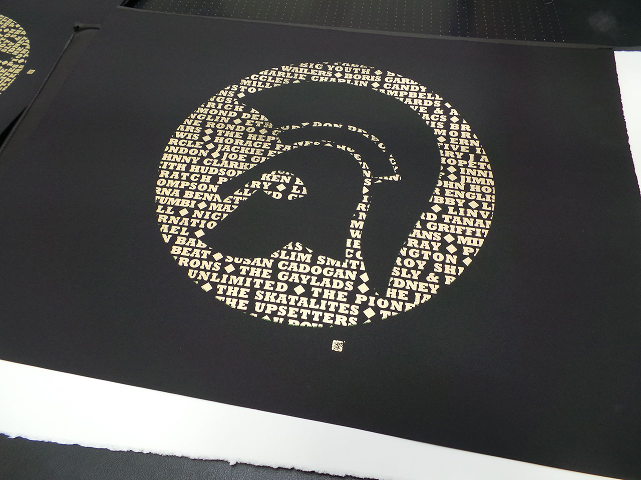
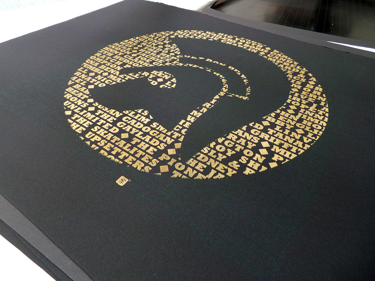
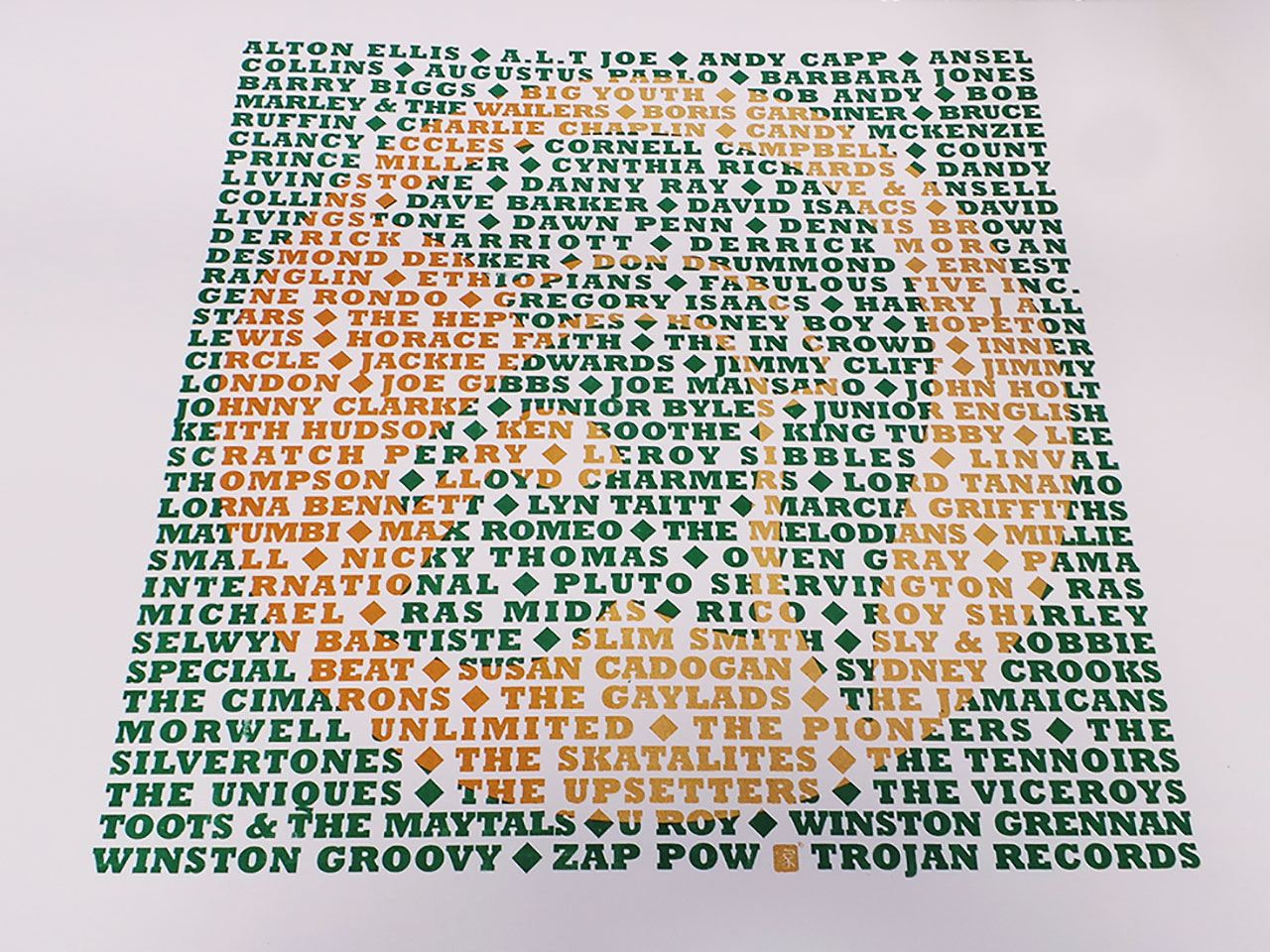
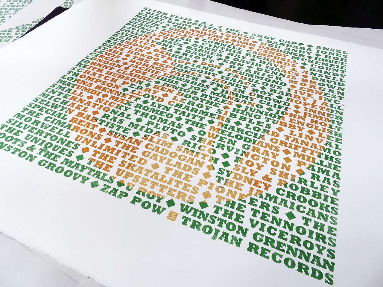
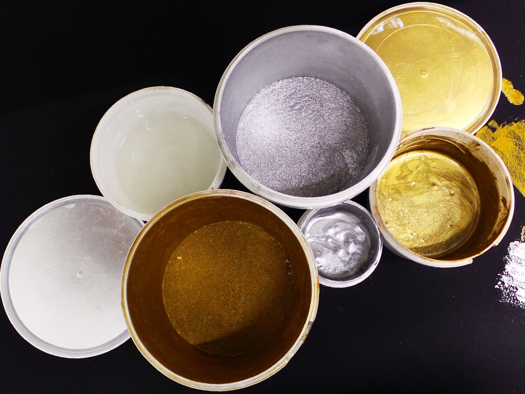
A limited edition set of artists proofs, screen printed in metallic gold and dark green and available on black and white fine art papers. Each screen print is unique with different variations of the gold ink mix. As with the previous Star Wars screen print, some have been printed with pure metallic gold and some have been mixed with a orange ink. This is especially apparent on the white Somerset Satin papers. These prints have lot more orange than metallic gold.
Signed and numbered.
The page you requested could not be found. Try refining your search, or use the navigation above to locate the post.
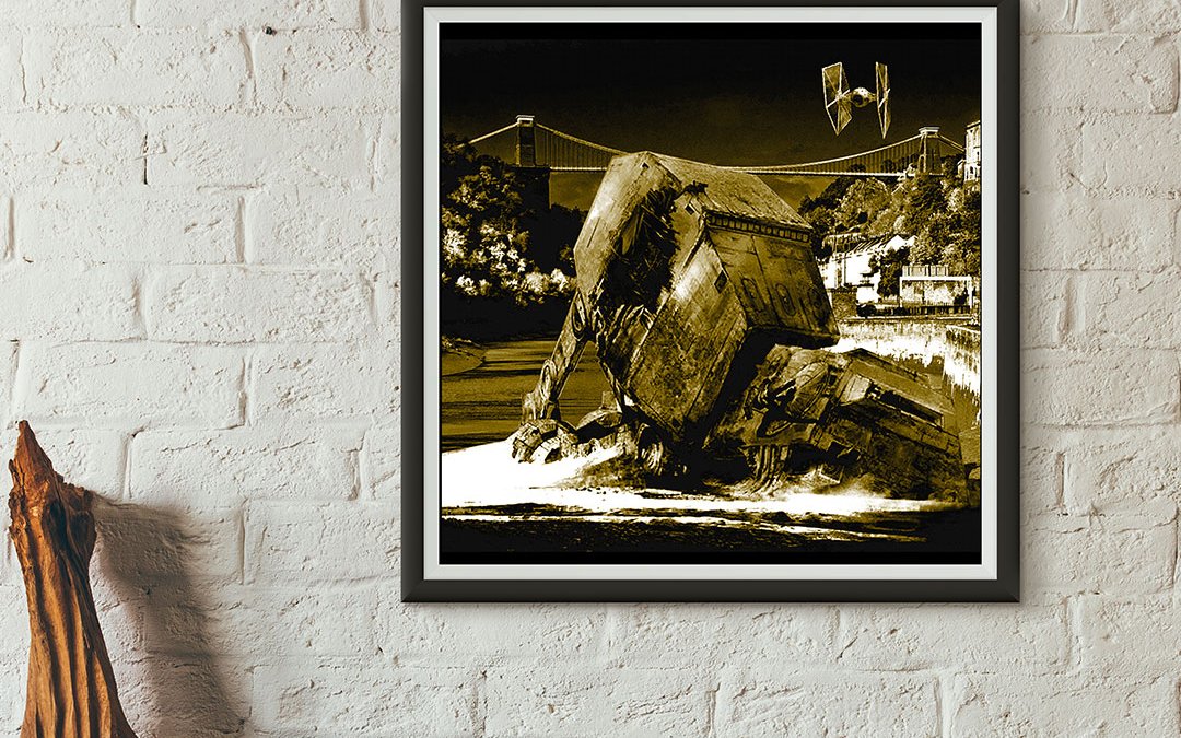
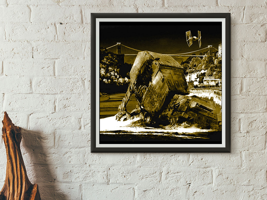
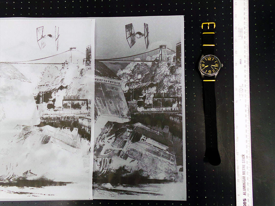
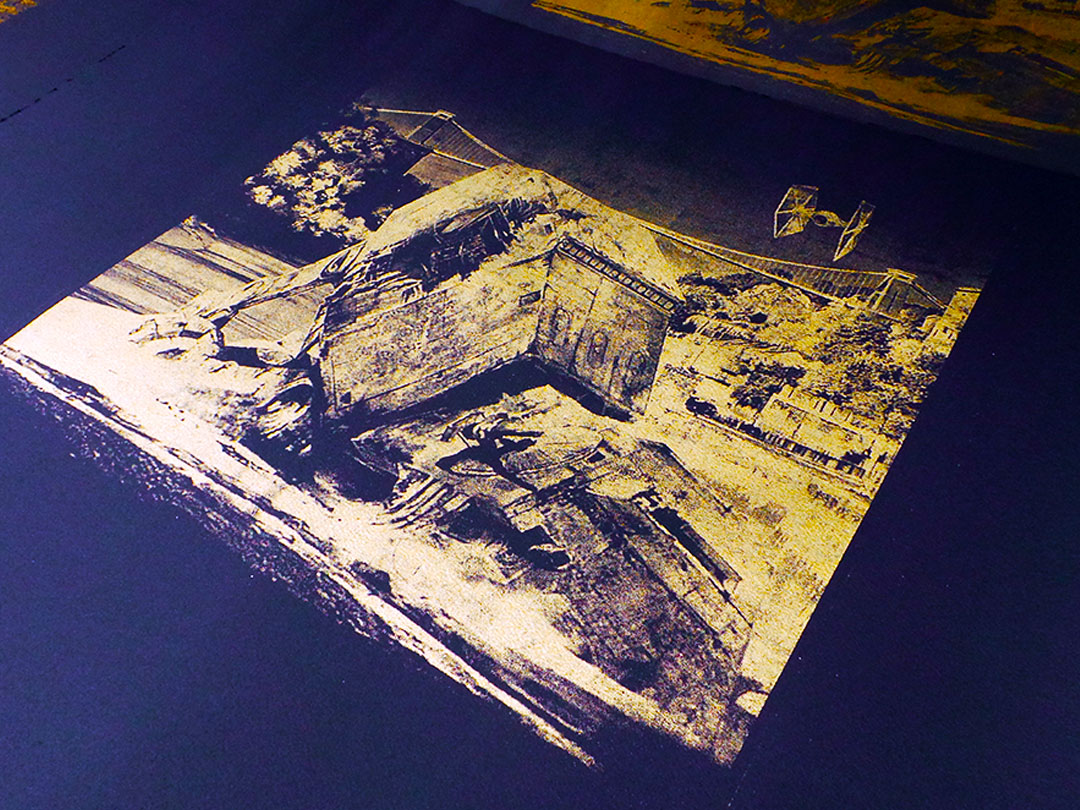
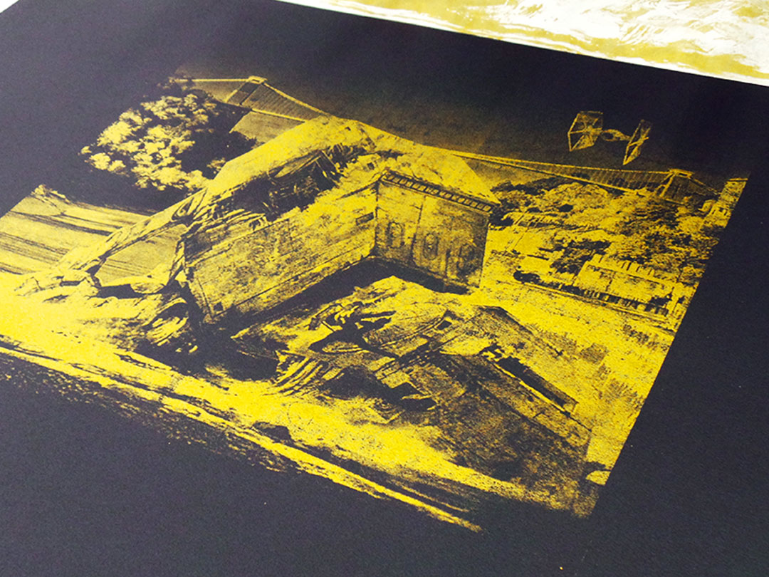
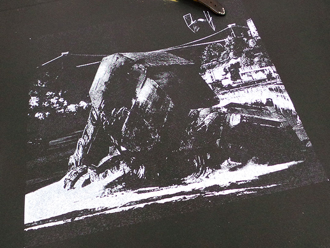
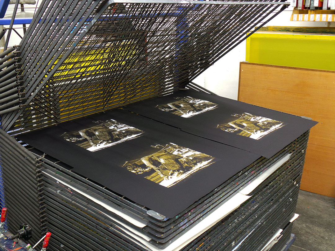
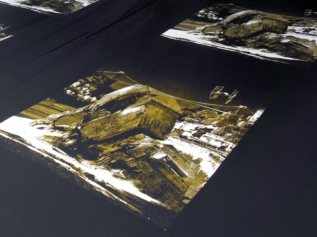
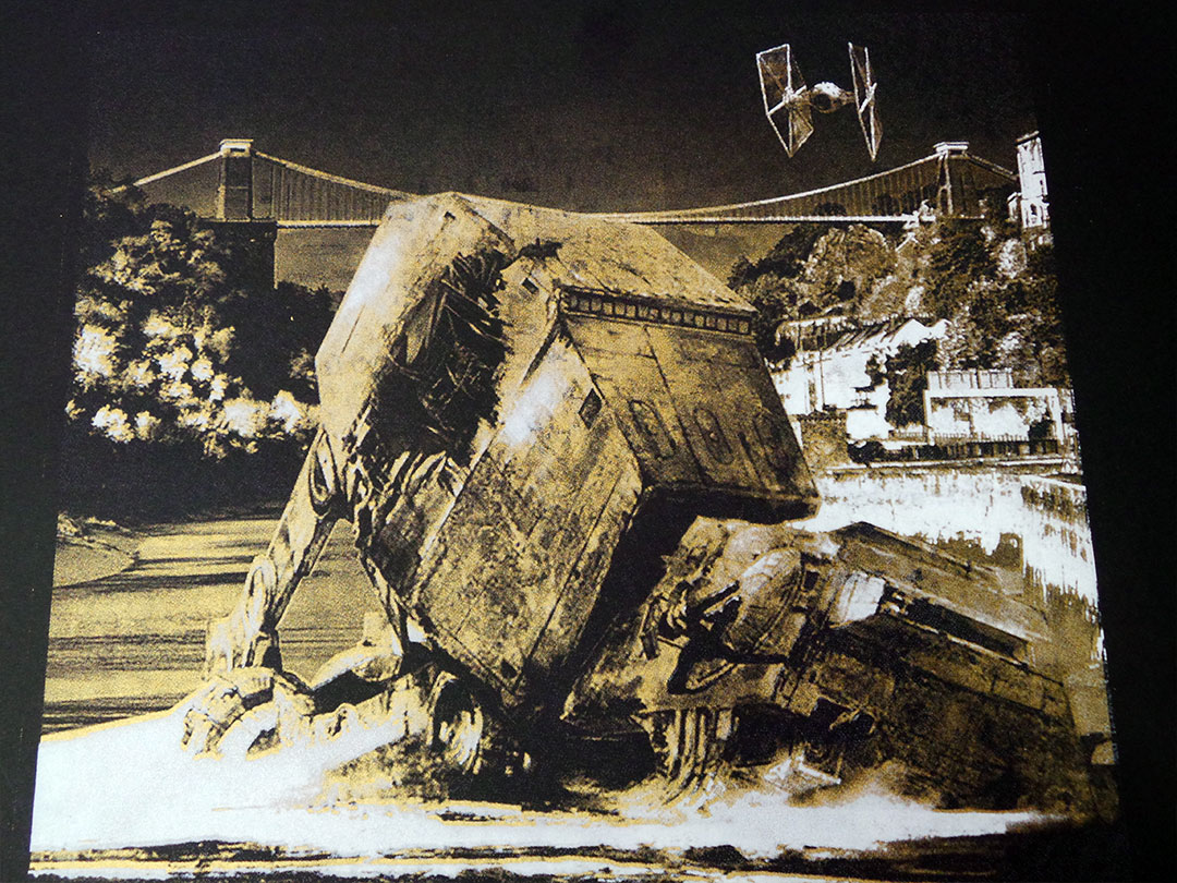
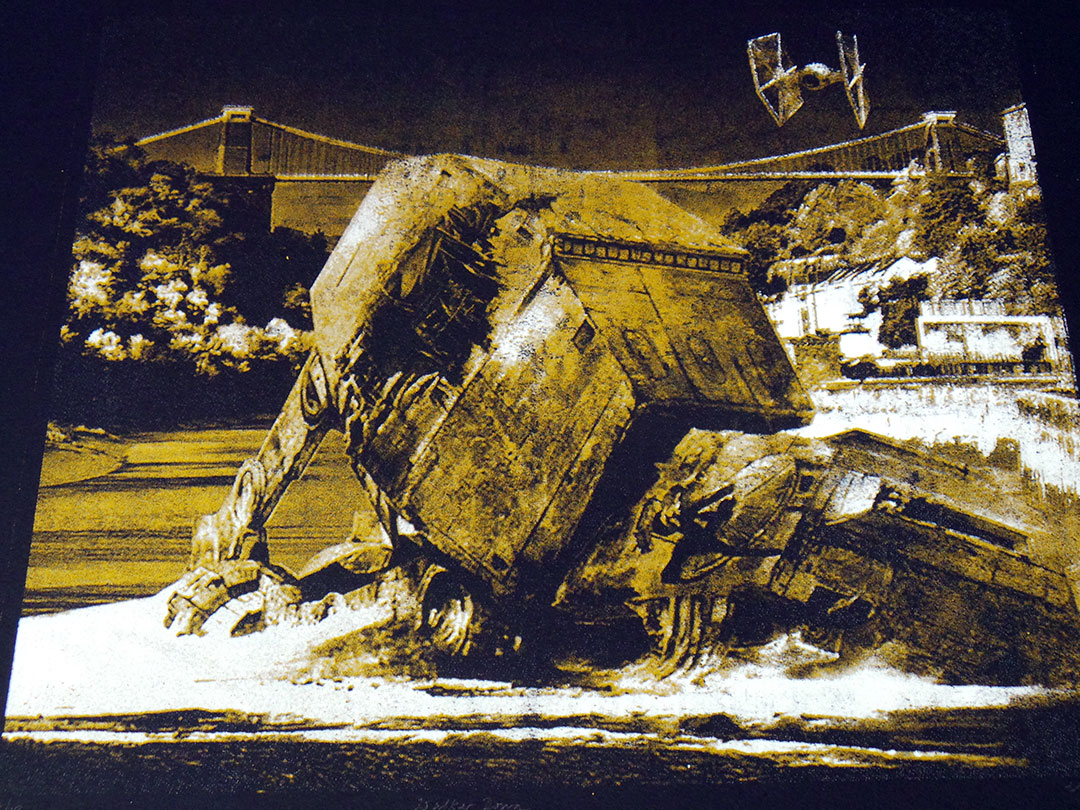
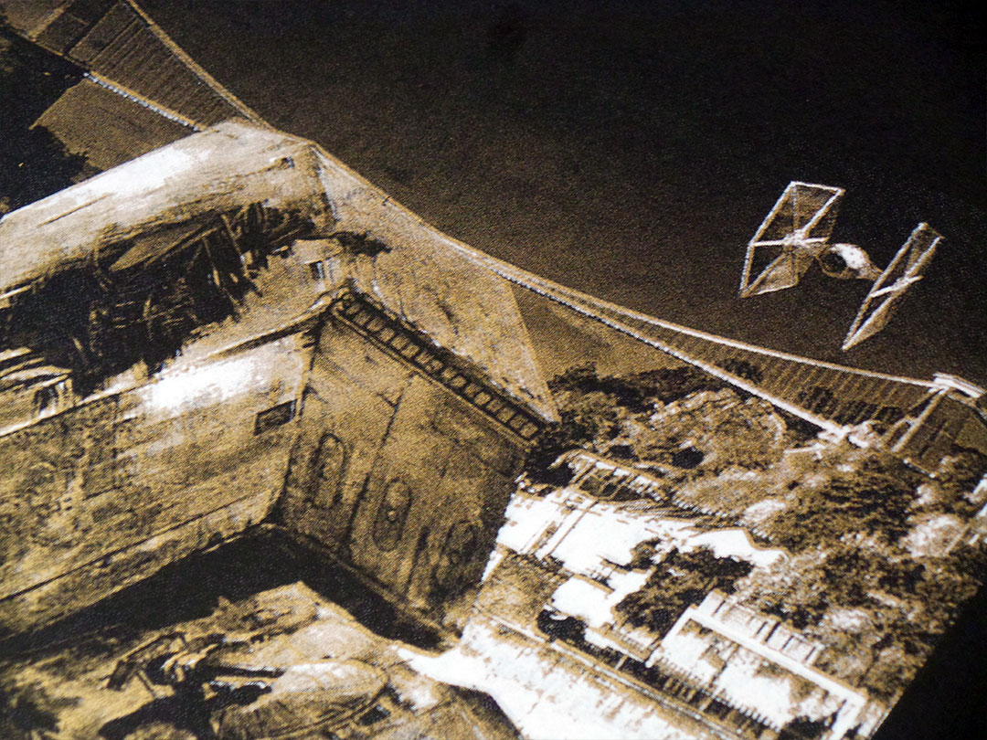
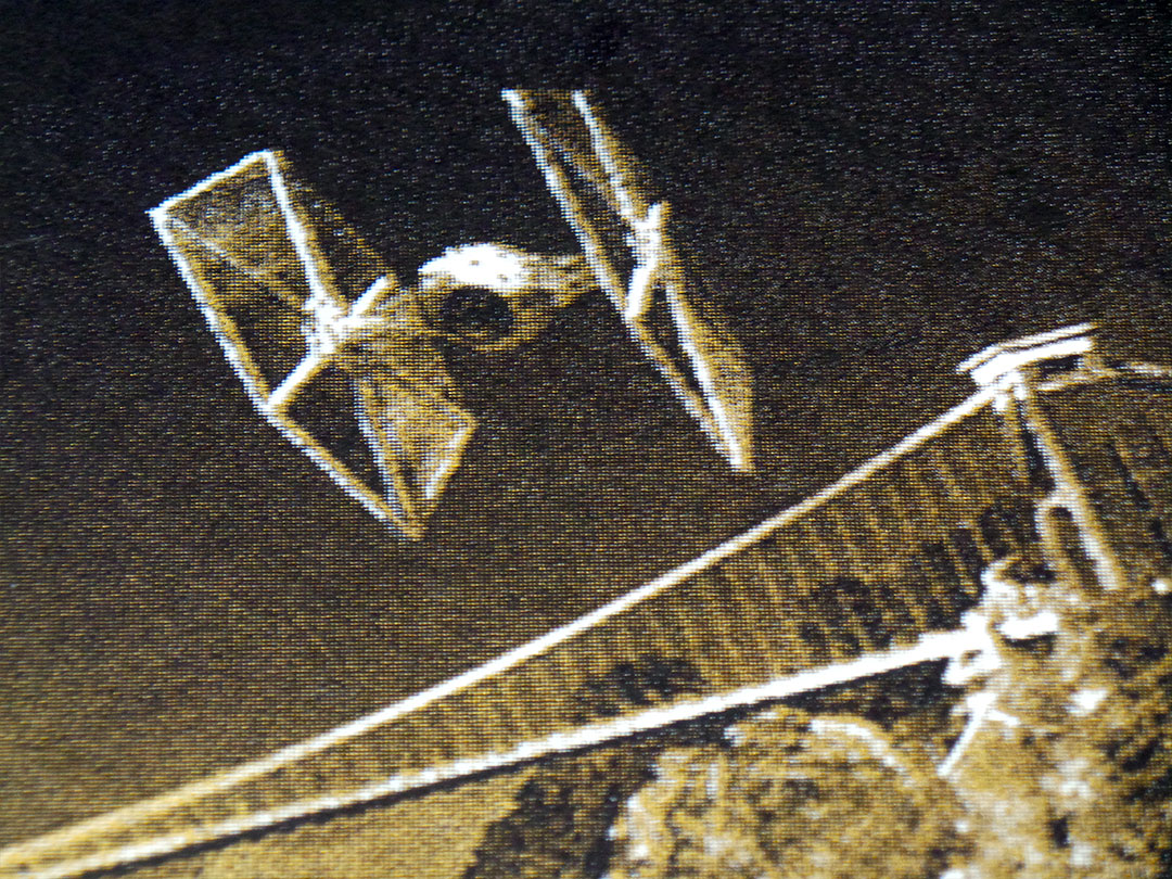
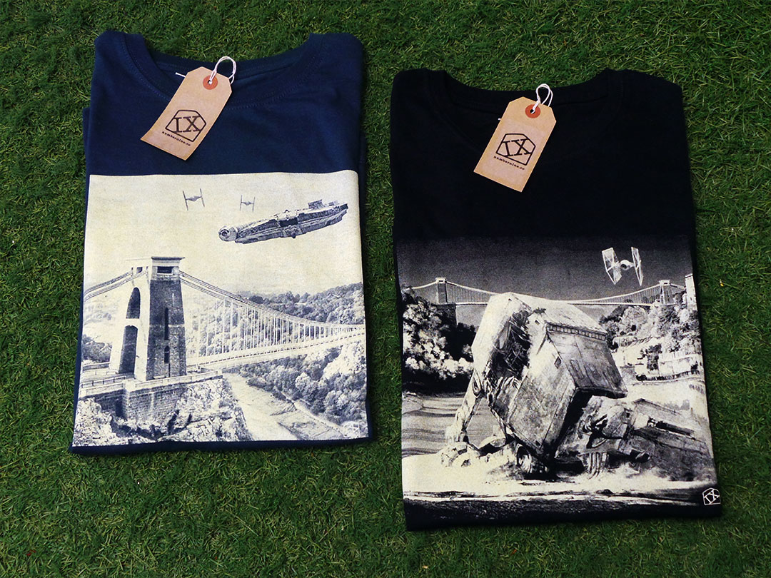
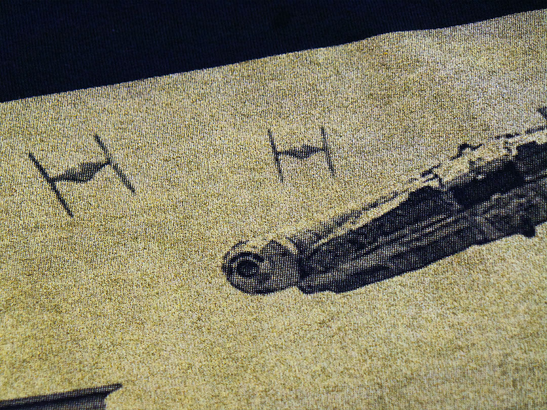
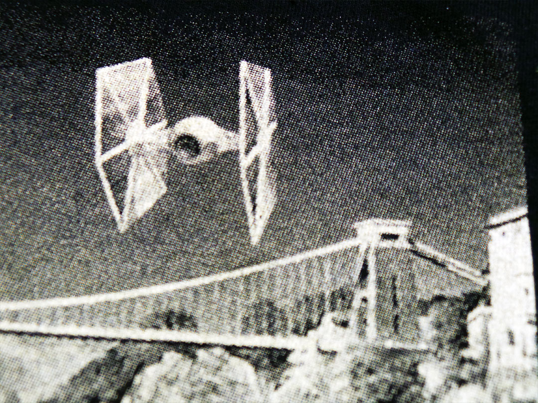
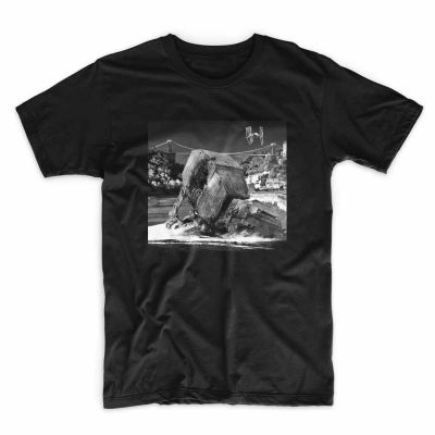
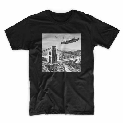
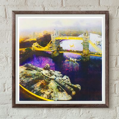
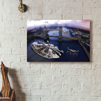
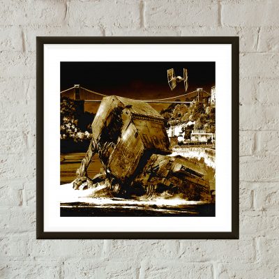
After a fierce dog fight with the Millennium Falcon and a vicious ground assault along the Avon Gorge, a TIE Fighter surveys the aftermath and finds a downed AT-AT Walker against the backdrop of Bristol’s Clifton Suspension Bridge.
See Episode I of the Star wars vs Bristol screen print project.
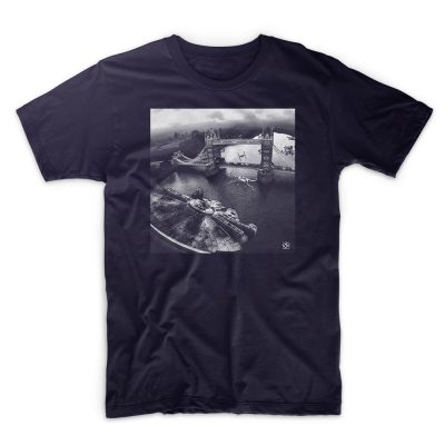
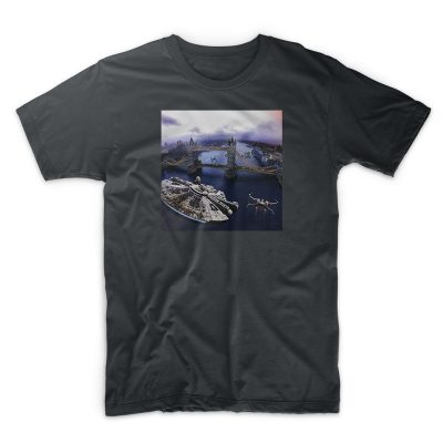
A limited edition of 13 two colour hand pulled screen prints for IX T shirts. Each print is unique as varying levels of metallic gold ink where used and some have gold mixed with orange producing a richer colour.
Printed on 250gsm black arches acid free paper.
Signed and numbered by the artist.


So, after a long wait for sunflower yellow T shirts, the Trojan T shirt reprints are done. I had created an ‘artist’s impression’ of the new yellow T shirts, thinking red and green print on yellow would not only look great, it’d be perfect for a reggae based T shirt. However, the mock-up posted on the product page suggested otherwise. I dismissed this and put it down to it being a mock-up and not a picture of an actual real printed T shirt! I was confident that when actually printed, the colours “will look dope on that colour T shirt!”.
They didn’t. It did remind me of having an eye test. On the yellow T shirts, the depth of the red and green colours was two close. The whole print was too dark to show the Trojan emblem prominently enough through the text – the opposite of what I wanted. The mock-up turned out to be accurate after all.
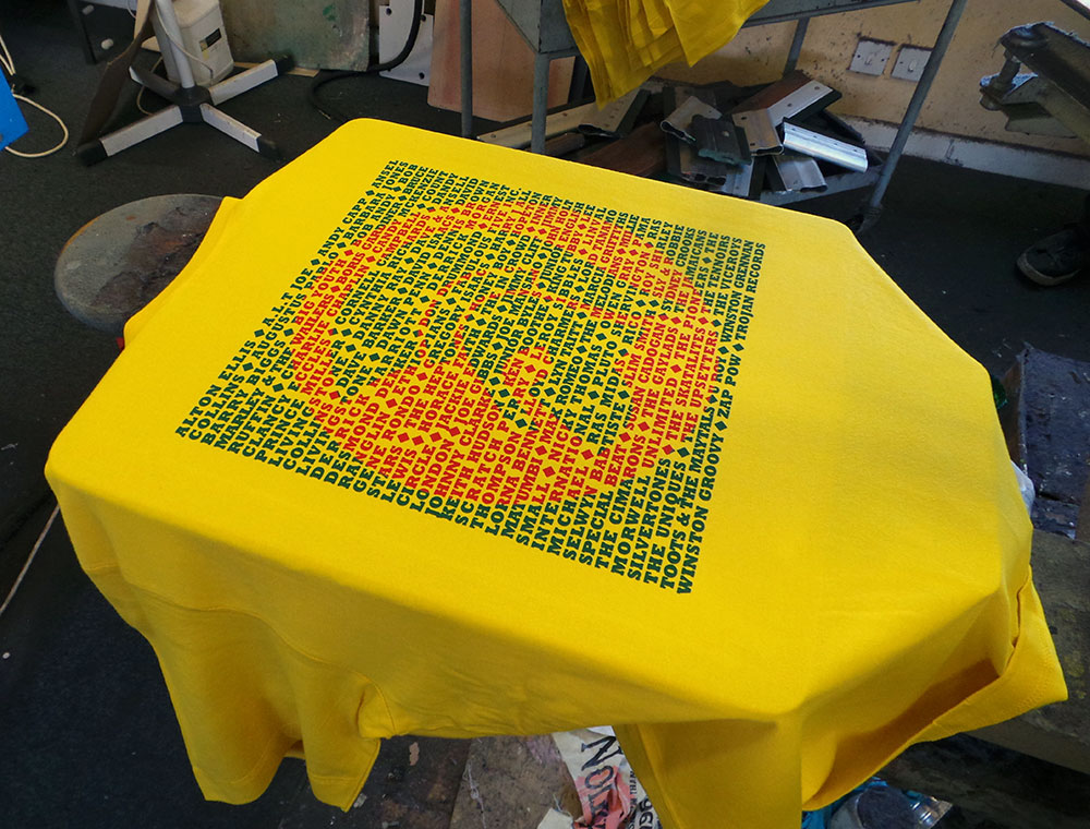
Trojan men’s T shirt – Red Gold and Green?
I was a little disappointed, but (and you have to stay on your feet in this game), I remembered that the last yellow uchi T shirt was printed using a dark golden yellow and the same green we were using, so…
We overprinted the poorly chosen red with the dark yellow and this is what we got.
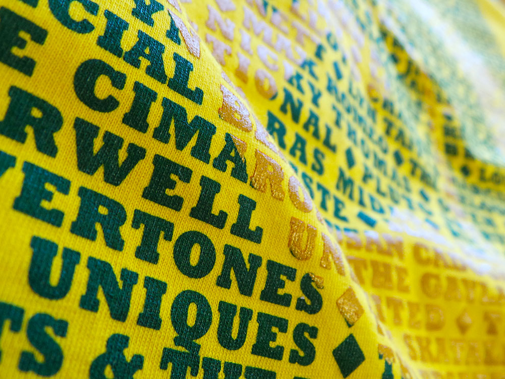
Trojan men’s T shirt – Sunflower Yellow
They say hindsight is a beautiful thing. And with further hindsight, or, by paying attention to the rules of colour instead of getting sentimental about red, gold and green combos, maybe even these current colour ways could be better? If instead, green and gold were printed on the cream and the yellow T shirt had the green/orange combo. Perhaps? It is a very limited run, so the next cream and yellow Trojan T shirts will probably see a reversal of colours… maybe clear and red inks?
Feel free to let me know what colour combo you’d like to see on a future uchi Trojan T shirt.
Trojan men’s T shirt – Black and Cream
The page you requested could not be found. Try refining your search, or use the navigation above to locate the post.
&url=https://uchi.co.uk/shop/mens-t-shirts/ix-t-shirt-dogfight-over-avon-gorge-colour/&media=https://uchi.co.uk/wp-content/uploads/2018/01/IX-TShirt-MillenniumColor-0ff-white-1024x1024.jpg)
&url=https://uchi.co.uk/shop/mens-t-shirts/ix-t-shirt-dogfight-over-avon-gorge-light/&media=https://uchi.co.uk/wp-content/uploads/2017/09/IX-TShirt-Millennium-offwhite-1024x1024.jpg)
&url=https://uchi.co.uk/shop/mens-t-shirts/ix-t-shirt-incident-at-tower-bridge-colour/&media=https://uchi.co.uk/wp-content/uploads/2018/01/IX-TShirt-Tower-Bridge-colour-grey-1024x1024.jpg)