

&url=https://uchi.co.uk/shop/mens-t-shirts/ix-t-shirt-dogfight-over-avon-gorge-colour/&media=https://uchi.co.uk/wp-content/uploads/2018/01/IX-TShirt-MillenniumColor-0ff-white-1024x1024.jpg)
&url=https://uchi.co.uk/shop/mens-t-shirts/mens-t-shirt-protect-ya-neck-colour/&media=https://uchi.co.uk/wp-content/uploads/2019/02/track58-mens-black.jpg)
No Results Found
The page you requested could not be found. Try refining your search, or use the navigation above to locate the post.
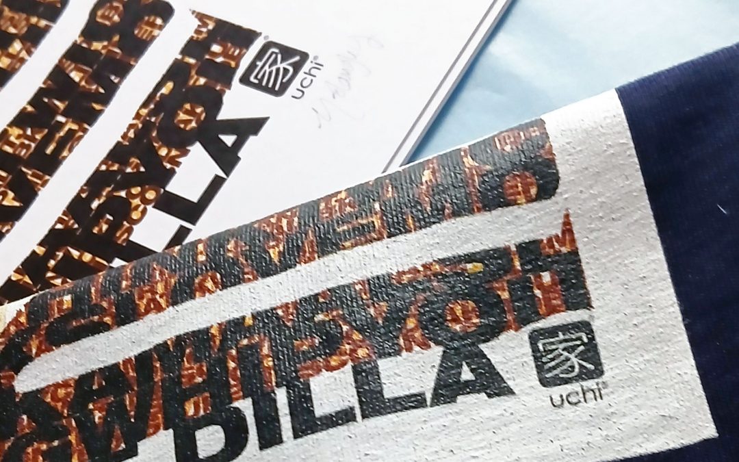
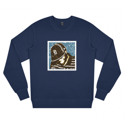
In October 2023 Hip Hop producer Vice Beats began his first 3 city tour called “An Afternoon of Dilla”, an annual event that celebrates the life and music of the late great Detroit based producer J Dilla through live performances, DJ sets, talks, and a Dilla-themed cypher. The tour is in support of the James Dewitt Yancey Foundation; which was setup in his name by his family to support community music projects and access to music technology for young people.


For the 2025 tour Vice Beats got together with uchi to create a J Dilla T shirt for the events held in Bristol and London. The design is layered and complex, much like Jay Dee’s music. The background text features the names of Dilla’s tracks, including production and remixes. The smaller, darker layers of text feature his collaborators, including early career artists.
The t-shirts, sweatshirts and art prints as with the events, are an official collaboration with Ma Dukes (Maureen Yancey) Jay Dee’s mum, who developed the James Dewitt Yancey Foundation. Each item sold donates profit to the foundation to further support their work.

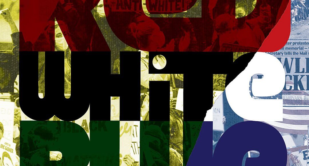
Anger over the murders of George Floyd, Breonna Taylor, Ahmaud Arbery and others, and the system that supports police brutality has hit many hard. Although saddening and horrific, they were not surprising events.
I am still angry but I am also hopeful that the seeds of real change for equality may have been sown.

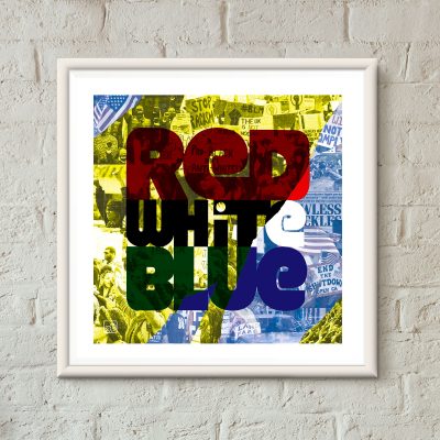
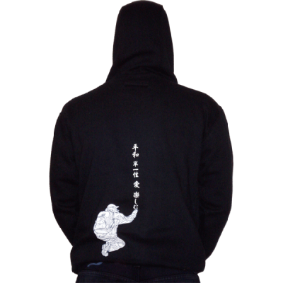
Based on an archived uchi T shirt design, this art print addresses the polarising protests and marches for racial justice and constitutional rights.
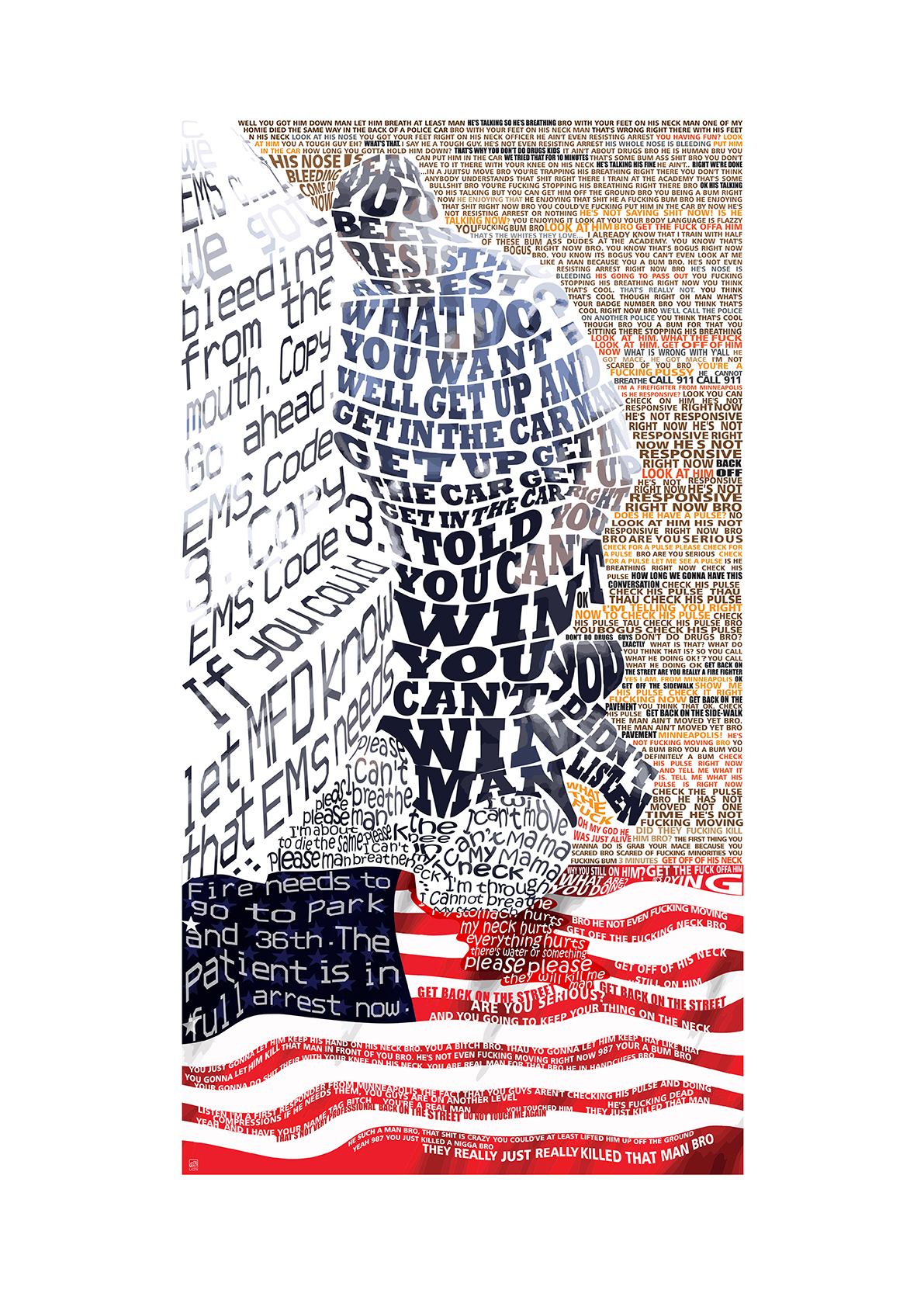
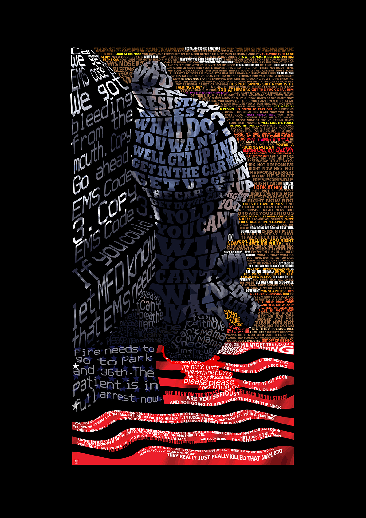
An art print addressing the saddening and horrific police brutality and murder of George Floyd and what was heard from the video of Darnella Frazier.
70% of the sale from these prints will go to the Bristol based charity Babbasa.
Babbasa is a Bristol-based social enterprise, dedicated to bringing equal opportunities to Bristol by supporting young people from underrepresented backgrounds discover their strengths and talents and pursue their ambitions. They are currently holding an appeal to support vulnerable young people affected by the Coronavirus pandemic.
Read more Babbasa and how they are helping black lives matter.


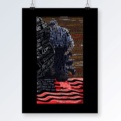


(16 three colour prints and 4 two colour prints).
Printed on 300gsm Somerset Satin acid free paper. Print size 42 x 42cm.
Signed and numbered by the artist.
Also available as fine art paper prints and T shirts
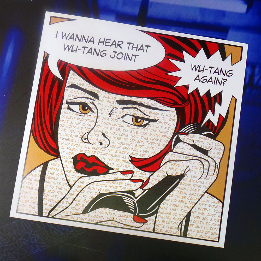
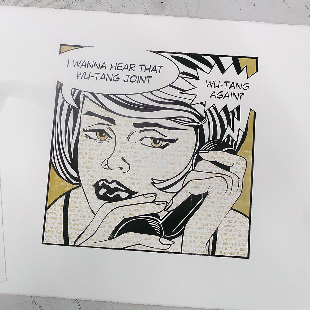
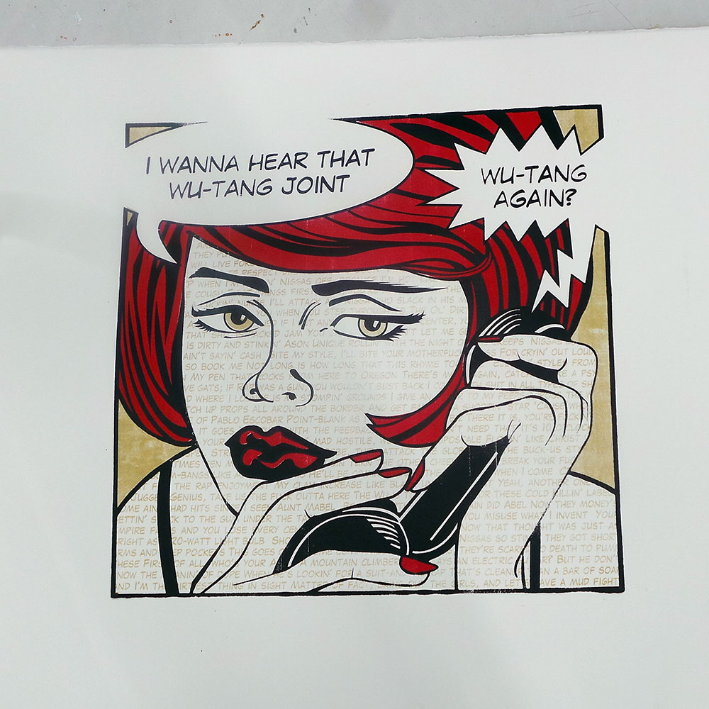
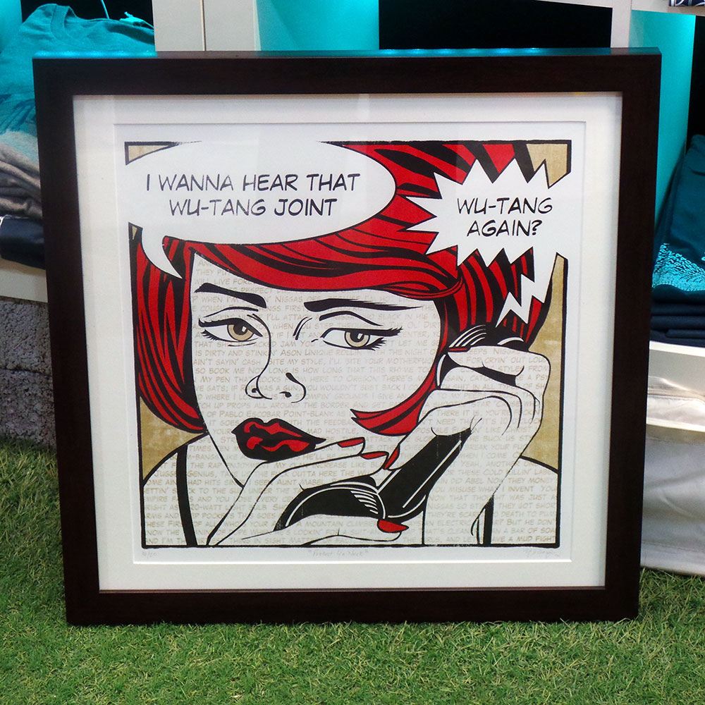
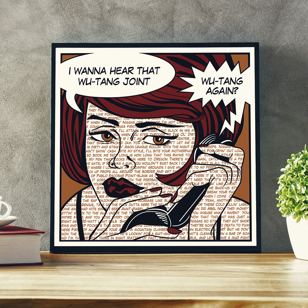
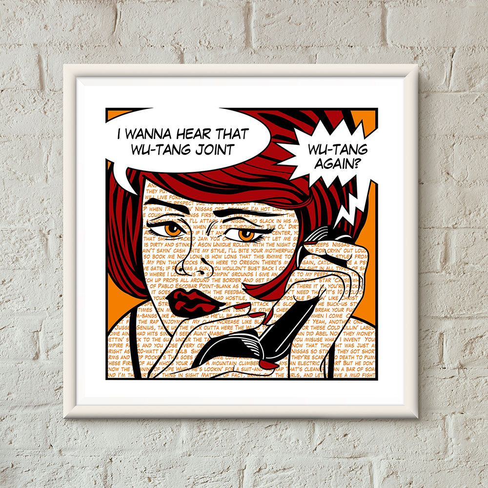
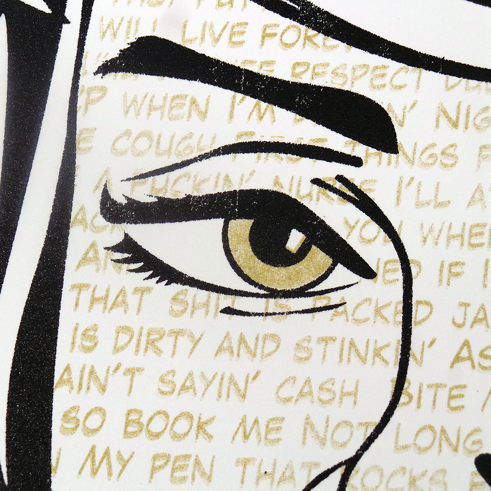
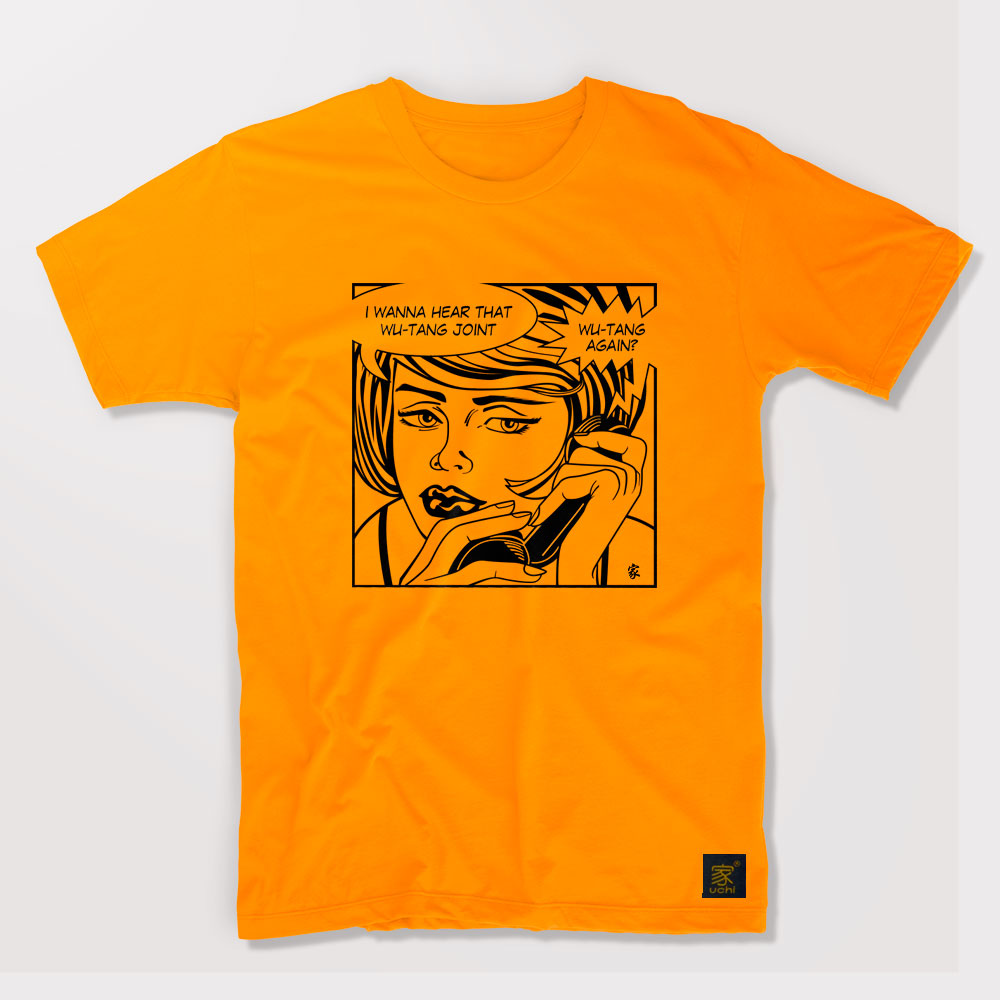
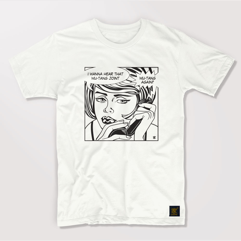
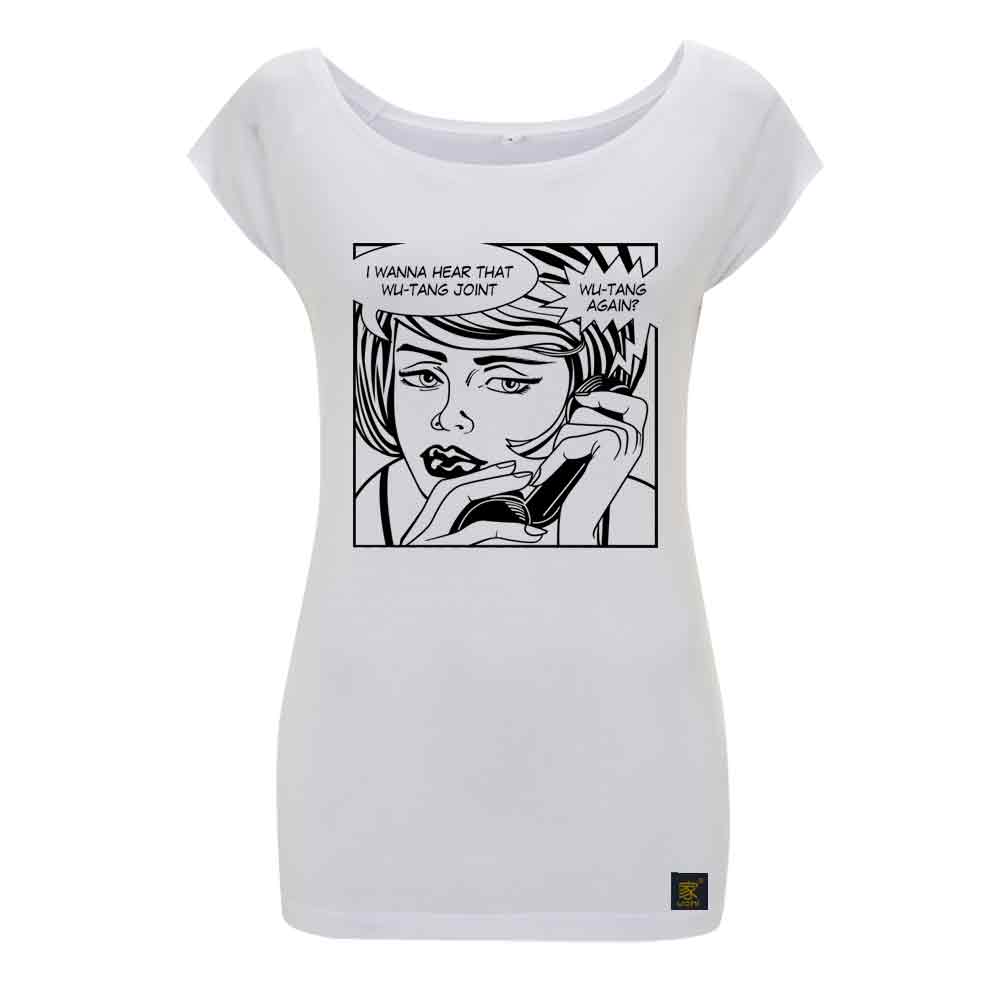

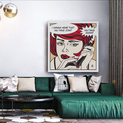
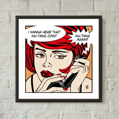
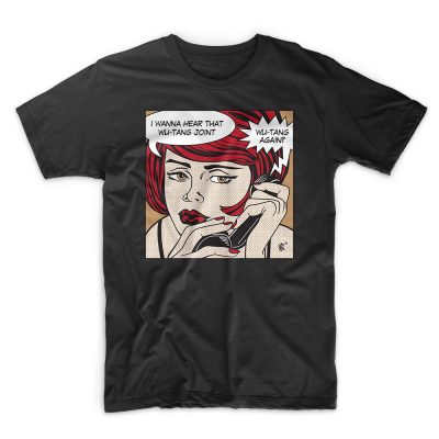
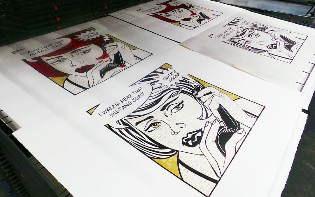
During the 1960s, Roy Fox Lichtenstein, along with Andy Warhol, Jasper Johns, David Hockney and Peter Blake and others, became leading figures in the new postmodernist Pop Art movement. Drawing inspiration from mass media, advertising and commercial imagery, their work defined the premise of pop art through parody and critique. One of his most famous paintings Whaam! is currently on permanent display at Tate Modern.
This particular piece is a parody of Roy Lichenstens’ “Oohh Alright” painting. However as I am a bigger fan of comic books, Lichtenstein’s original inspiration, the June 1963 edition of Secret Hearts #88 was the reference for this image.

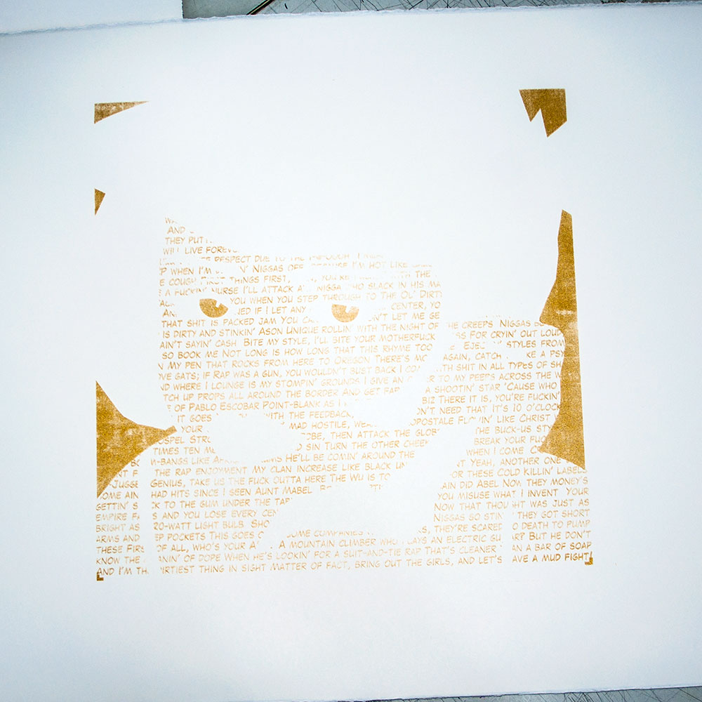
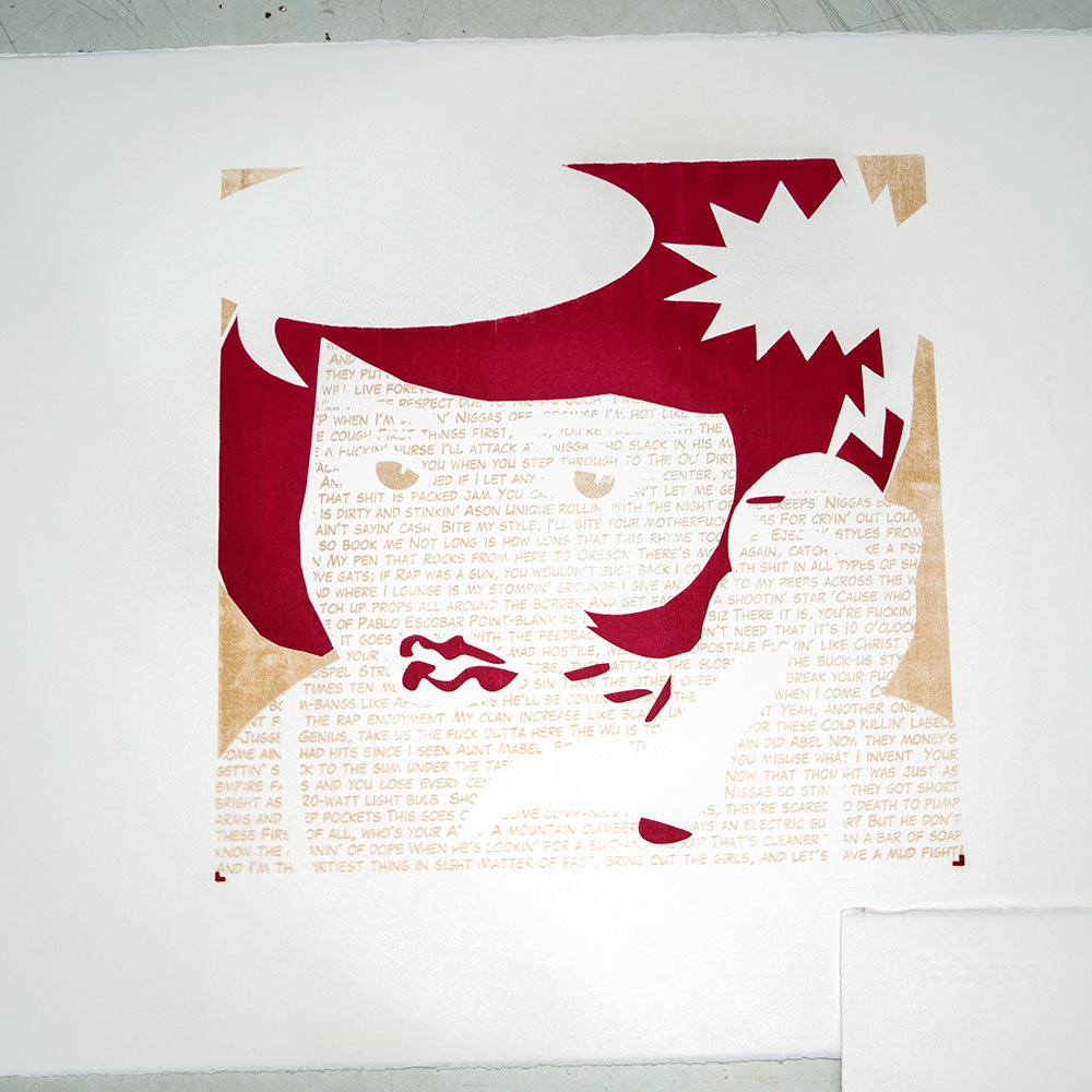
Because I also love typography and print and to add that extra twist, the traditional Ben-Day dots, used for the mass printing of comic books and mimicked in paint on “Ooh Alright”, have been replaced with the “Protect Ya Neck” song lyrics.

“Protect Ya Neck” is the first official single from Wu Tang Clan’s critically acclaimed first album Enter the Wu-Tang (36 Chambers). Produced by The RZA, it features eight of the original nine group members.
In 1993, when the Wu-Tang Clan first emerged, Hip Hop as a whole was not considered Pop culture. The Wu-Tang Clan’s distinctly New York underground sound was far too ‘radio unfriendly’ to be commercially mainstream, at least not by today’s standard. At that time, production values were giving Hip Hop a more polished sound that appealed to a broader audience. In contrast the Wu-Tangs’ stripped back sound, choppy samples and rhyme flows didn’t allow for formulaic radio play and was definitely underground.
Despite this, the Wu-Tang Clan helped pave the way for a ‘back-to-basics Hip Hop’ wave of new artists and crews. Their first album Enter the Wu-Tang (36 Chambers) sold 30,000 copies in the 1st week, achieved Platinum status within two years and is widely regarded as one of the most influential Hip Hop albums of all time and one of the most significant albums of the 1990s.
The Pop Art movement raised questions about mass consumerism and western values. It was a revolt against traditional views on what art should be. Hip Hop was born from the revolution of marginalized communities, giving expression to the political and socially unheard around the world. Both challenged the status quo and were rejected as art by critics and the mainstream.
Today, Pop Art is one of the most recognizable styles of modern art and Hip Hop is the most popular genre of music. It may or not be ironic that Pop Art and Hip Hop culture have had such a huge impact on the commercial world despite their revolutionary roots of anti-establishment expressions and cynical views on mass consumerism.
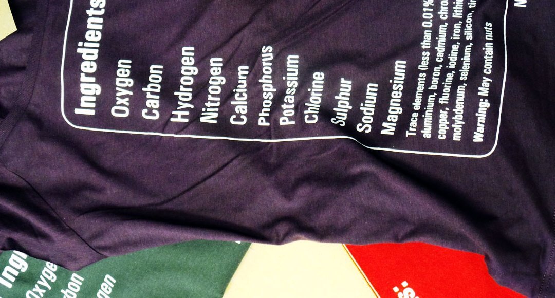
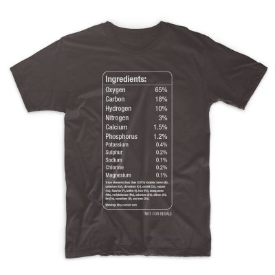
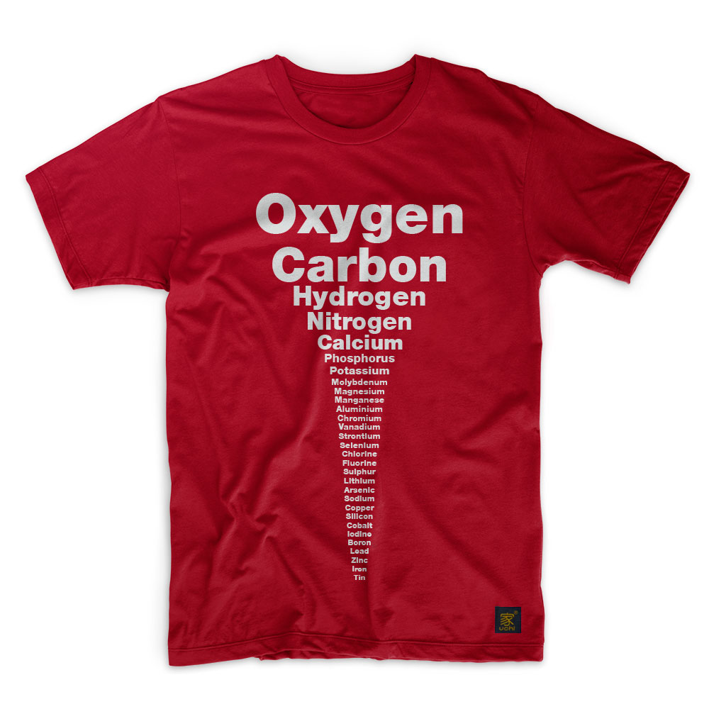
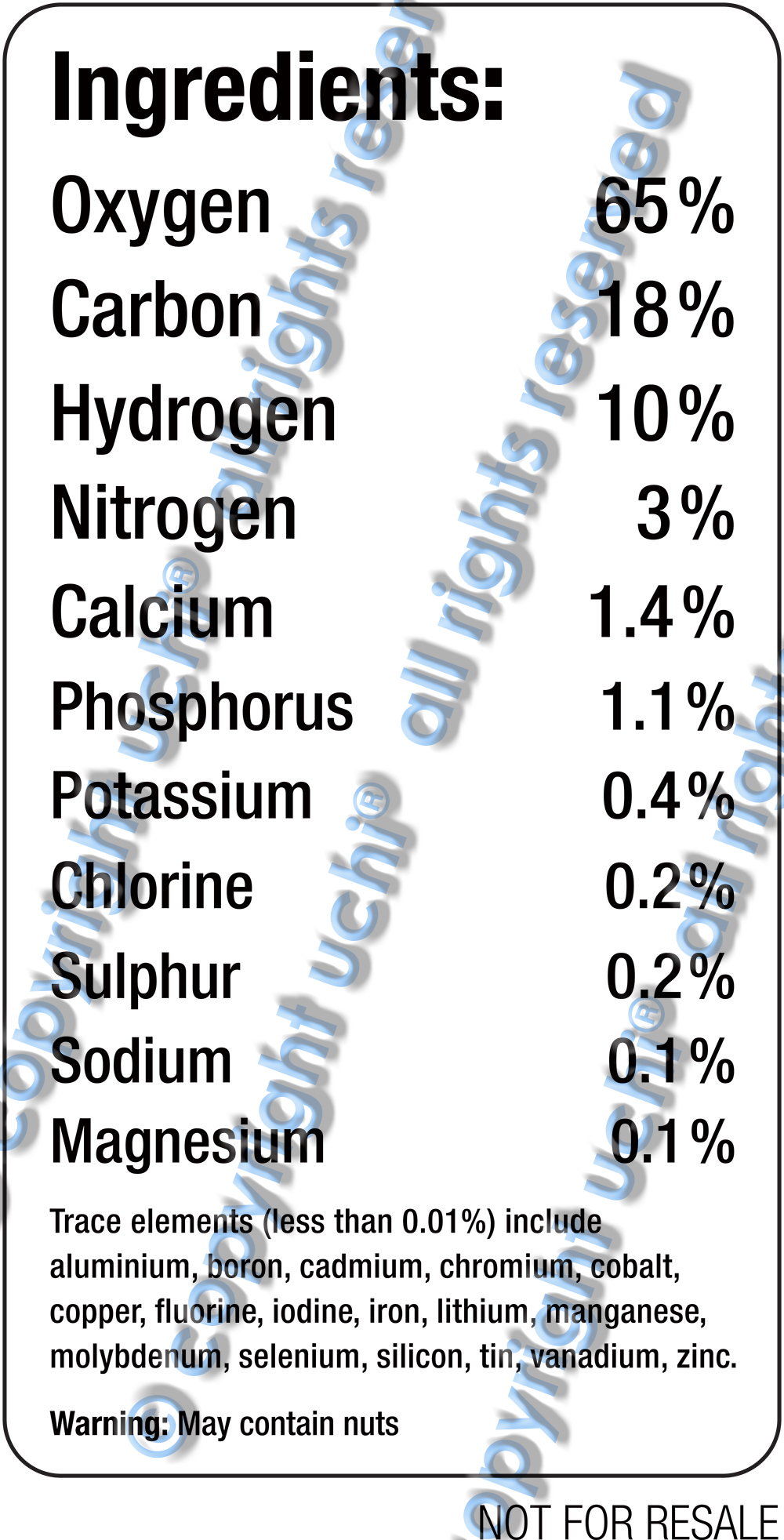
The first question sounds a little metaphorical and will probably be addressed sometime in the future. But for now, the latest uchi track addresses the physical, or, more accurately, the chemical. I’m a science geek and a T shirt showing the chemical elements that make up the human body has been on the back burner of my mind for some time. It felt right to follow the last uchi T-shirt “Stereotype” with another typography design – contrasting, but also related. Think of it as the B Side to Stereotype.
A T-shirt displaying the chemical elements of the human body.
A bunch of stats from various academic websites to get the elements as well as each element’s mass (all with slightly varying approximations). I’ve since learnt that the exact amounts vary from person to person.
So how do you display the elements of the human body in a simplistic design? A graphical, infographic design? Maybe a pie chart or graph? Following on from ‘Stereotype‘, I thought “simple is best” and decided to rely solely on text and my typographical training to communicate the idea.
I wanted the names of each element to be printed in proportion to each other’s relative size. But this proved problematic, in terms of both design and print.
So I ditched the ratio idea in favour of a more aesthetically pleasing design. Starting with oxygen and ending with tin, each element’s representation would be slightly smaller than the one before it. I liked it. However, though simple, it wasn’t technically accurate. That was because the order of the trace elements was determined by the size of the word representing them – not by their mass. This bugged me.
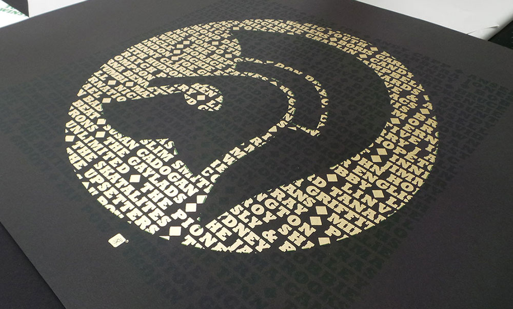
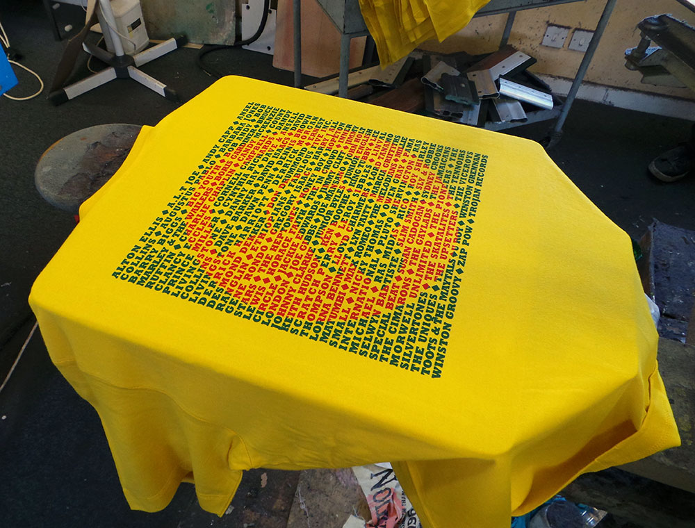
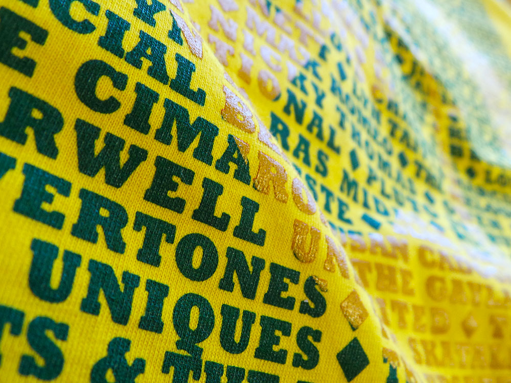
It’s no secret that I love typography and screen printing. So, after the success of the Vinyl Records based T shirts and the Gil Scott Heron limited edition art print, I decided to produce a series of limited edition prints of the Trojan design…
From reggae, ska, rock steady and dub, Trojan Records logos’ endurance is a testament to the music and culture. We haven’t included the complete list of all the artists that appeared under Trojan Records, but hope we’ve caught a few of everybody’s favourites.
Growing up in a house full of reggae records has made the Trojan logo as recognisable to me as the Nike swoosh. It’s no coincidence that the typeface Trojan Records uses is a robust and solid one. Like them, Rockwell Bold evokes strength and stability. They chose well.
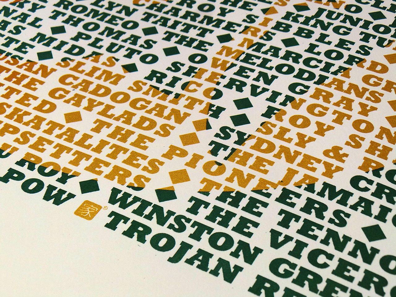
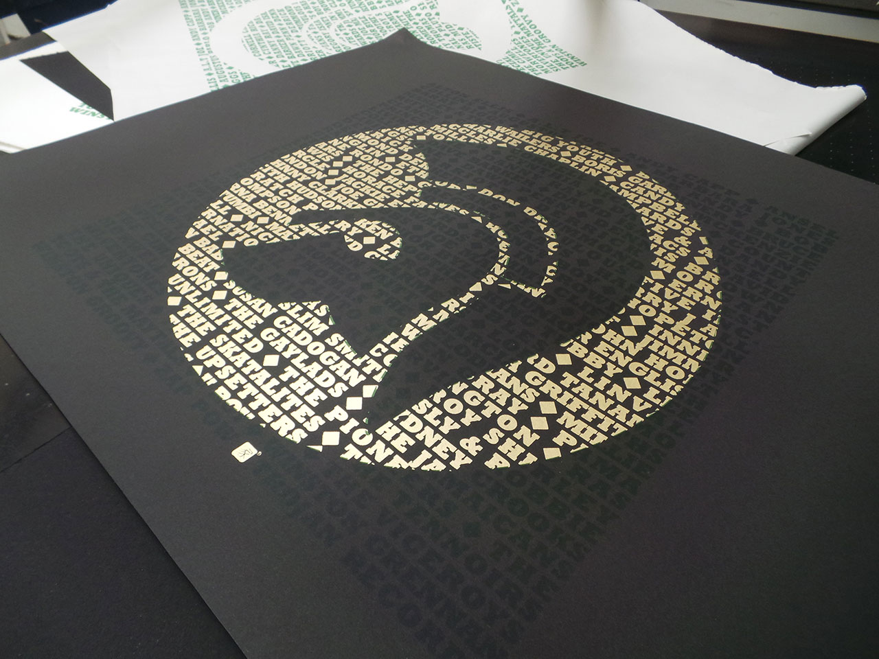
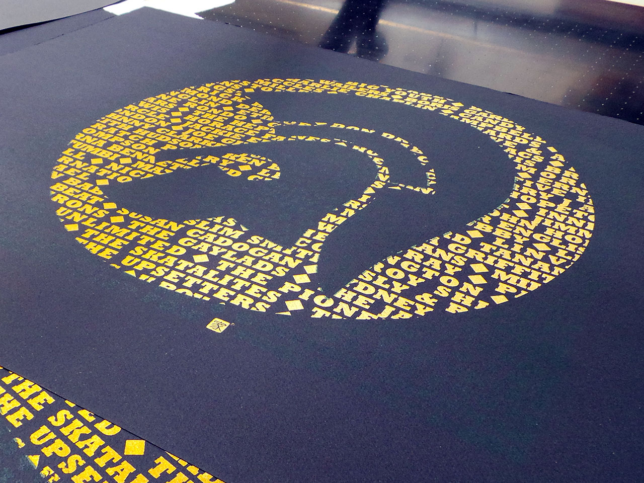

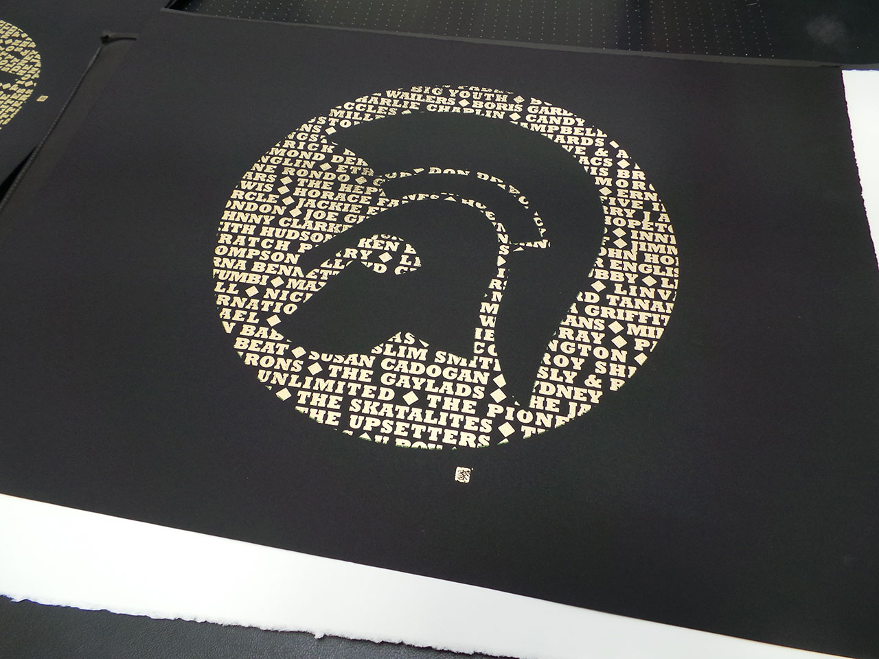
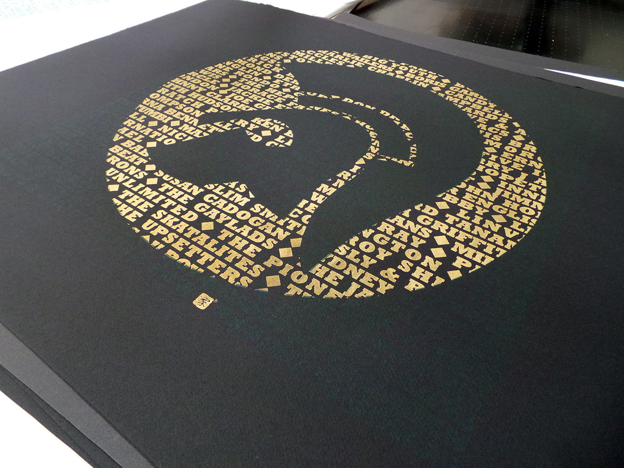
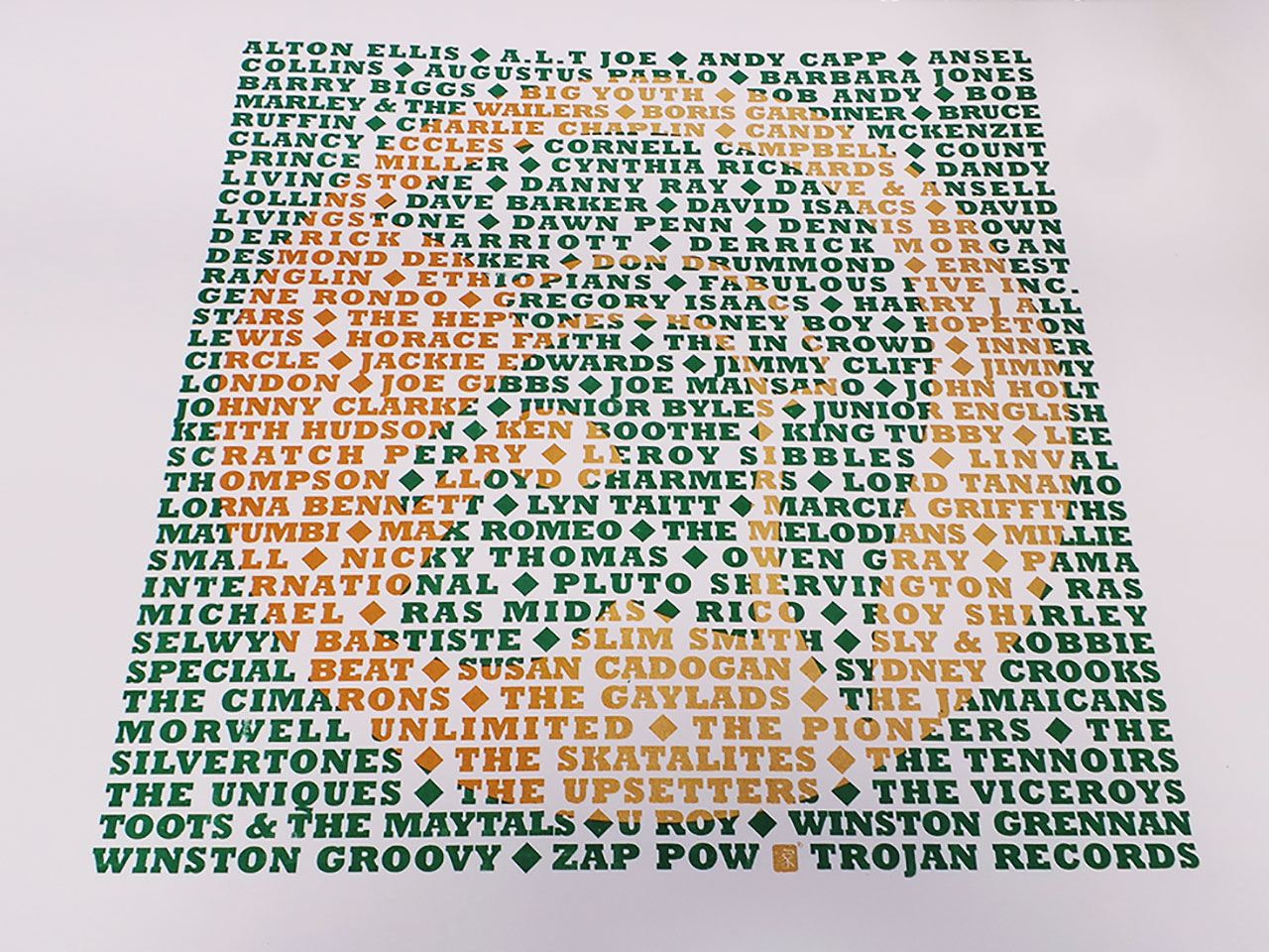
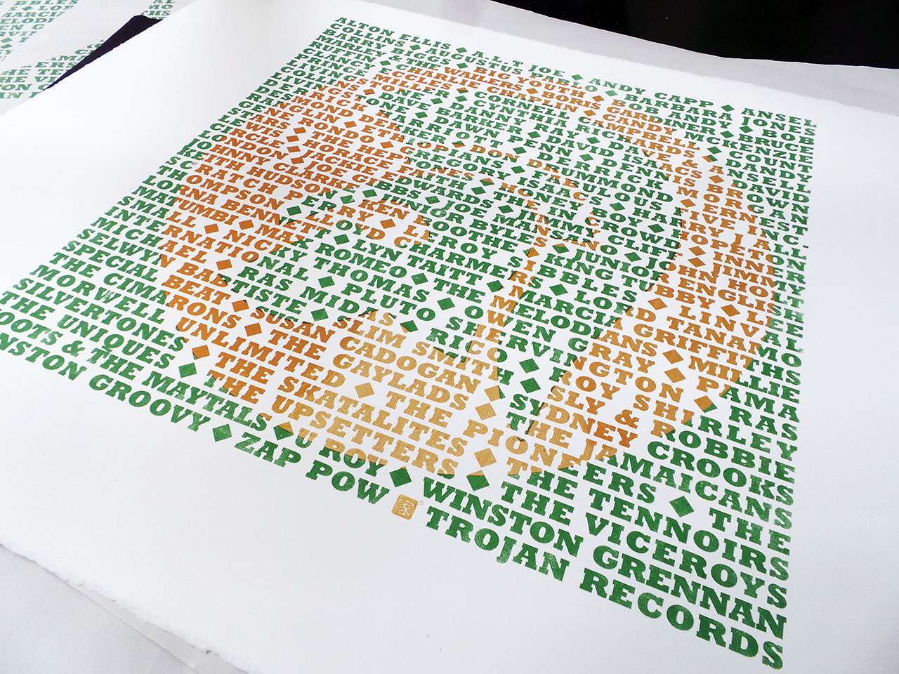
A limited edition set of artists proofs, screen printed in metallic gold and dark green and available on black and white fine art papers. Each screen print is unique with different variations of the gold ink mix. As with the previous Star Wars screen print, some have been printed with pure metallic gold and some have been mixed with a orange ink. This is especially apparent on the white Somerset Satin papers. These prints have lot more orange than metallic gold.
Signed and numbered.
The page you requested could not be found. Try refining your search, or use the navigation above to locate the post.

So, after a long wait for sunflower yellow T shirts, the Trojan T shirt reprints are done. I had created an ‘artist’s impression’ of the new yellow T shirts, thinking red and green print on yellow would not only look great, it’d be perfect for a reggae based T shirt. However, the mock-up posted on the product page suggested otherwise. I dismissed this and put it down to it being a mock-up and not a picture of an actual real printed T shirt! I was confident that when actually printed, the colours “will look dope on that colour T shirt!”.
They didn’t. It did remind me of having an eye test. On the yellow T shirts, the depth of the red and green colours was two close. The whole print was too dark to show the Trojan emblem prominently enough through the text – the opposite of what I wanted. The mock-up turned out to be accurate after all.
Trojan men’s T shirt – Red Gold and Green?
I was a little disappointed, but (and you have to stay on your feet in this game), I remembered that the last yellow uchi T shirt was printed using a dark golden yellow and the same green we were using, so…
We overprinted the poorly chosen red with the dark yellow and this is what we got.
Trojan men’s T shirt – Sunflower Yellow
They say hindsight is a beautiful thing. And with further hindsight, or, by paying attention to the rules of colour instead of getting sentimental about red, gold and green combos, maybe even these current colour ways could be better? If instead, green and gold were printed on the cream and the yellow T shirt had the green/orange combo. Perhaps? It is a very limited run, so the next cream and yellow Trojan T shirts will probably see a reversal of colours… maybe clear and red inks?
Feel free to let me know what colour combo you’d like to see on a future uchi Trojan T shirt.
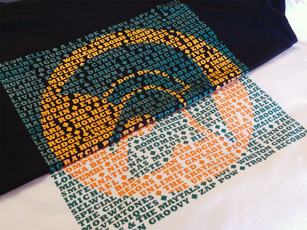
Trojan men’s T shirt – Black and Cream
The page you requested could not be found. Try refining your search, or use the navigation above to locate the post.