An Afternoon of Dilla
Vice Beats x uchi clothing presents
a celebration of J Dilla
In October 2023 Hip Hop producer Vice Beats began his first 3 city tour called “An Afternoon of Dilla”, an annual event that celebrates the life and music of the late great Detroit based producer J Dilla through live performances, DJ sets, talks, and a Dilla-themed cypher. The tour is in support of the James Dewitt Yancey Foundation; which was setup in his name by his family to support community music projects and access to music technology for young people.


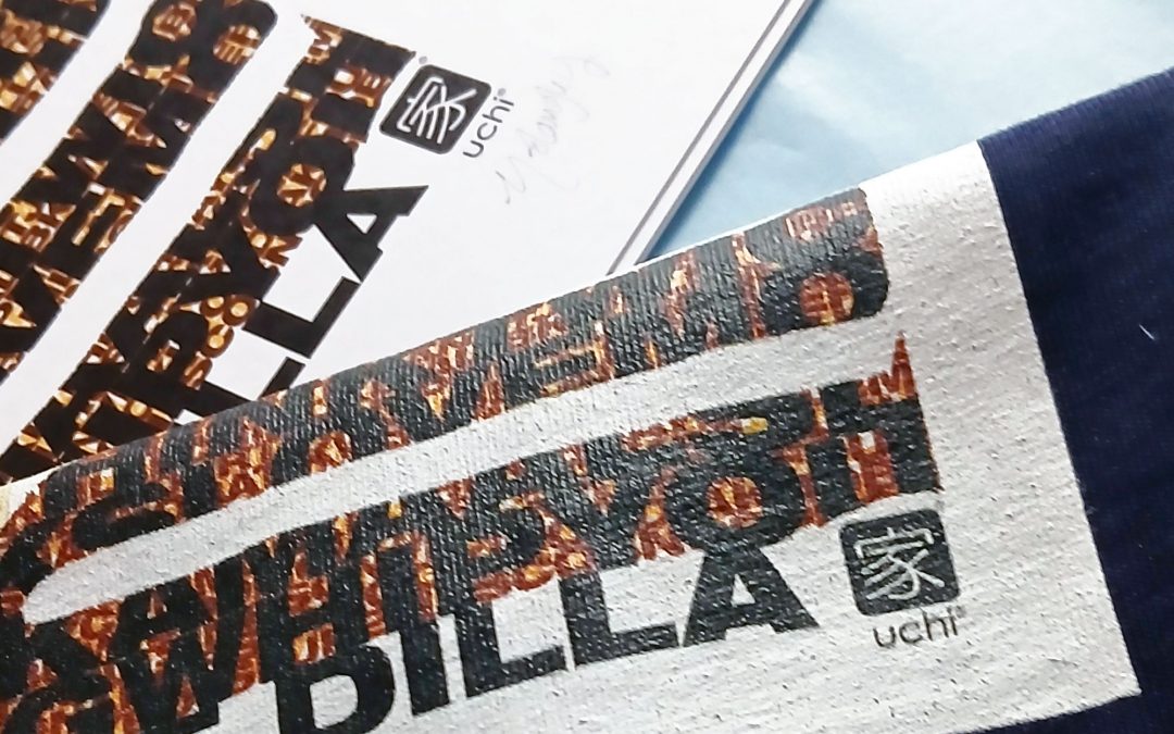
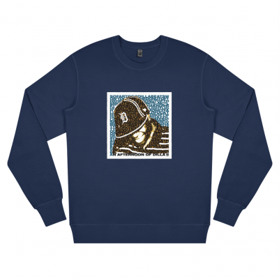
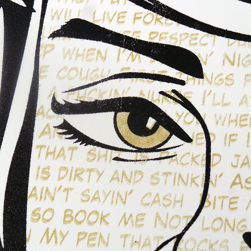
For the 2025 tour Vice Beats got together with uchi to create a J Dilla T shirt for the events held in Bristol and London. The design is layered and complex, much like Jay Dee’s music. The background text features the names of Dilla’s tracks, including production and remixes. The smaller, darker layers of text feature his collaborators, including early career artists.
The t-shirts, sweatshirts and art prints as with the events, are an official collaboration with Ma Dukes (Maureen Yancey) Jay Dee’s mum, who developed the James Dewitt Yancey Foundation. Each item sold donates profit to the foundation to further support their work.


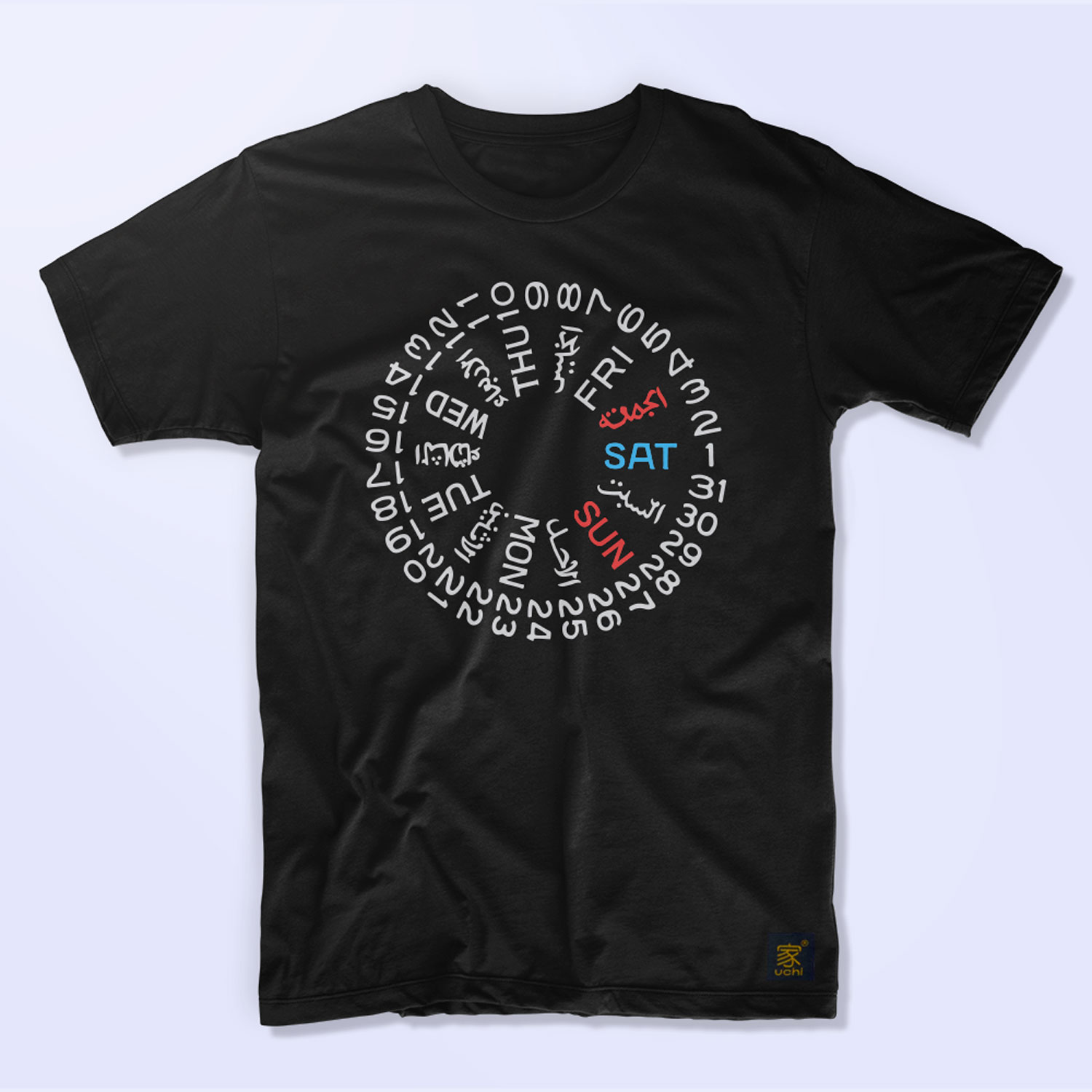
&url=https://uchi.co.uk/shop/mens-t-shirts/mens-t-shirt-protect-ya-neck-colour/&media=https://uchi.co.uk/wp-content/uploads/2019/02/track58-mens-black.jpg)
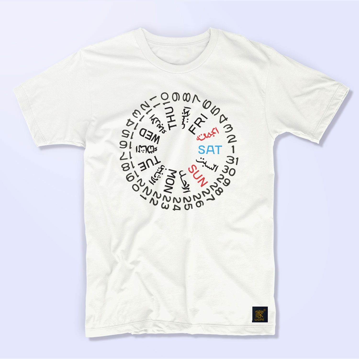
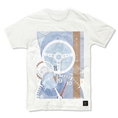
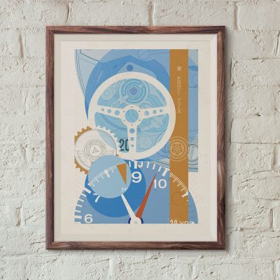
&url=https://uchi.co.uk/shop/mens-t-shirts/mens-t-shirt-tag-heuer-monaco-bauhaus-edition/&media=https://uchi.co.uk/wp-content/uploads/2018/06/mens_t_shirts_tag-bauhaus_white-1024x1024.jpg)