It’s the end of the sixth uchi album of T shirts. All but two of the designs on this as yet untitled album are music related. I am pleased that these last two designs follow the music theme, with a particular focus on vinyl.
There are a couple of new designs that were going to be included, but were not finished in time. On reflection it worked out fine. The two unfinished pieces are very illustrative and more like designs in the pipeline than the ones recently done. So, maybe the next album will be all illustration? We’ll see.
Here are the latest two uchi vinyl-related T shirts and the stories behind them…
Founded in 1968, the British founded Trojan Records has one of the most iconic and recognisable logos and a host of equally iconic and renowned artists under its belt.
From reggae, ska, rock steady and dub, its endurance is a testament to the music and culture. We haven’t included the complete list of all the artists that appeared under Trojan Records, but hope we’ve caught a few of everybody’s favourites.
For me, growing up in a house full of reggae records has made the Trojan logo as recognisable as the Nike swoosh, but with a ton of more meaning. It’s no coincidence that they also use a heavy robust and solid typeface like Rockwell Extra Bold.
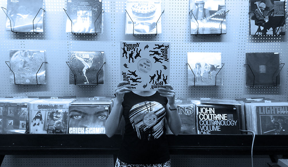
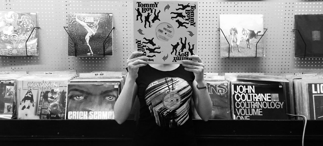
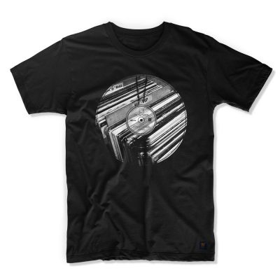
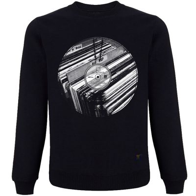
Although a reggae specialist Payback Records have a great selection of non-reggae vinyl. Their HipHop section is featured on The Big Payback T shirt. Coincidentally, the record store is named after the 1989 EPMD track of the same name; perfect uchi. I was unaware of this connection before I added the type. The Big Payback is one of my favourite EPMD tracks and is somewhere in the stack of old school vinyl in the image. In the shot, I’m actually standing in Payback Records.
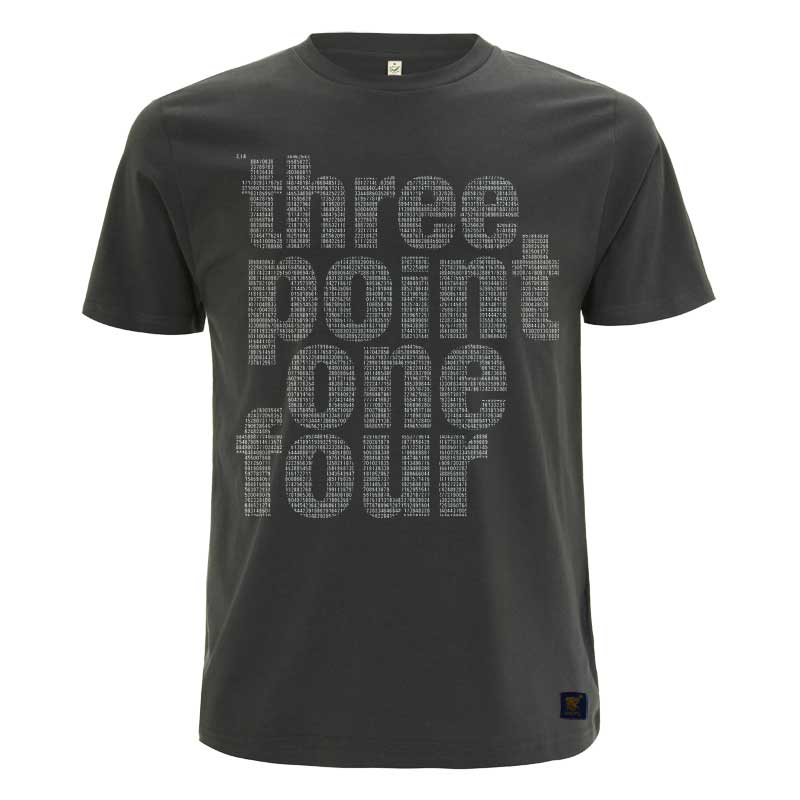
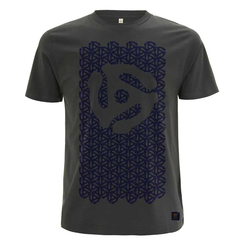
Our latest tracks are a remix of the best selling Pi T shirt and our own take on the classic 45 rpm record adapter t shirt.
I recently heard of the origins of the 45 rpm record adaptor, which explains why, growing up, it was only needed on the reggae singles in my house.
In the early days, DJ’s in Jamaica would need to turn records over quickly, attempting to keep the tempo and the party going. However, the size of the centre hole made this awkward and time consuming, especially in low light. They decided to punch out a larger hole in the 45s and add a spindle to the turntable, so that the record, with minimum interruption, could easily be flipped over with one hand, whilst still holding the microphone in the other. The record labels eventually began to manufacture all 7 inch singles without the centre piece and the RCA Corporation introduced the plastic snap-in Spider adaptor to fill in the gap. There it is.
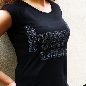
By popular request, here’s the first colour drop of uchi’s Typographic Periodic Table – charcoal grey on a women’s bamboo T shirt.
There’s quite a few “Periodic Table of Typefaces” T shirts and posters but uchi’s version is not just a Periodic Table of Typefaces for typography geeks done in the ‘style’ of the Periodic Table. uchi’s Typographic Periodic Table uses the actual Periodic Table of Elements, containing both elements and typefaces for chemistry geeks and typography geeks alike. In my opinion, there’s no point in displaying typefaces using such an iconic (and useful) format just because it looks good, without trying, at least, to do justice to both the Periodic Table and typography. Plus I love both science and typography, so had to put the work in…
Typographic Periodic Table of Elements
uchi’s Periodic Table — a brief description of each typeface group.
There are many styles of type and many classification systems – defined by their visual characteristics (stroke contrast, serif shape, etc) and their historical development or reference. Here, I’ve tried to match typefaces over the ages into their main classifications within the element groups on the Periodic Table. Also, except for the Lanthanoids and Actinoids (Glyphic, Script, Blackletter and Graphic faces) and, where possible, in each element group, the typefaces are in roughly in date order from the top to bottom. There are some notable exceptions for aesthetic reasons. For example, Helevtica was made in 1957, but it had to be Hydrogen!
Want to know your serif from your slab-serif? Read on for a brief description of each type style.
Great kinetic typography video of “True School” by DJ Jean Maron feat KRS ONE. A perfect choice of slab serif type used on this! Although it’s a little harsh on Puff Daddy.


 There are many styles of type and many classification systems – defined by their visual characteristics (stroke contrast, serif shape, etc) and their historical development or reference. Here, I’ve tried to match typefaces over the ages into their main classifications within the element groups on the Periodic Table. Also, except for the Lanthanoids and Actinoids (Glyphic, Script, Blackletter and Graphic faces) and, where possible, in each element group, the typefaces are in roughly in date order from the top to bottom. There are some notable exceptions for aesthetic reasons. For example, Helevtica was made in 1957, but it had to be Hydrogen!