No Results Found
The page you requested could not be found. Try refining your search, or use the navigation above to locate the post.
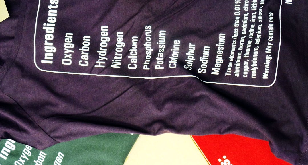
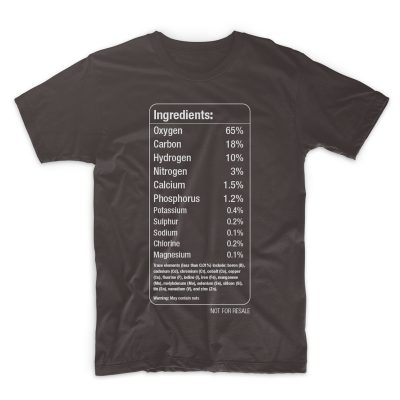
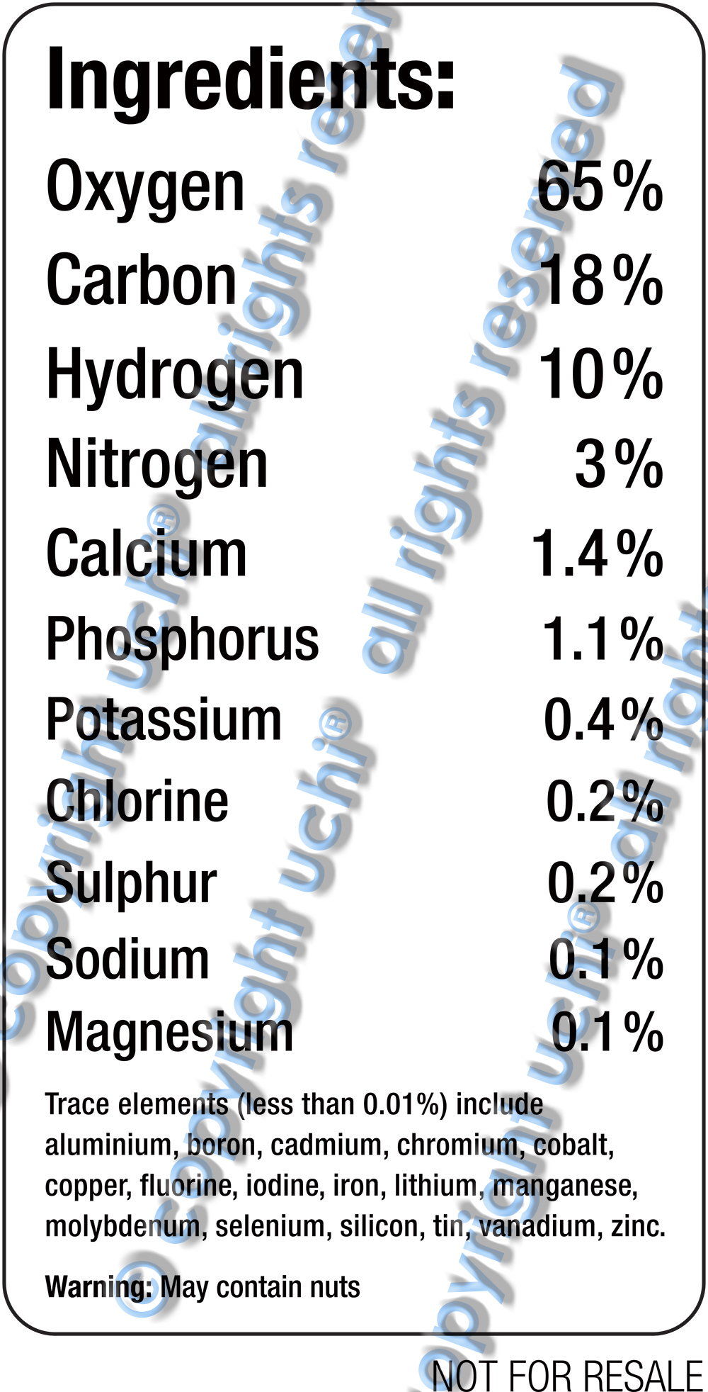
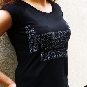
The first question sounds a little metaphorical and will probably be addressed sometime in the future. But for now, the latest uchi track addresses the physical, or, more accurately, the chemical. I’m a science geek and a T shirt showing the chemical elements that make up the human body has been on the back burner of my mind for some time. It felt right to follow the last uchi T-shirt “Stereotype” with another typography design – contrasting, but also related. Think of it as the B Side to Stereotype.
A T-shirt displaying the chemical elements of the human body.
A bunch of stats from various academic websites to get the elements as well as each element’s mass (all with slightly varying approximations). I’ve since learnt that the exact amounts vary from person to person.
So how do you display the elements of the human body in a simplistic design? A graphical, infographic design? Maybe a pie chart or graph? Following on from ‘Stereotype‘, I thought “simple is best” and decided to rely solely on text and my typographical training to communicate the idea.
I wanted the names of each element to be printed in proportion to each other’s relative size. But this proved problematic, in terms of both design and print.
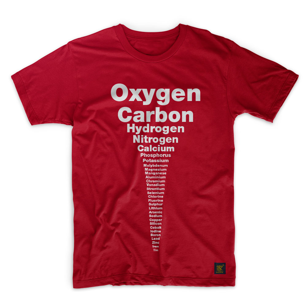
So I ditched the ratio idea in favour of a more aesthetically pleasing design. Starting with oxygen and ending with tin, each element’s representation would be slightly smaller than the one before it. I liked it. However, though simple, it wasn’t technically accurate. That was because the order of the trace elements was determined by the size of the word representing them – not by their mass. This bugged me.
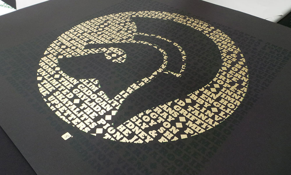
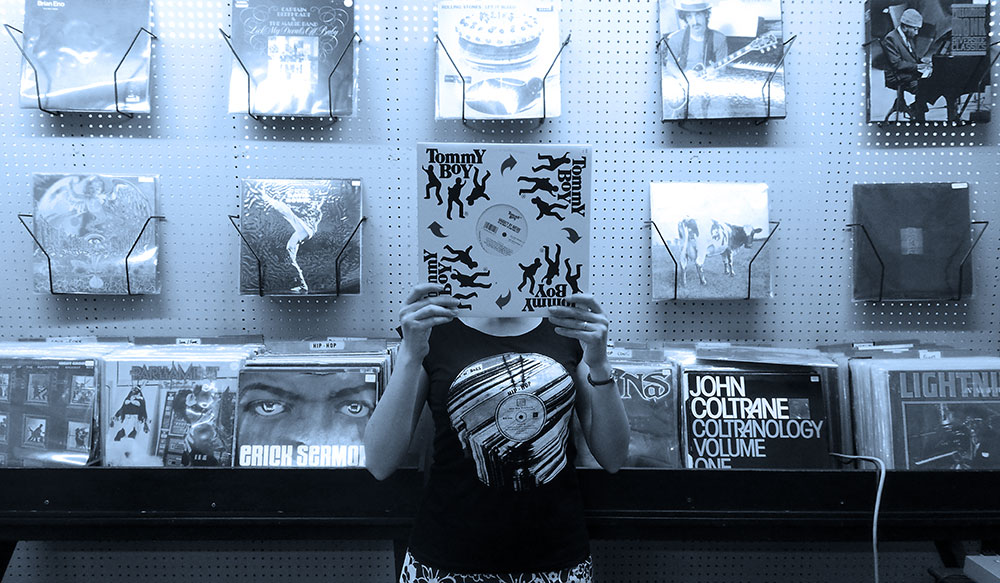
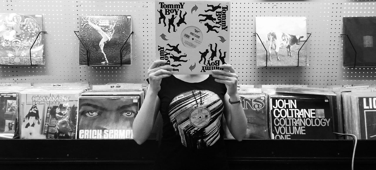
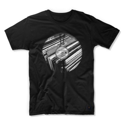
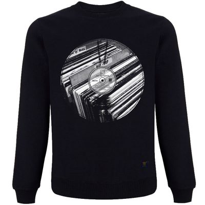
It’s no secret that I love typography and screen printing. So, after the success of the Vinyl Records based T shirts and the Gil Scott Heron limited edition art print, I decided to produce a series of limited edition prints of the Trojan design…
From reggae, ska, rock steady and dub, Trojan Records logos’ endurance is a testament to the music and culture. We haven’t included the complete list of all the artists that appeared under Trojan Records, but hope we’ve caught a few of everybody’s favourites.
Growing up in a house full of reggae records has made the Trojan logo as recognisable to me as the Nike swoosh. It’s no coincidence that the typeface Trojan Records uses is a robust and solid one. Like them, Rockwell Bold evokes strength and stability. They chose well.
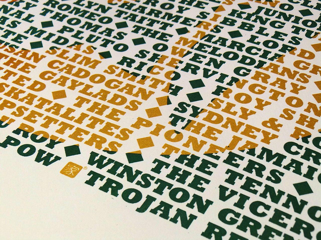
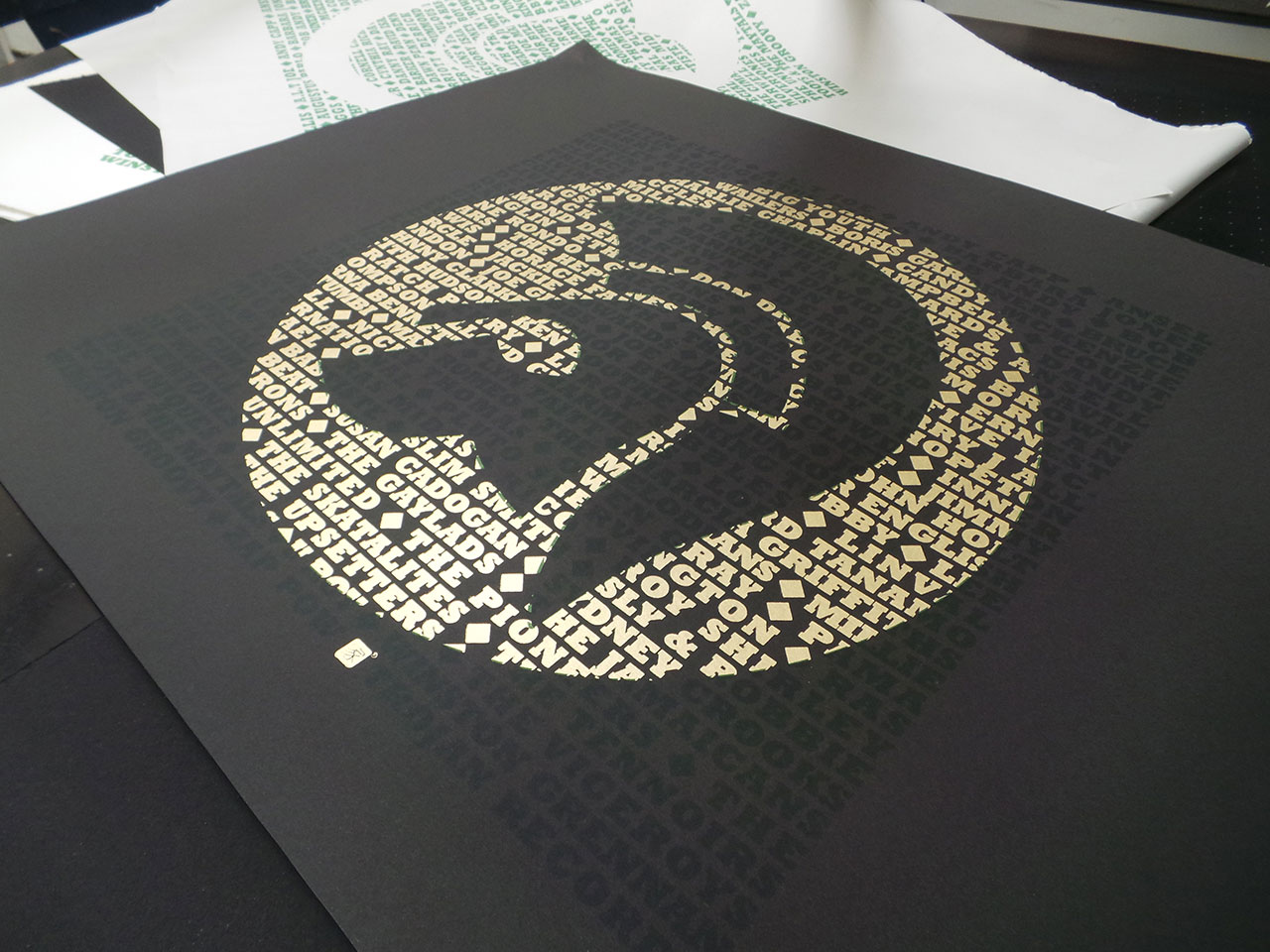
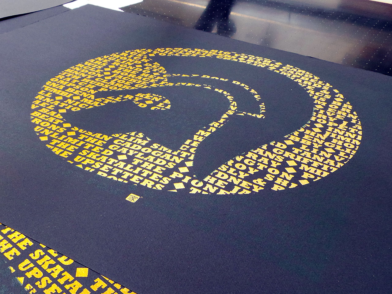

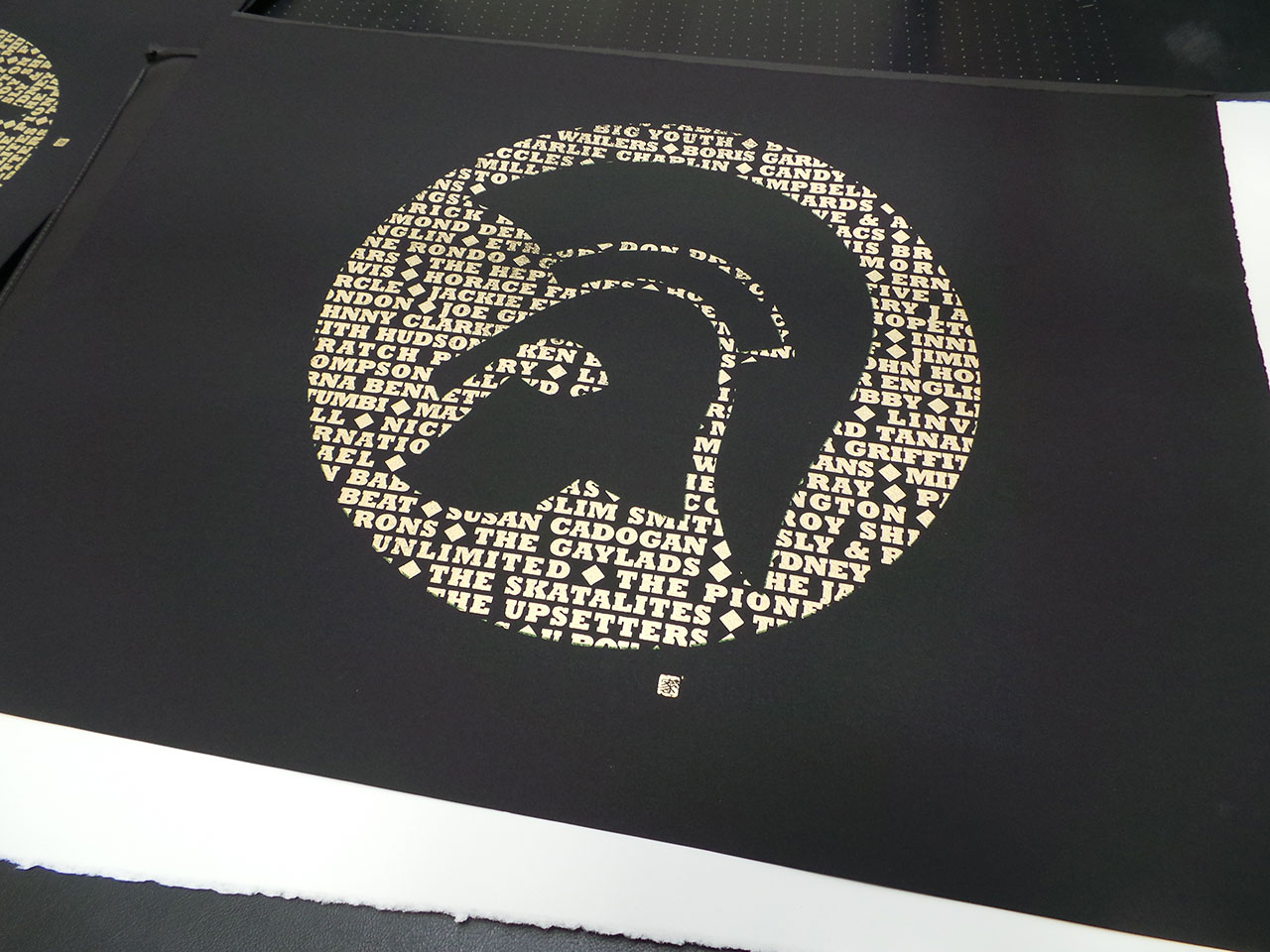
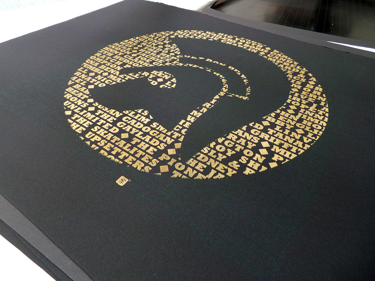
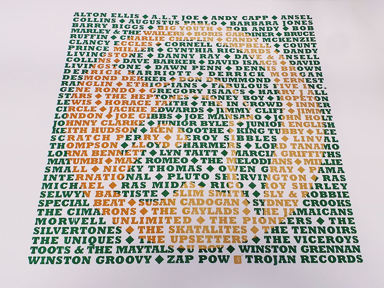
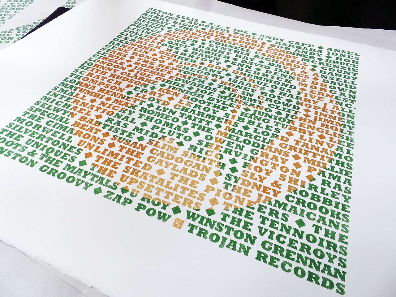
A limited edition set of artists proofs, screen printed in metallic gold and dark green and available on black and white fine art papers. Each screen print is unique with different variations of the gold ink mix. As with the previous Star Wars screen print, some have been printed with pure metallic gold and some have been mixed with a orange ink. This is especially apparent on the white Somerset Satin papers. These prints have lot more orange than metallic gold.
Signed and numbered.
The page you requested could not be found. Try refining your search, or use the navigation above to locate the post.

So, after a long wait for sunflower yellow T shirts, the Trojan T shirt reprints are done. I had created an ‘artist’s impression’ of the new yellow T shirts, thinking red and green print on yellow would not only look great, it’d be perfect for a reggae based T shirt. However, the mock-up posted on the product page suggested otherwise. I dismissed this and put it down to it being a mock-up and not a picture of an actual real printed T shirt! I was confident that when actually printed, the colours “will look dope on that colour T shirt!”.
They didn’t. It did remind me of having an eye test. On the yellow T shirts, the depth of the red and green colours was two close. The whole print was too dark to show the Trojan emblem prominently enough through the text – the opposite of what I wanted. The mock-up turned out to be accurate after all.
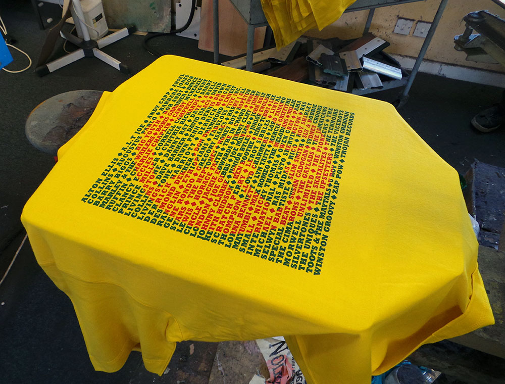
Trojan men’s T shirt – Red Gold and Green?
I was a little disappointed, but (and you have to stay on your feet in this game), I remembered that the last yellow uchi T shirt was printed using a dark golden yellow and the same green we were using, so…
We overprinted the poorly chosen red with the dark yellow and this is what we got.
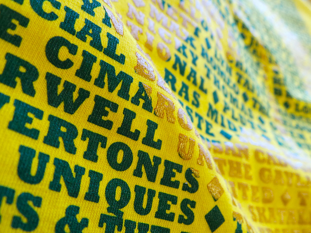
Trojan men’s T shirt – Sunflower Yellow
They say hindsight is a beautiful thing. And with further hindsight, or, by paying attention to the rules of colour instead of getting sentimental about red, gold and green combos, maybe even these current colour ways could be better? If instead, green and gold were printed on the cream and the yellow T shirt had the green/orange combo. Perhaps? It is a very limited run, so the next cream and yellow Trojan T shirts will probably see a reversal of colours… maybe clear and red inks?
Feel free to let me know what colour combo you’d like to see on a future uchi Trojan T shirt.
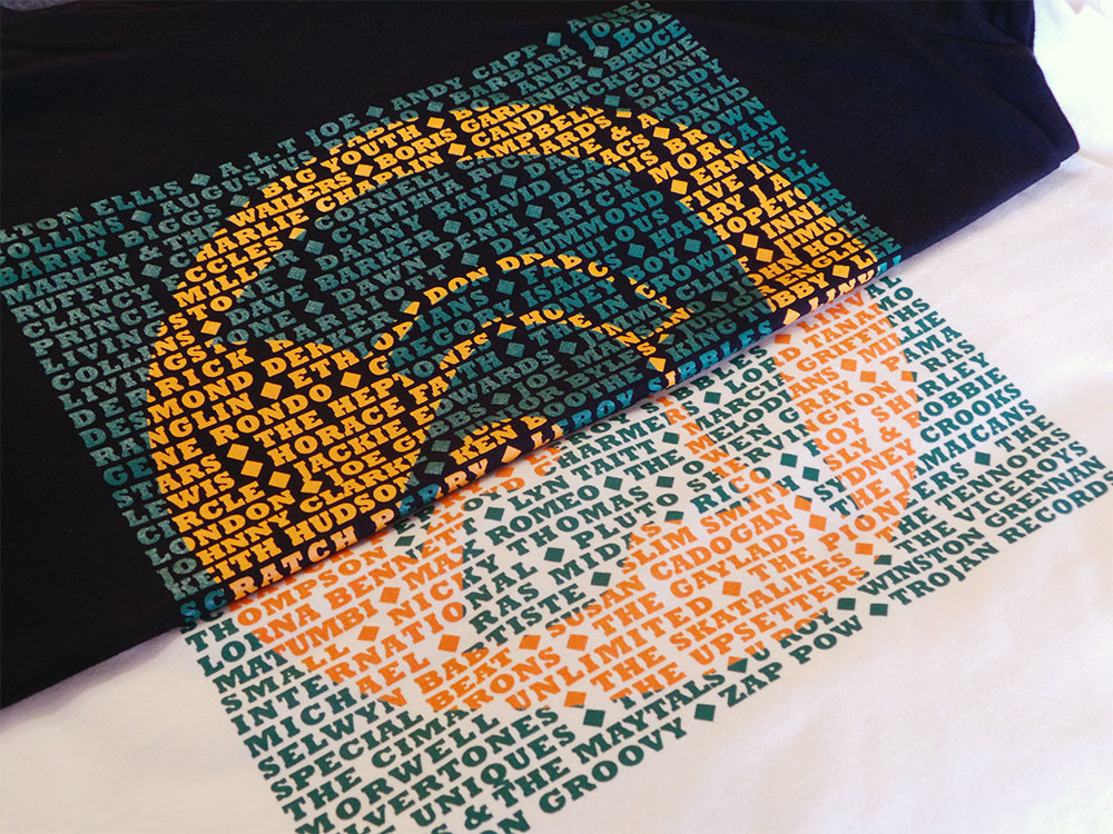
Trojan men’s T shirt – Black and Cream
The page you requested could not be found. Try refining your search, or use the navigation above to locate the post.
There are a couple of new designs that were going to be included, but were not finished in time. On reflection it worked out fine. The two unfinished pieces are very illustrative and more like designs in the pipeline than the ones recently done. So, maybe the next album will be all illustration? We’ll see.
Here are the latest two uchi vinyl-related T shirts and the stories behind them…
Trojan and The Big Payback were influenced by our neighbours here in Bristol – Payback Records.

For me, growing up in a house full of reggae records has made the Trojan logo as recognisable as the Nike swoosh, but with a ton of more meaning. It’s no coincidence that they also use a heavy robust and solid typeface like Rockwell Extra Bold.

Only thing left to do is name the album!

By popular request, here’s the first colour drop of uchi’s Typographic Periodic Table – charcoal grey on a women’s bamboo T shirt.
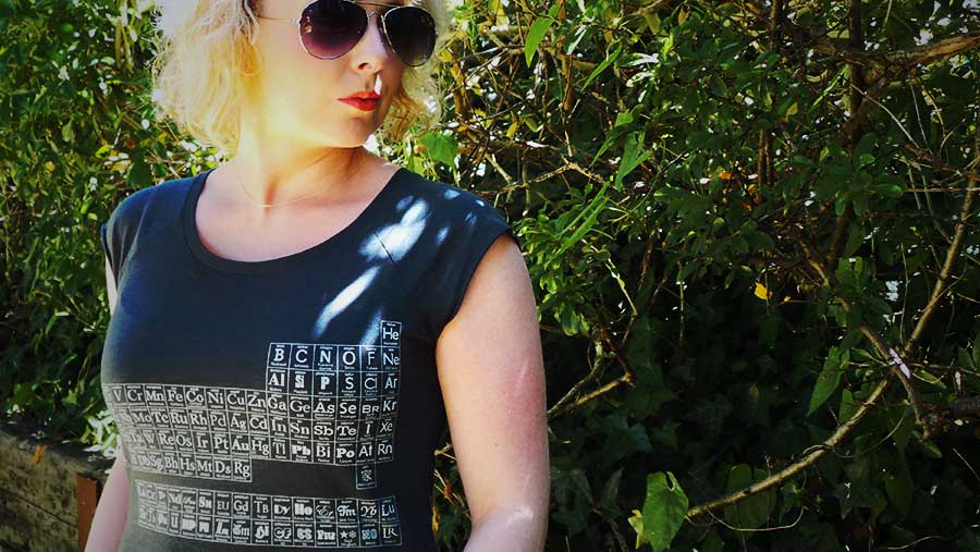

Typographic Periodic Table of Elements
 There are many styles of type and many classification systems – defined by their visual characteristics (stroke contrast, serif shape, etc) and their historical development or reference. Here, I’ve tried to match typefaces over the ages into their main classifications within the element groups on the Periodic Table. Also, except for the Lanthanoids and Actinoids (Glyphic, Script, Blackletter and Graphic faces) and, where possible, in each element group, the typefaces are in roughly in date order from the top to bottom. There are some notable exceptions for aesthetic reasons. For example, Helevtica was made in 1957, but it had to be Hydrogen!
Want to know your serif from your slab-serif? Read on for a brief description of each type style.