No Results Found
The page you requested could not be found. Try refining your search, or use the navigation above to locate the post.
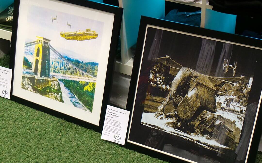
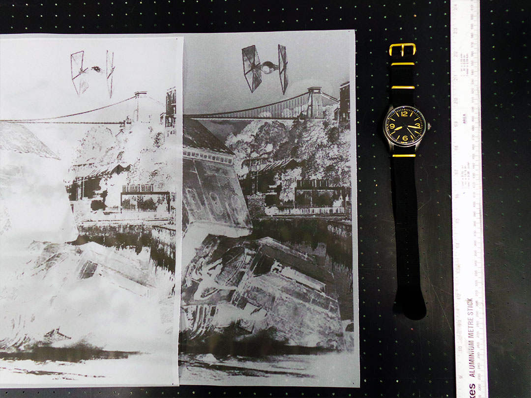
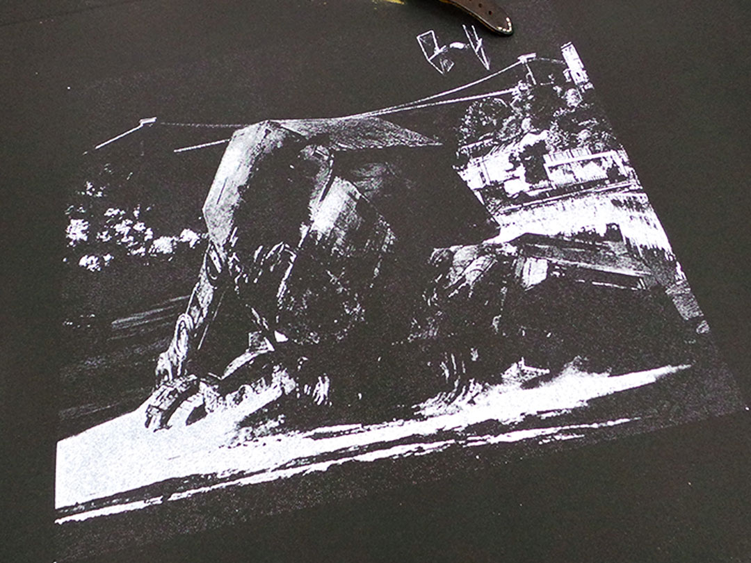
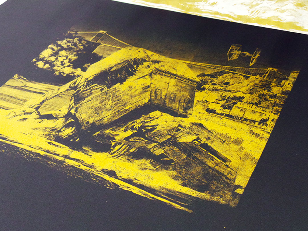
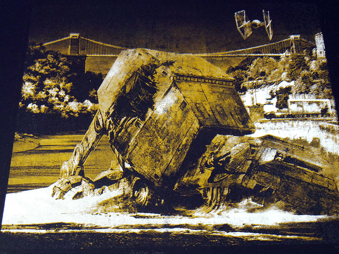
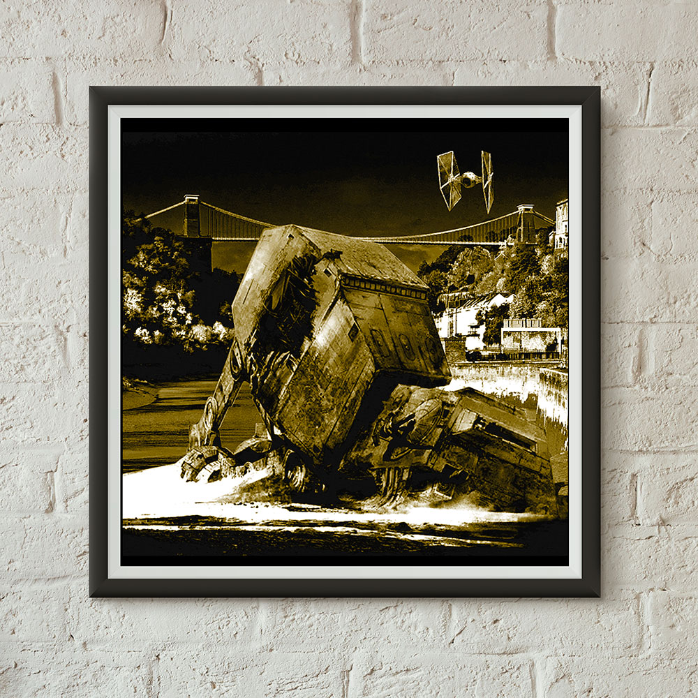
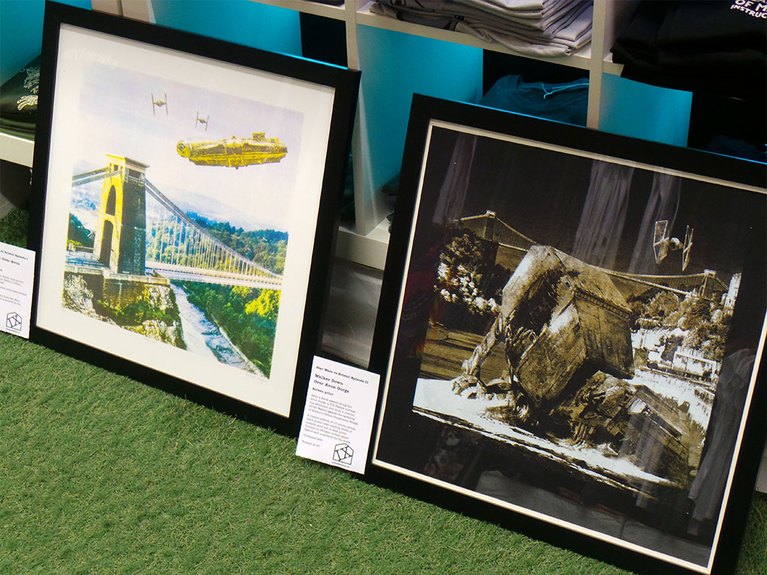
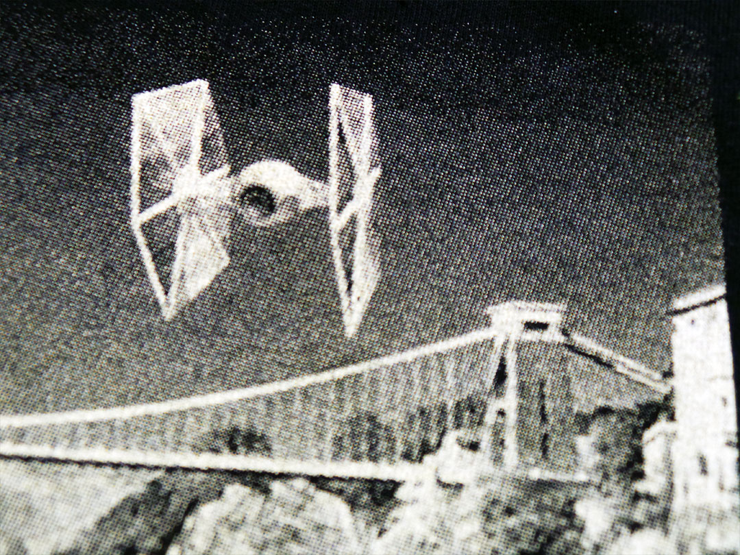
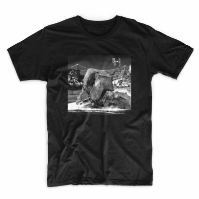
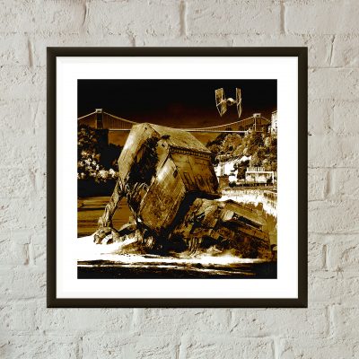
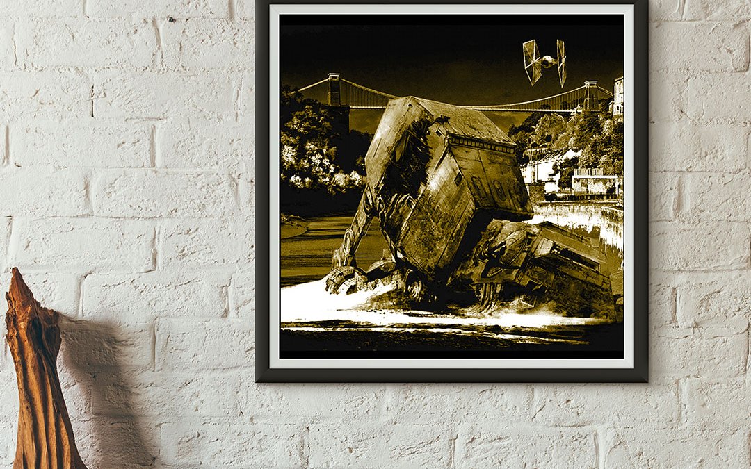
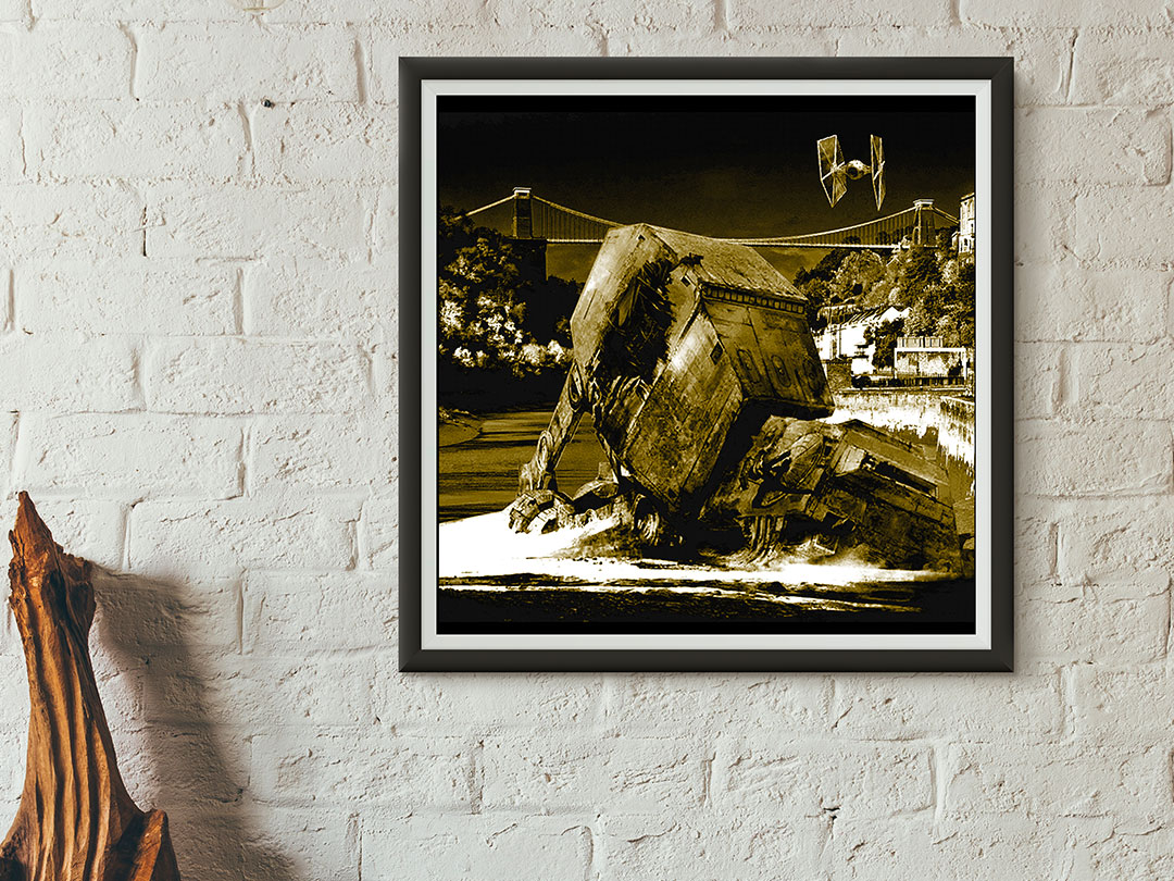
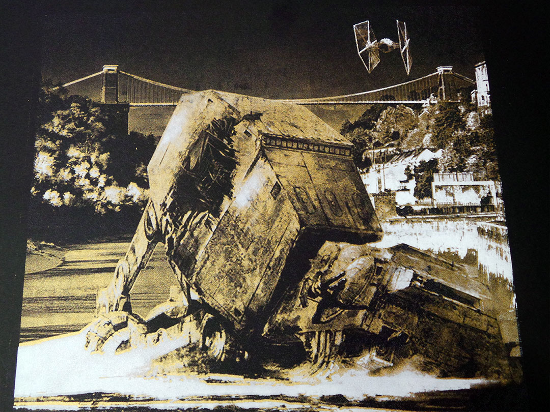
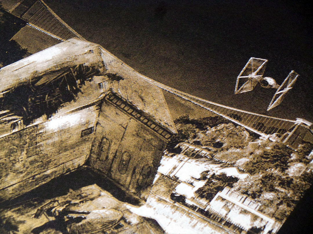
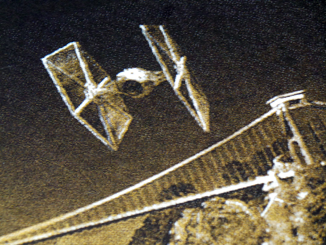
After a fierce dog fight with the Millennium Falcon and a vicious ground assault along the Avon Gorge, a TIE Fighter surveys the aftermath and finds a downed AT-AT Walker against the backdrop of Bristol’s Clifton Suspension Bridge…
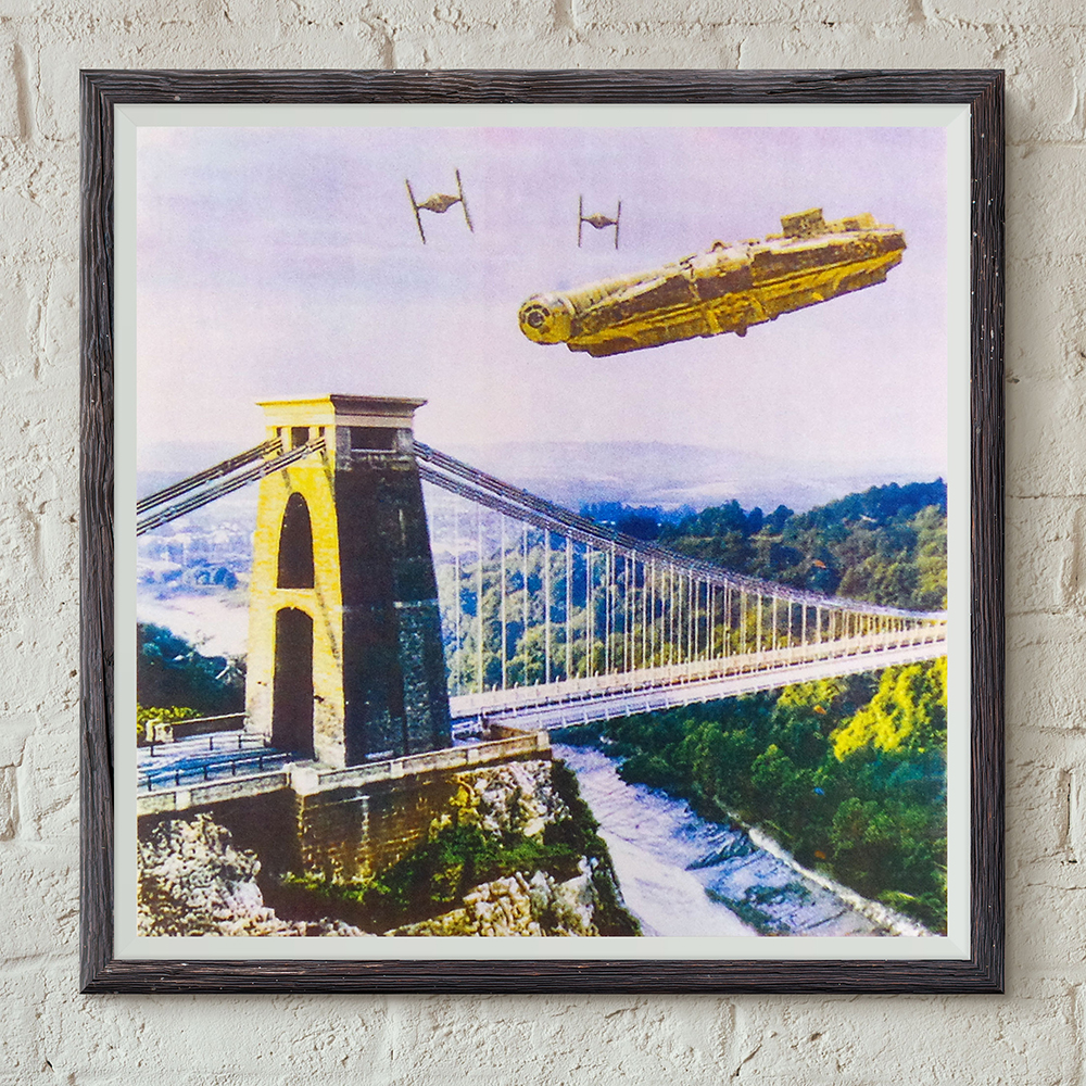
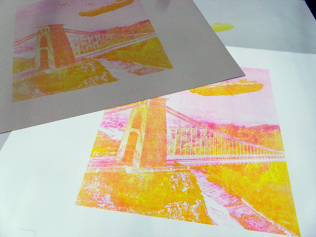
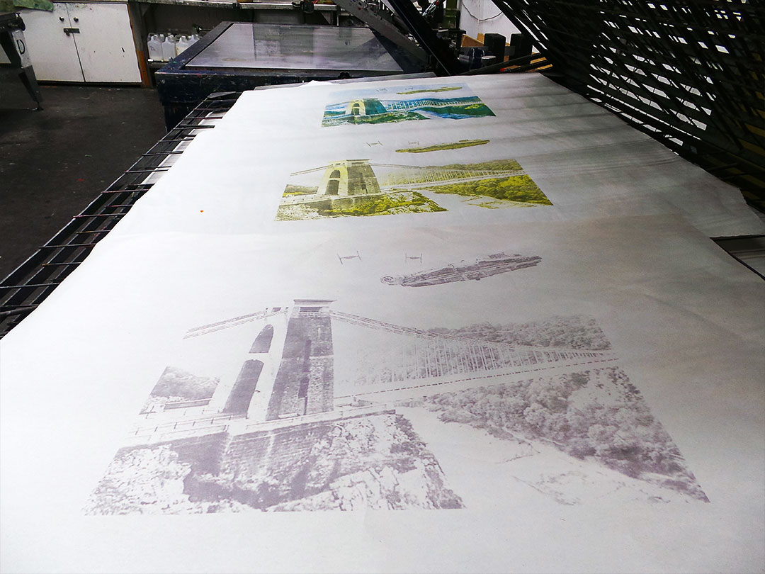
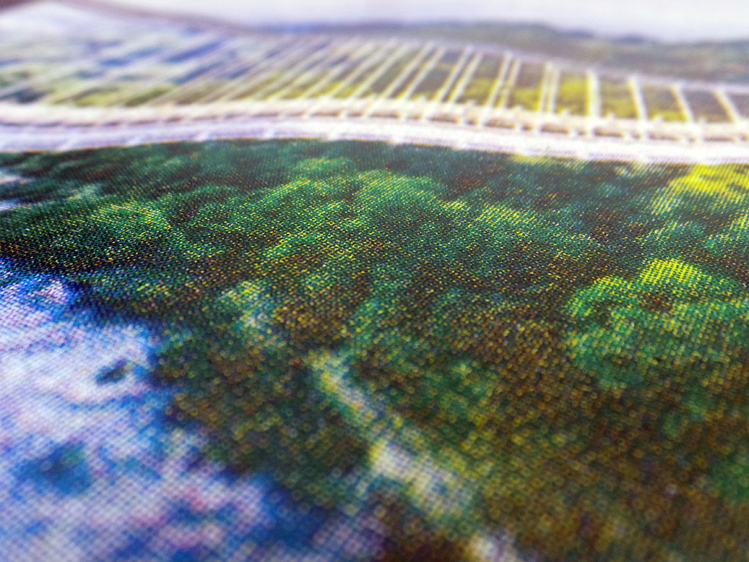
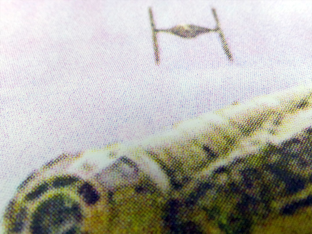
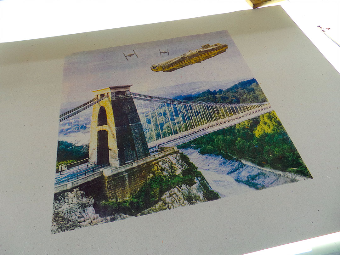
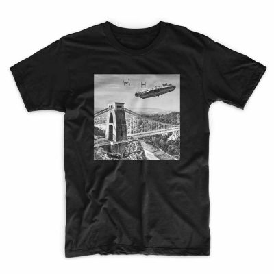
The Millennium Falcon outruns two TIE Fighters over Bristol’s Clifton Suspension Bridge. Printed by hand in four halftone colours on 300gsm Somerset Satin paper. This print edition is limited to 10 screen prints. Print size 50 x 50cm. Signed and numbered by the artist.
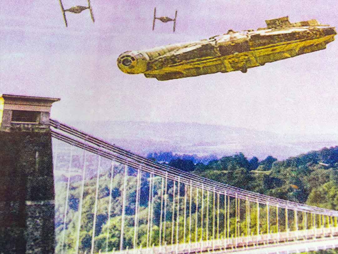
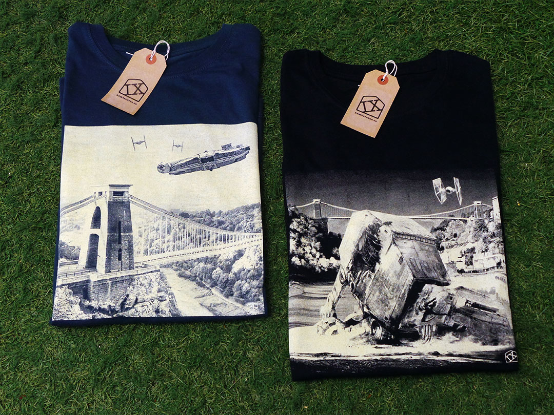
After a fierce dogfight with the Millennium Falcon and a vicious ground assault along the Avon Gorge, a TIE Fighter surveys the aftermath and finds a downed AT-AT Walker against the backdrop of Bristol’s Clifton Suspension Bridge.
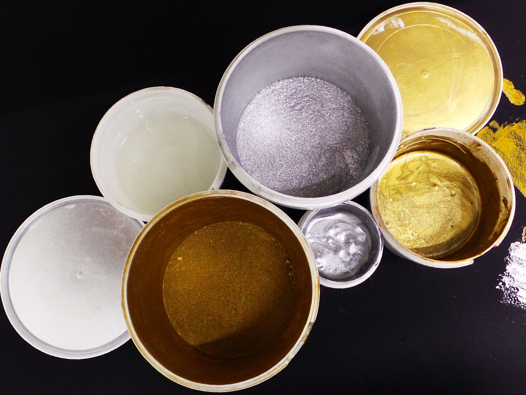
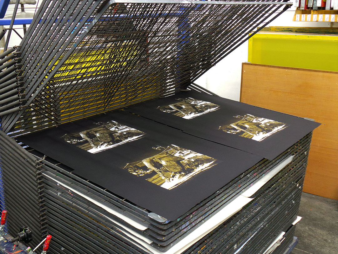
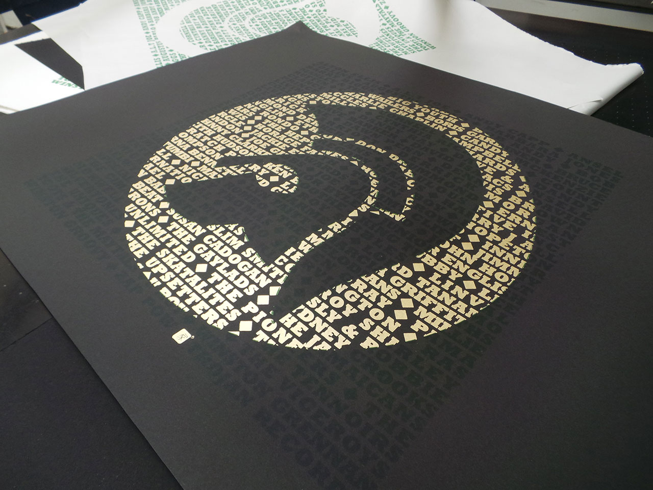
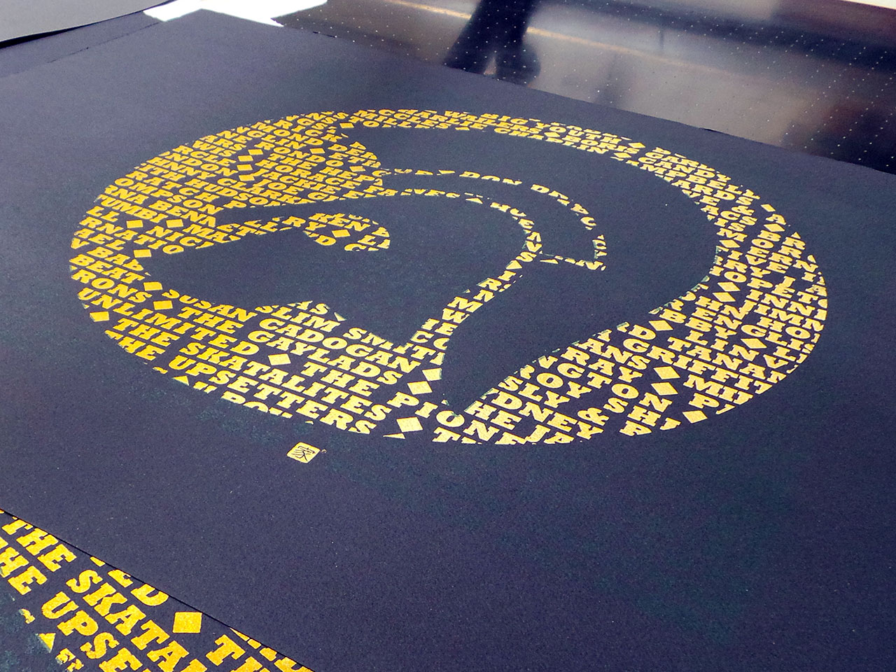
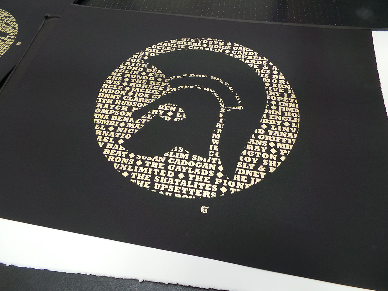
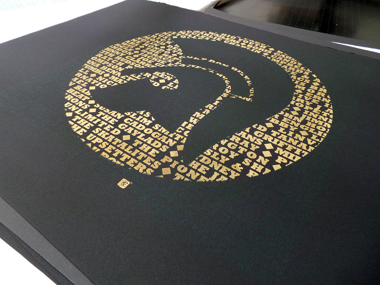
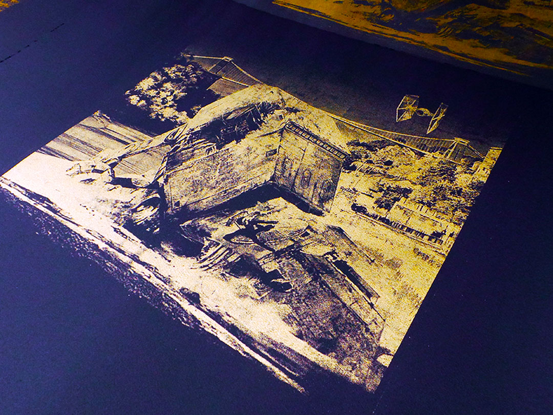
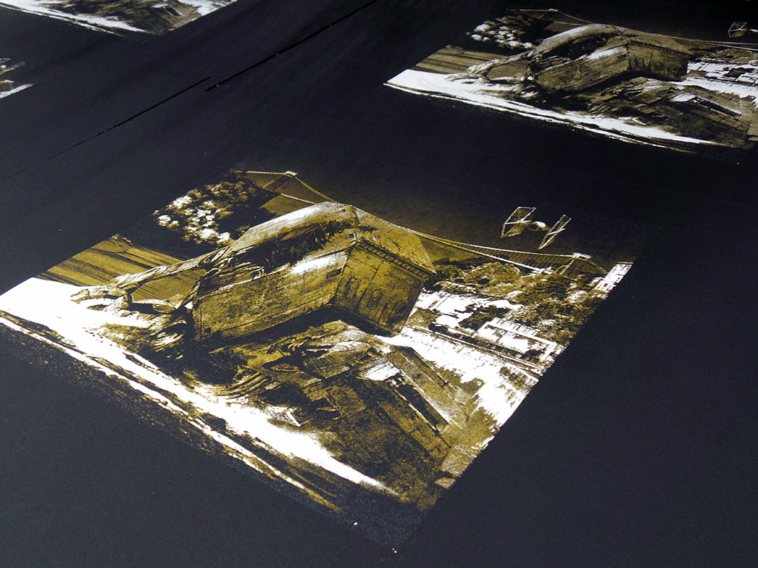
A limited edition of 13 two colour screen prints. Each print hand pulled with varying levels of metallic gold ink in each print. Printed on 250gsm black Arches acid free paper.
Signed and numbered by the artist. Print size 50 x 50cm.


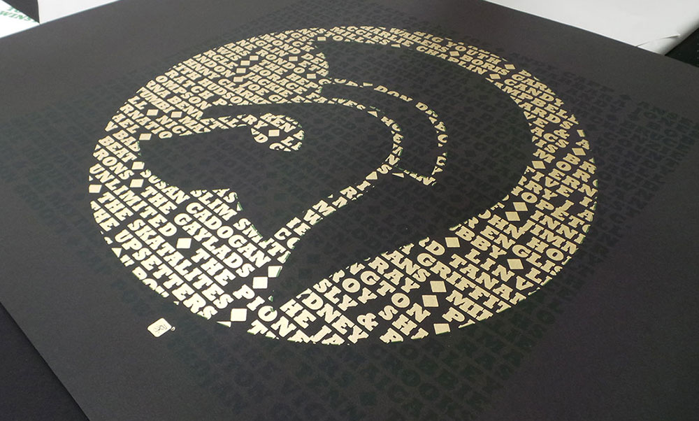
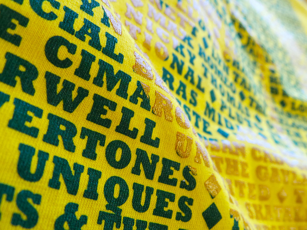
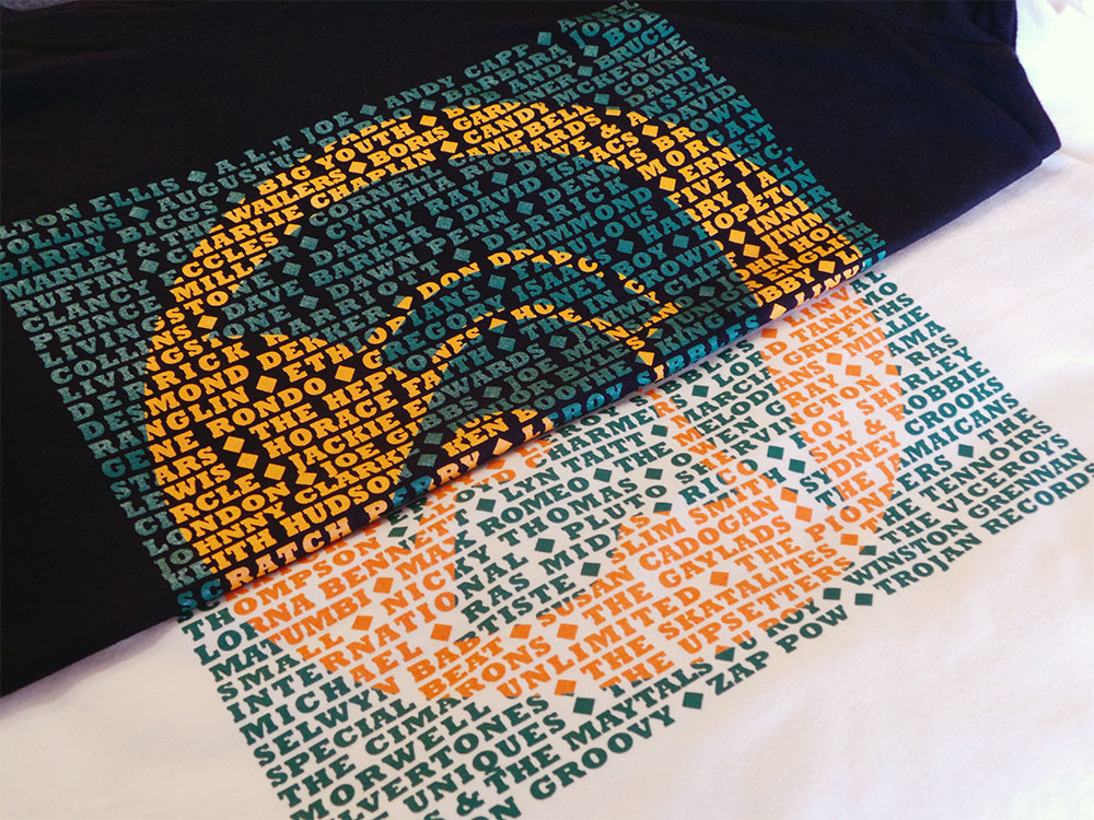
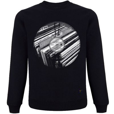
It’s no secret that I love typography and screen printing. So, after the success of the Vinyl Records based T shirts and the Gil Scott Heron limited edition art print, I decided to produce a series of limited edition prints of the Trojan design…
From reggae, ska, rock steady and dub, Trojan Records logos’ endurance is a testament to the music and culture. We haven’t included the complete list of all the artists that appeared under Trojan Records, but hope we’ve caught a few of everybody’s favourites.
Growing up in a house full of reggae records has made the Trojan logo as recognisable to me as the Nike swoosh. It’s no coincidence that the typeface Trojan Records uses is a robust and solid one. Like them, Rockwell Bold evokes strength and stability. They chose well.
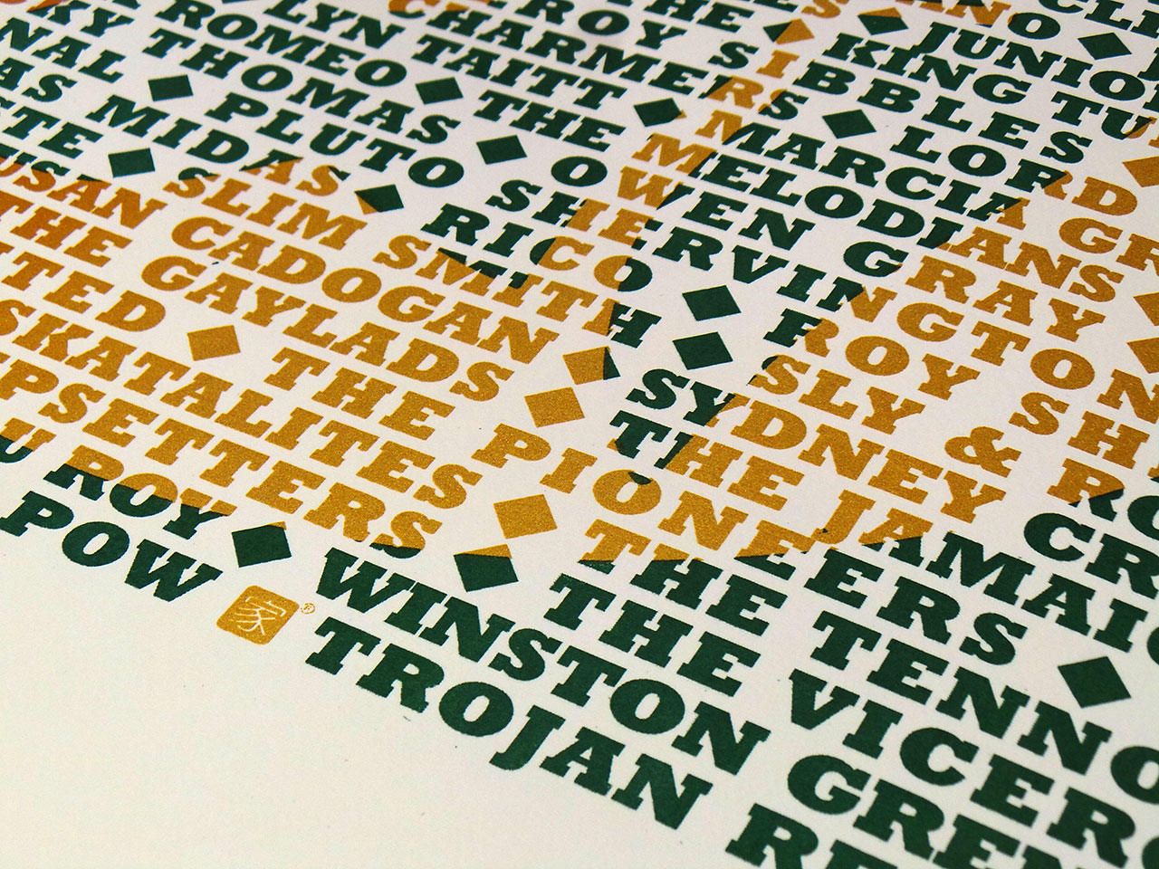

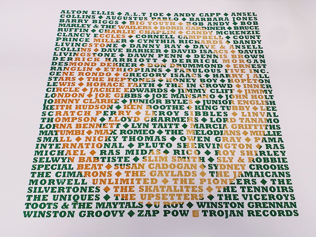
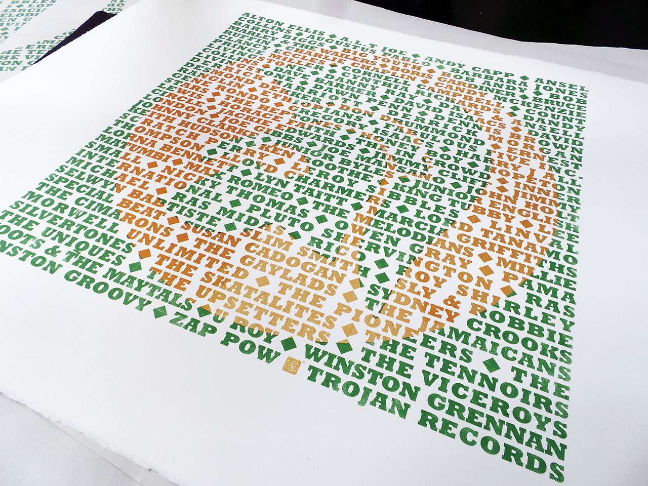
A limited edition set of artists proofs, screen printed in metallic gold and dark green and available on black and white fine art papers. Each screen print is unique with different variations of the gold ink mix. As with the previous Star Wars screen print, some have been printed with pure metallic gold and some have been mixed with a orange ink. This is especially apparent on the white Somerset Satin papers. These prints have lot more orange than metallic gold.
Signed and numbered.
The page you requested could not be found. Try refining your search, or use the navigation above to locate the post.
After a fierce dog fight with the Millennium Falcon and a vicious ground assault along the Avon Gorge, a TIE Fighter surveys the aftermath and finds a downed AT-AT Walker against the backdrop of Bristol’s Clifton Suspension Bridge.
See Episode I of the Star wars vs Bristol screen print project.
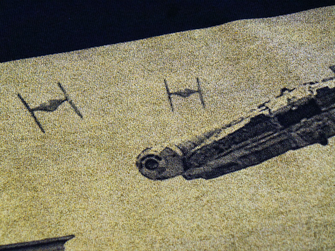
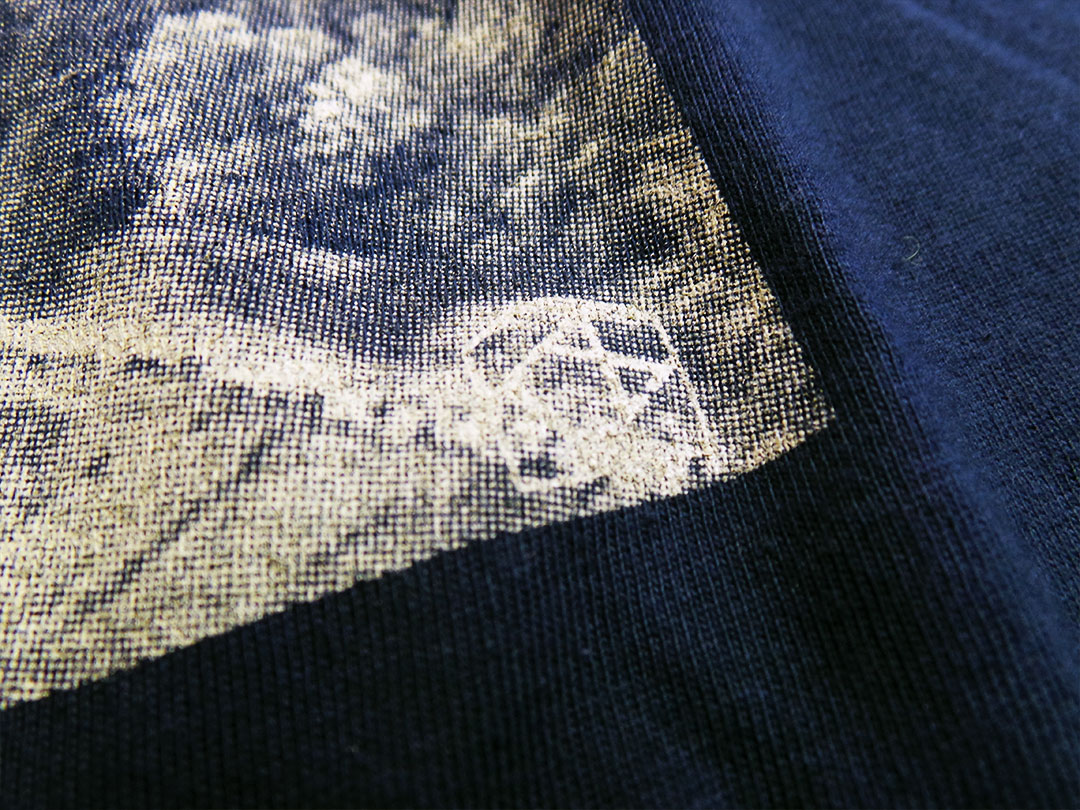
A limited edition of 13 two colour hand pulled screen prints for IX T shirts. Each print is unique as varying levels of metallic gold ink where used and some have gold mixed with orange producing a richer colour.
Printed on 250gsm black arches acid free paper.
Signed and numbered by the artist.

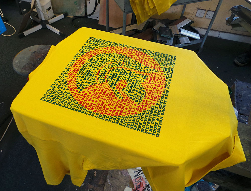
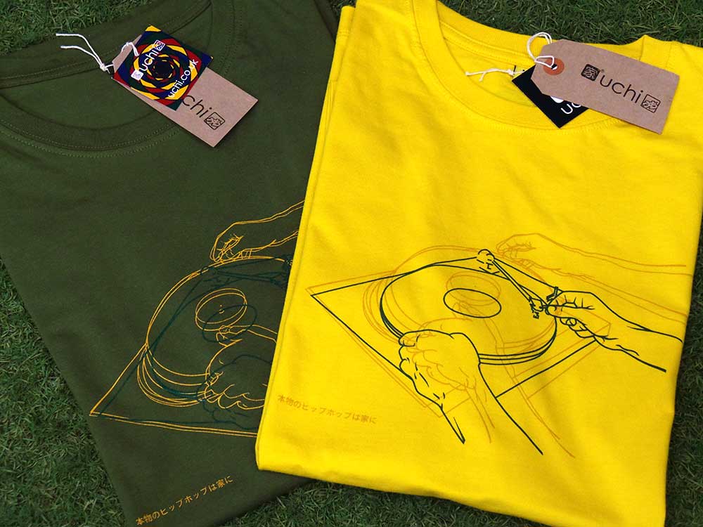
So, after a long wait for sunflower yellow T shirts, the Trojan T shirt reprints are done. I had created an ‘artist’s impression’ of the new yellow T shirts, thinking red and green print on yellow would not only look great, it’d be perfect for a reggae based T shirt. However, the mock-up posted on the product page suggested otherwise. I dismissed this and put it down to it being a mock-up and not a picture of an actual real printed T shirt! I was confident that when actually printed, the colours “will look dope on that colour T shirt!”.
They didn’t. It did remind me of having an eye test. On the yellow T shirts, the depth of the red and green colours was two close. The whole print was too dark to show the Trojan emblem prominently enough through the text – the opposite of what I wanted. The mock-up turned out to be accurate after all.
Trojan men’s T shirt – Red Gold and Green?
I was a little disappointed, but (and you have to stay on your feet in this game), I remembered that the last yellow uchi T shirt was printed using a dark golden yellow and the same green we were using, so…
We overprinted the poorly chosen red with the dark yellow and this is what we got.
Trojan men’s T shirt – Sunflower Yellow
They say hindsight is a beautiful thing. And with further hindsight, or, by paying attention to the rules of colour instead of getting sentimental about red, gold and green combos, maybe even these current colour ways could be better? If instead, green and gold were printed on the cream and the yellow T shirt had the green/orange combo. Perhaps? It is a very limited run, so the next cream and yellow Trojan T shirts will probably see a reversal of colours… maybe clear and red inks?
Feel free to let me know what colour combo you’d like to see on a future uchi Trojan T shirt.
Trojan men’s T shirt – Black and Cream
The page you requested could not be found. Try refining your search, or use the navigation above to locate the post.
There are a couple of new designs that were going to be included, but were not finished in time. On reflection it worked out fine. The two unfinished pieces are very illustrative and more like designs in the pipeline than the ones recently done. So, maybe the next album will be all illustration? We’ll see.
Here are the latest two uchi vinyl-related T shirts and the stories behind them…
Trojan and The Big Payback were influenced by our neighbours here in Bristol – Payback Records.

For me, growing up in a house full of reggae records has made the Trojan logo as recognisable as the Nike swoosh, but with a ton of more meaning. It’s no coincidence that they also use a heavy robust and solid typeface like Rockwell Extra Bold.

Only thing left to do is name the album!
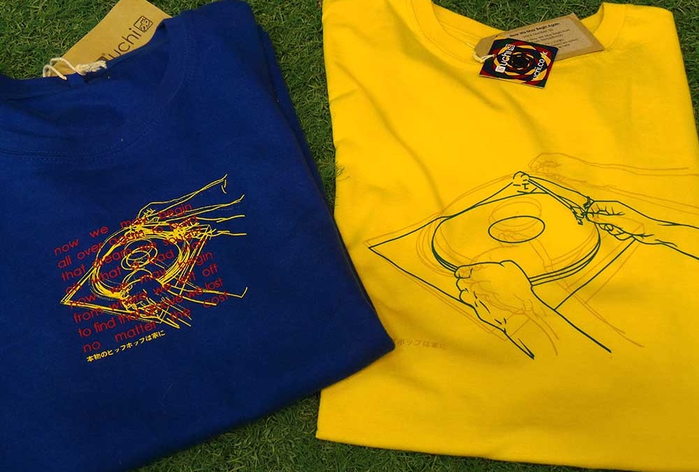
Here’s some old and new. A look back at the original uchi classic T shirt No 18 – Now We May Begin and the 2016 remix, Now We May Begin Again.
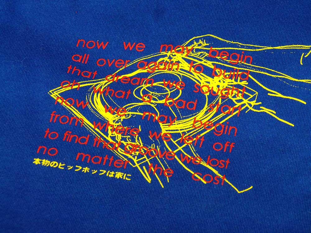
Although the original T shirt design uses four overlaid images and the remix only three, there were originally 36 photographs shot in sequence documenting the vinyl selection process (Natural Selection), to the needle dropping on the record, as shown on Always Use Clean Needles. The remix is more subtle – the “sample” – the first verse from Randy Crawford’s song of the same name has been removed and the lines redrawn for a bigger print.
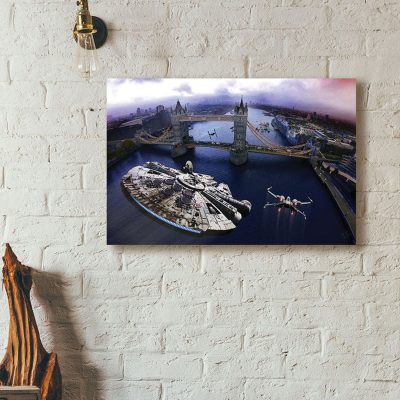
&url=https://uchi.co.uk/shop/mens-t-shirts/ix-t-shirt-dogfight-over-avon-gorge-colour/&media=https://uchi.co.uk/wp-content/uploads/2018/01/IX-TShirt-MillenniumColor-0ff-white-1024x1024.jpg)
&url=https://uchi.co.uk/shop/mens-t-shirts/ix-t-shirt-dogfight-over-avon-gorge-light/&media=https://uchi.co.uk/wp-content/uploads/2017/09/IX-TShirt-Millennium-offwhite-1024x1024.jpg)
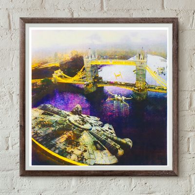
&url=https://uchi.co.uk/shop/mens-t-shirts/ix-t-shirt-incident-at-tower-bridge-colour/&media=https://uchi.co.uk/wp-content/uploads/2018/01/IX-TShirt-Tower-Bridge-colour-grey-1024x1024.jpg)