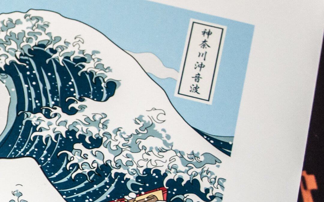
Soundwave off Kanagawa Art print (神奈川沖音波)
Soundwave off Kanagawa (神奈川沖音波) Art print
A retrospective look at a classic ukiyo-e printFollowing the latest uchi print based on The Great Wave off Kanagawa (神奈川沖浪裏), we look at the Ukiyo-e traditional Japanese woodblock prints and in particular the works of ukiyo-e artist Katsushika Hokusai.
Soundwave off Kanagawa
神奈川沖音波
Fine art print
A fine art print of an original illustration based on The Great Wave off Kanagawa (神奈川沖浪裏) Japanese woodblock print by ukiyo-e artist Katsushika Hokusai.
Available in A3, A2 and A1 fine art paper prints. Signed by the artist.
")
Pictures of the Floating World
Ukiyo-e refers to the Japanese paintings and woodblock prints that emerged in Japan’s Edo period (1615-1868). These affordable prints captured everyday Japanese life; stylish courtesans, kabuki theatres, sumō wrestlers, historical events, landscapes and erotica. Ukiyo-e (浮世絵), although often translated as “pictures of the floating world,” literally means “Pictures of the fleeting world”, that is the fleeting secular world. As such, the paintings and prints were more appealing and diverse than art of the ruling Shōgun class.

Not only did the ukiyo-e prints document the leisure activities and climate of the era, they also showcased Japanese aesthetics of beauty, nature and spirituality to the outside world and was central to forming the West’s perhaps misleading perception of Japanese culture. The development of multicoloured printing led to mass-marketing and increased popularity, and by the mid-19th century a print could run into the thousands. At this time the Japanese arts were ‘trending’ in Western culture and had a strong influence on early Impressionists and Art Nouveau artists such as Monet, Vincent van Gogh and Toulouse-Lautrec. Today, ukiyo-e is still the best know style of Japanese painting.
Katsushika Hokusai had more aliases than a Wu-Tang Clan member
Born in what is known now as Tokyo in 1760 Katsushika Hokusai began painting early in life. His name as a child was “Tokitarō” and at 14 began honing his skills as an apprentice wood-carver. He then studied under the ukiyo-e artist Katsukawa Shunshō who would give him a new name “Shunrō” and from whose school he would eventually be expelled. An inspiring time for an artist, he is quoted as saying “What really motivated the development of my artistic style was the embarrassment I suffered at Shunkō’s hands.” He now had a new focus. Instead of the usual courtesans and Kabuki images practiced by artists like his former master, he focused on landscapes and the portrayal of everyday Japanese society, changing both his career and ukiyo-e art.

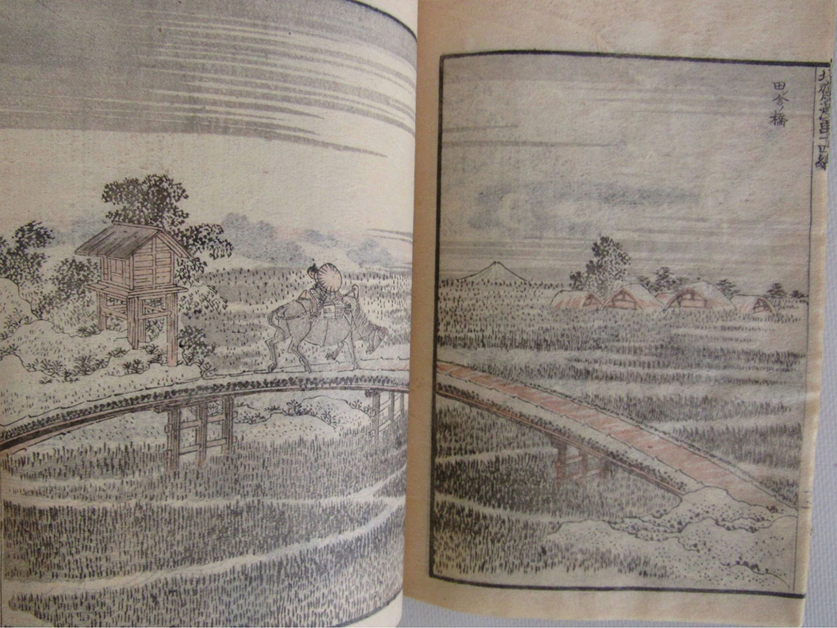
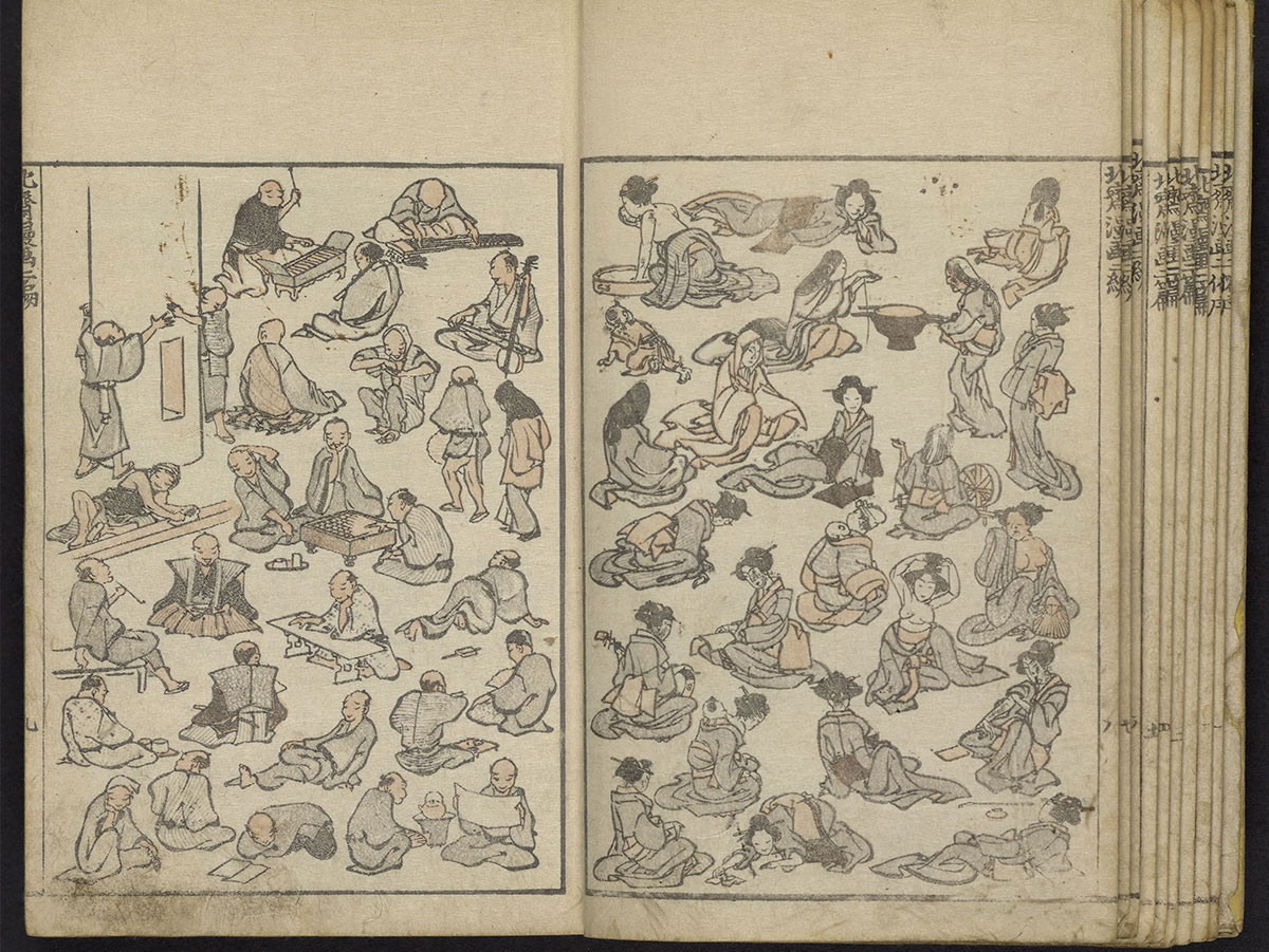
In 1811 at the age of 51, Hokusai changed his name to “Taito” and begun his largest body of work, Hokusai Manga (北斎漫画). This was a 15-volume collection of sketches featuring animals, religious figures, everyday people, objects, landscapes, dragons, the list goes on. They have been compared to Rembrandt and Van Gogh’s work, for “the thrilling panorama they provide both of the world and of Hokusai’s imagination”.
One Again
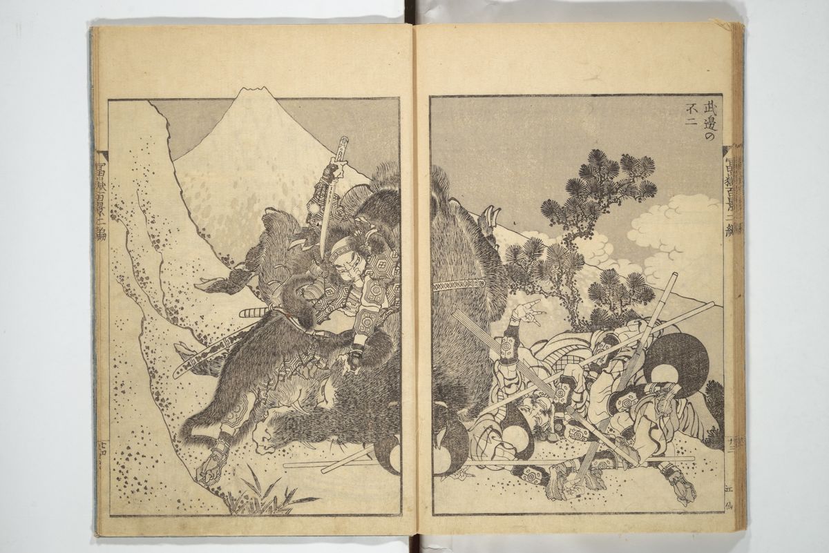
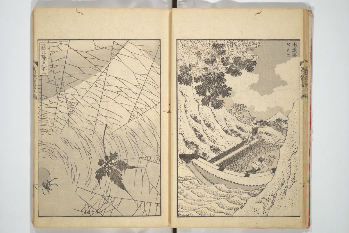
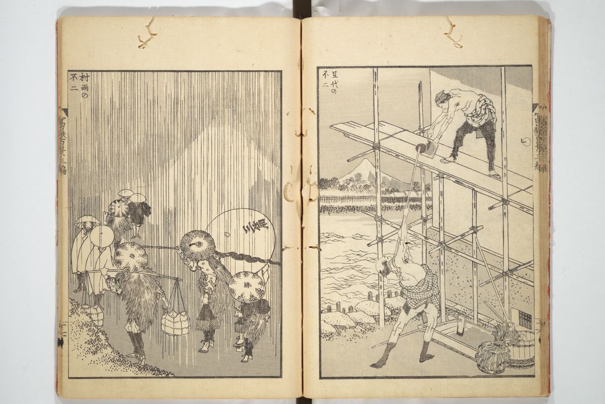
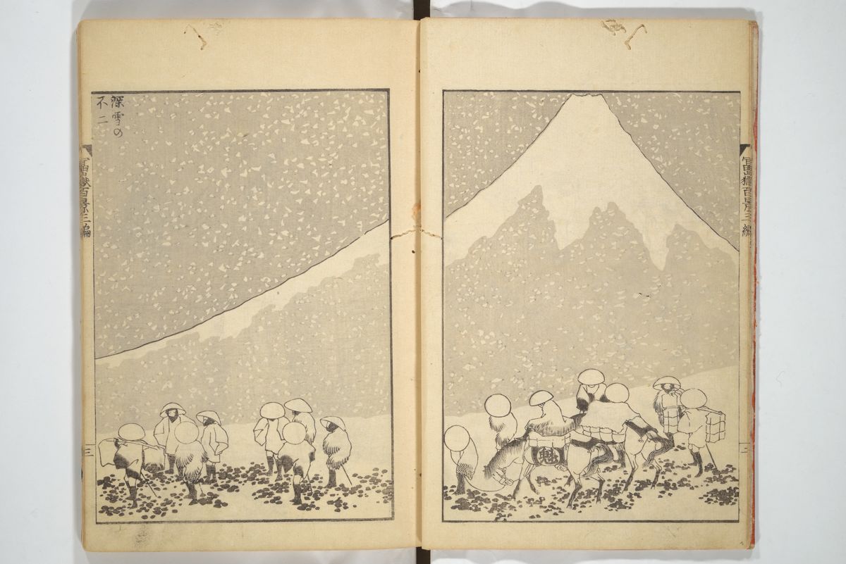
On his sixtieth birthday in 1820, Hokusai changed his name to “Iitsu” meaning “one again”. It was during this period he would make one of his most celebrated print series, Thirty-Six Views of Mount Fuji. Published between 1830 and 1832, this series included the famous Great Wave off Kanagawa. Due to it’s popularity, ten more prints were later added. And then, in 1834 under the new pseudonym “Gakyō Rōjin Manji” (The Old Man Mad About Art) he published One Hundred Views of Mount Fuji (富嶽百景 Fugaku Hyakkei), a work which “is generally considered the masterpiece among his landscape picture books”.

Among the other popular series of prints he published during this time are A Tour of the Waterfalls of the Provinces and Unusual Views of Celebrated Bridges in the Provinces. He later began producing a number of detailed individual images of flowers and birds, including the extraordinarily detailed Poppies and Flock of Chickens. He died after a short illness in 1849, aged 90.

From the age of six I had a mania for drawing the shapes of things. When I was 50 I had published a universe of designs. But all I have done before the age of 70 is not worth bothering with. At 75 I’ll have learned something of the pattern of nature, of animals, of plants, of trees, birds, fish and insects. When I am 80 you will see real progress. At 90 I shall have cut my way deeply into the mystery of life itself. At 100, I shall be a marvellous artist. At 110, everything I create; a dot, a line, will jump to life as never before. To all of you who are going to live as long as I do, I promise to keep my word. I am writing this in my old age. I used to call myself Hokusai, but today I sign my self ‘The Old Man Mad About Drawing’.
Woodblock printing in Japan
Woodblock printing in Japan (木版画, mokuhanga) was also used for printing books long before the advent of movable type. Woodblock printing had been used in China for centuries but was widely adopted in Japan during the Edo period. Although similar to woodcut in Western printmaking in some regards, the mokuhanga technique uses water-based inks as opposed to oil-based inks primarily used in western woodcuts. The Japanese water-based inks provide a wide range of vivid colors, glazes, and transparency.
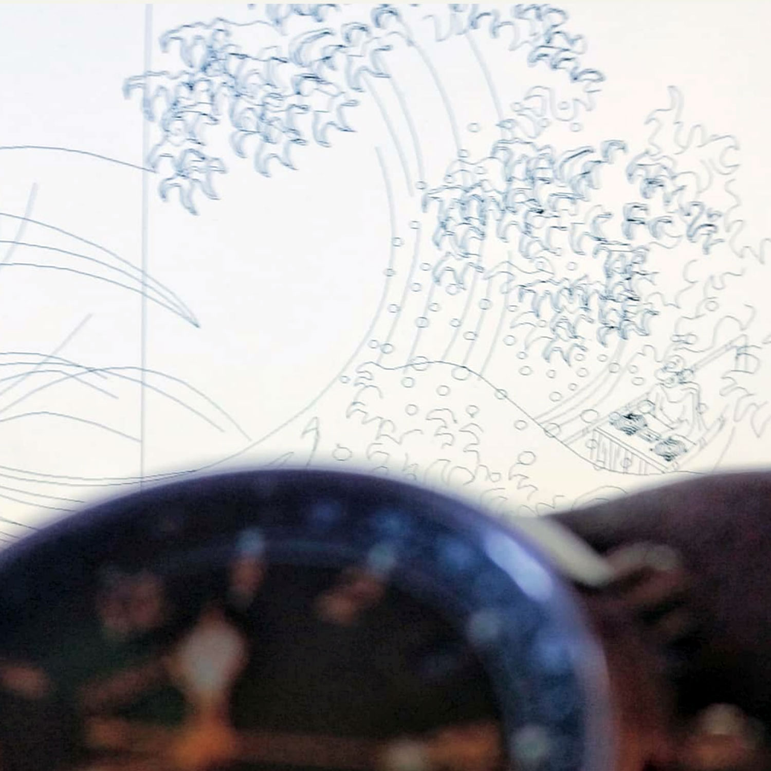
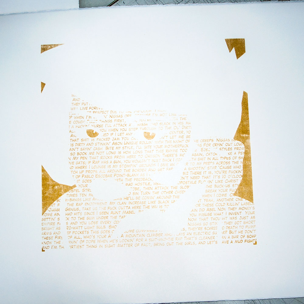
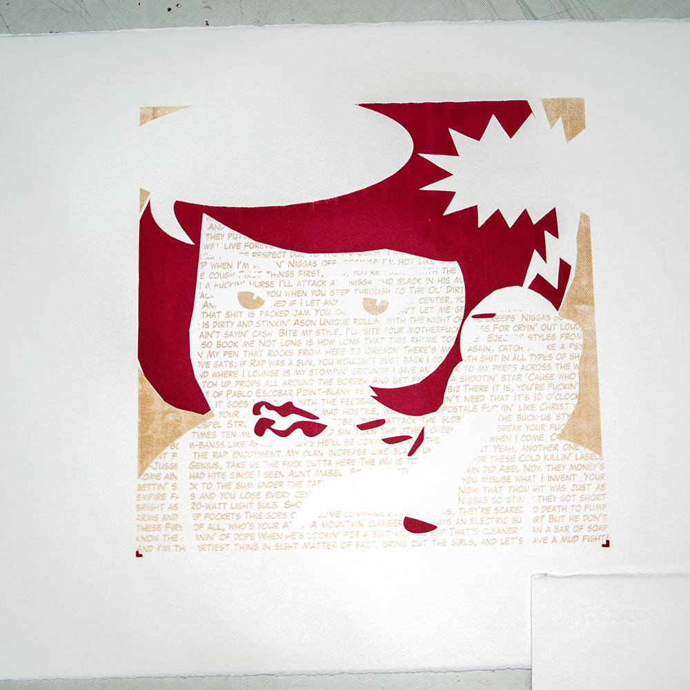
I am a huge fan of woodblock prints, especially those by Japanese artists, past and present. Coming from a print background myself, I’ve always admired the results of fine draftsmanship and quality that relief printing can achieve. Woodblock printing involves carving the desired pattern onto a large block, covering that design in ink or dye, and stamping it onto the fabric. I only wish I had the skill and patience that woodblock artists have. As a screen printer however, I am looking forward to screen printing the Soundwave off Kanagawa and seeing the difference between the digital version and a woodblock print.
How Did Hokusai Create The Great Wave?
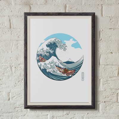
Soundwave off Kanagawa
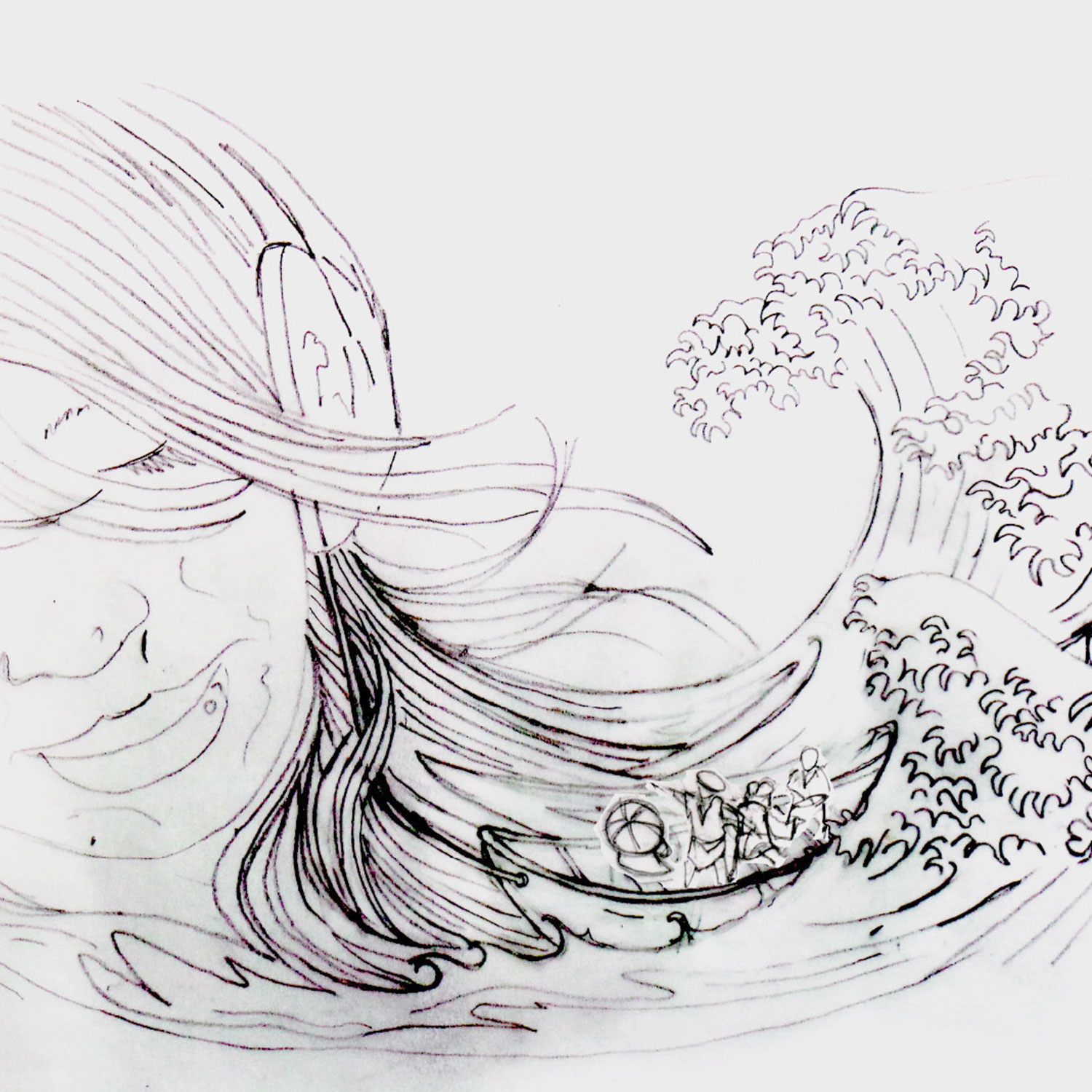
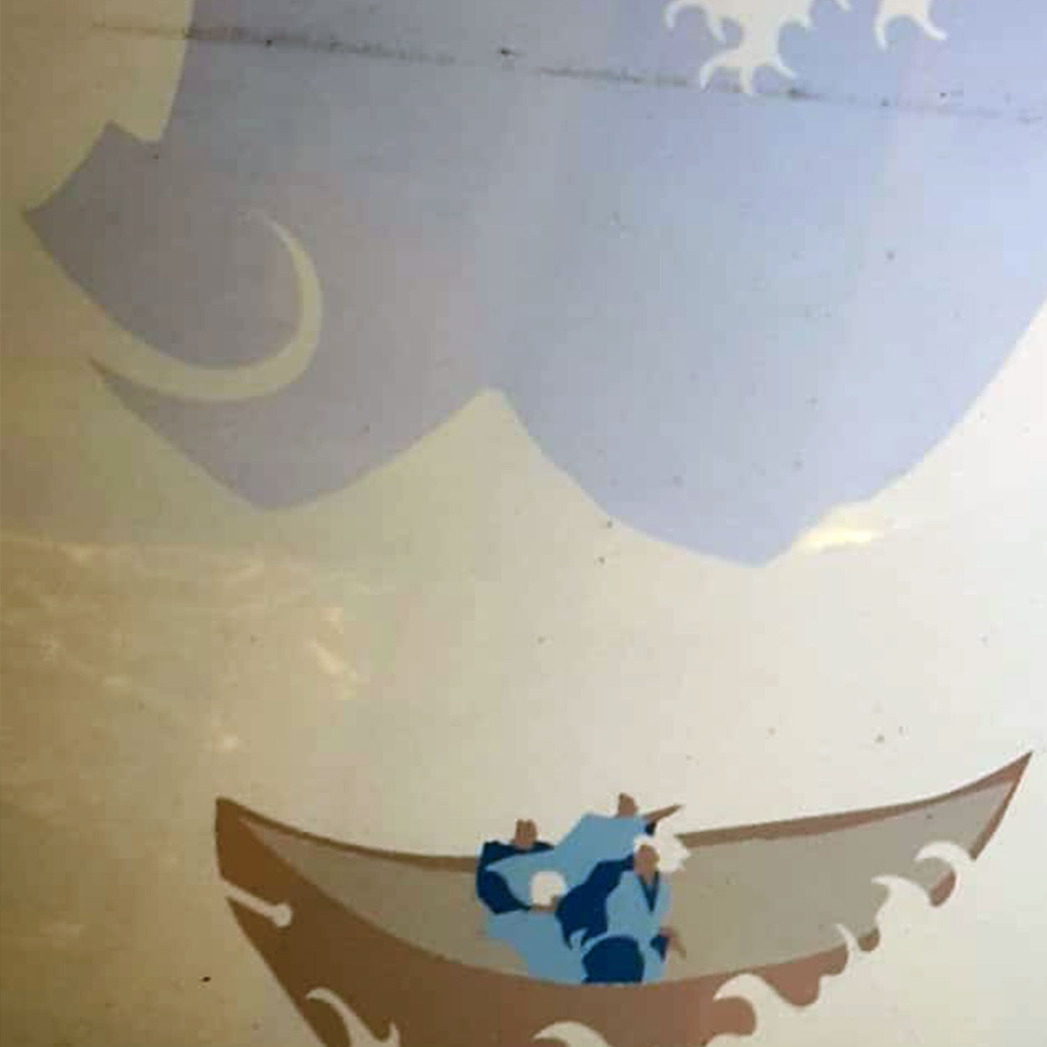
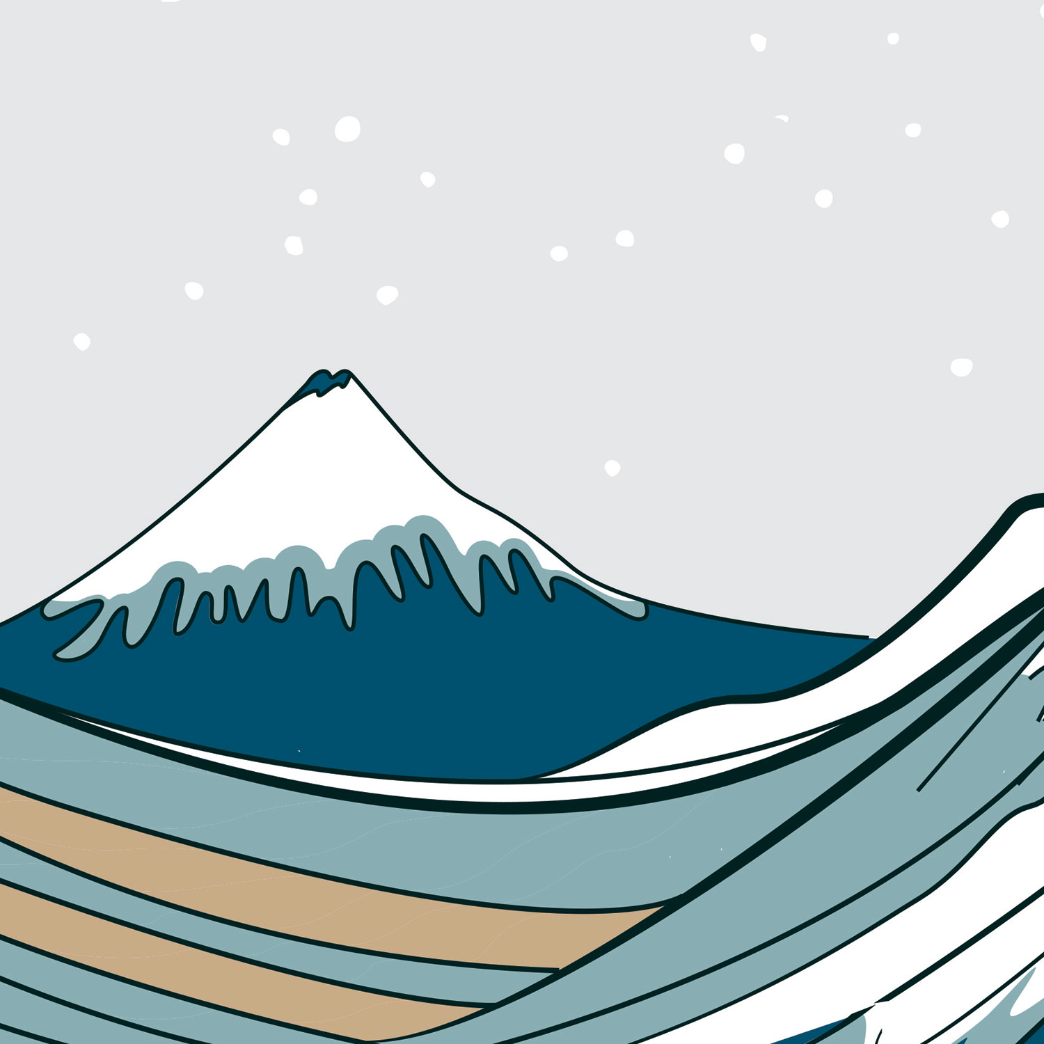
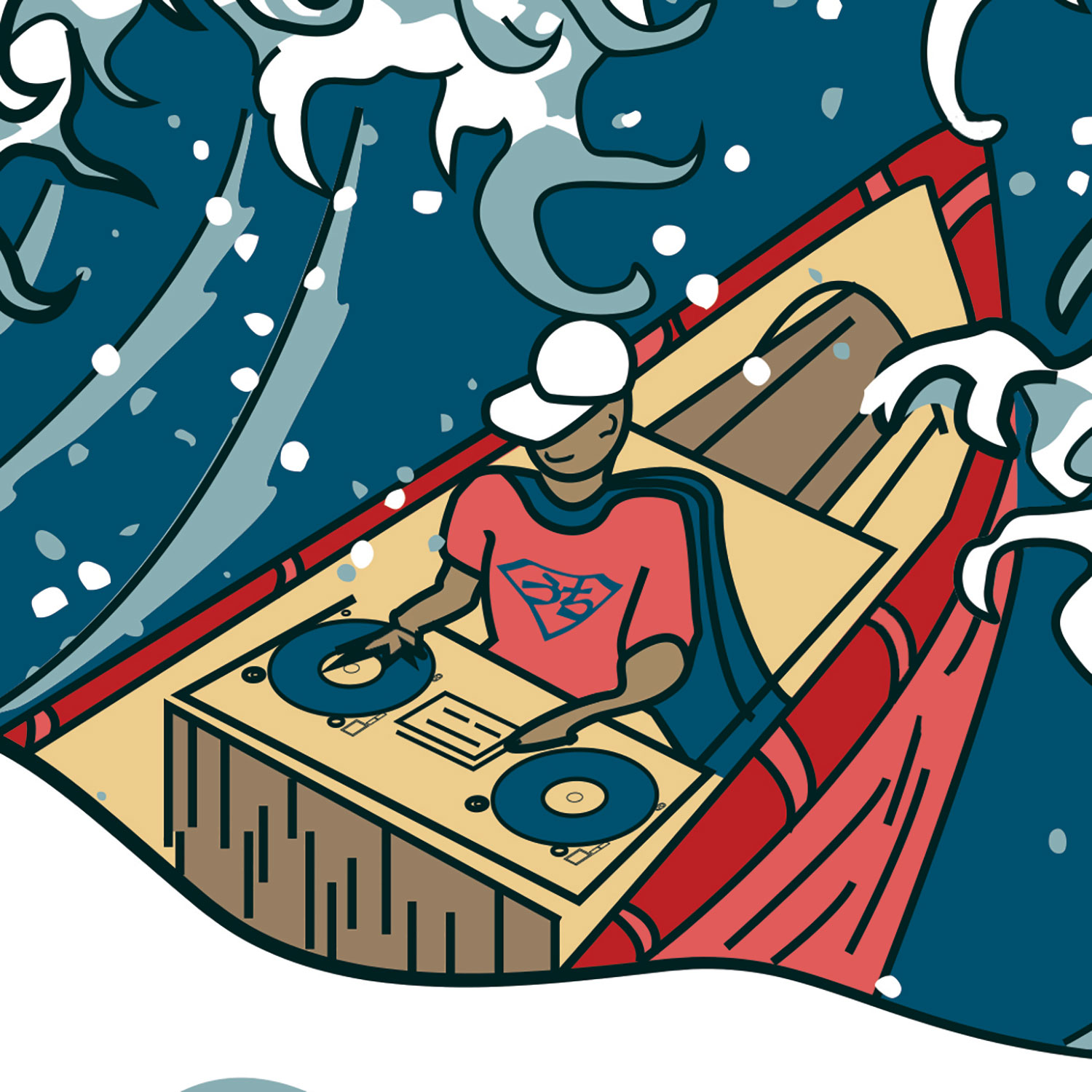
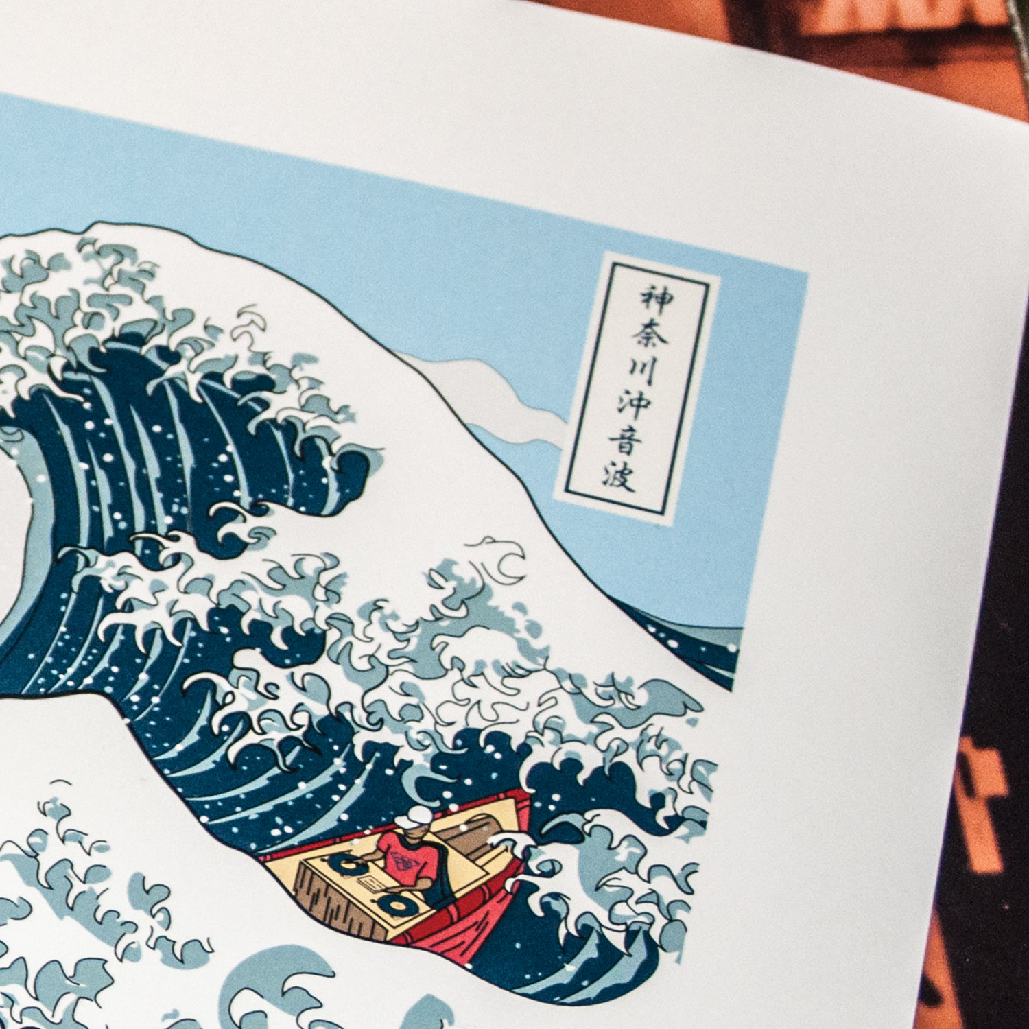
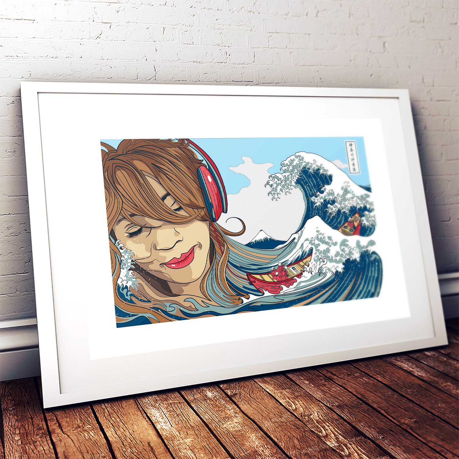
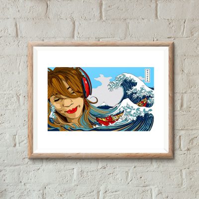
This latest uchi art print, entitled ‘Soundwave off Kanagawa‘ (神奈川沖音波) features a redrawn Hokusai Wave with Mount Fuji in the background. The drama unfolding in the sea has been changed form the original. Instead of three “fast boats” in the sea there is one boat with a deejay at the helm. The people in the boat are based on figures depicted in the ukiyo-e print “Tea house at Koishikawa. The morning after a snowfall” (礫川雪の旦).
I like the idea of a synergy between all the different elements and how they could be affecting each other. How the waves might be responding to the sound from the boat. Are the people in the boat responding to what the deejay is playing or the approaching wave? And, on a science geek tip, I also like the idea of symbolizing sound waves (longitudinal waves) and sea waves (transverse waves).


%20Art%20print&url=https://uchi.co.uk/shop/limited-edition-artprints/soundwave-off-kanagawa-art-print/&media=https://uchi.co.uk/wp-content/uploads/2019/01/Soundwave-framed-1024x1024.jpg)
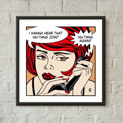
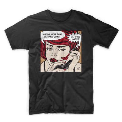
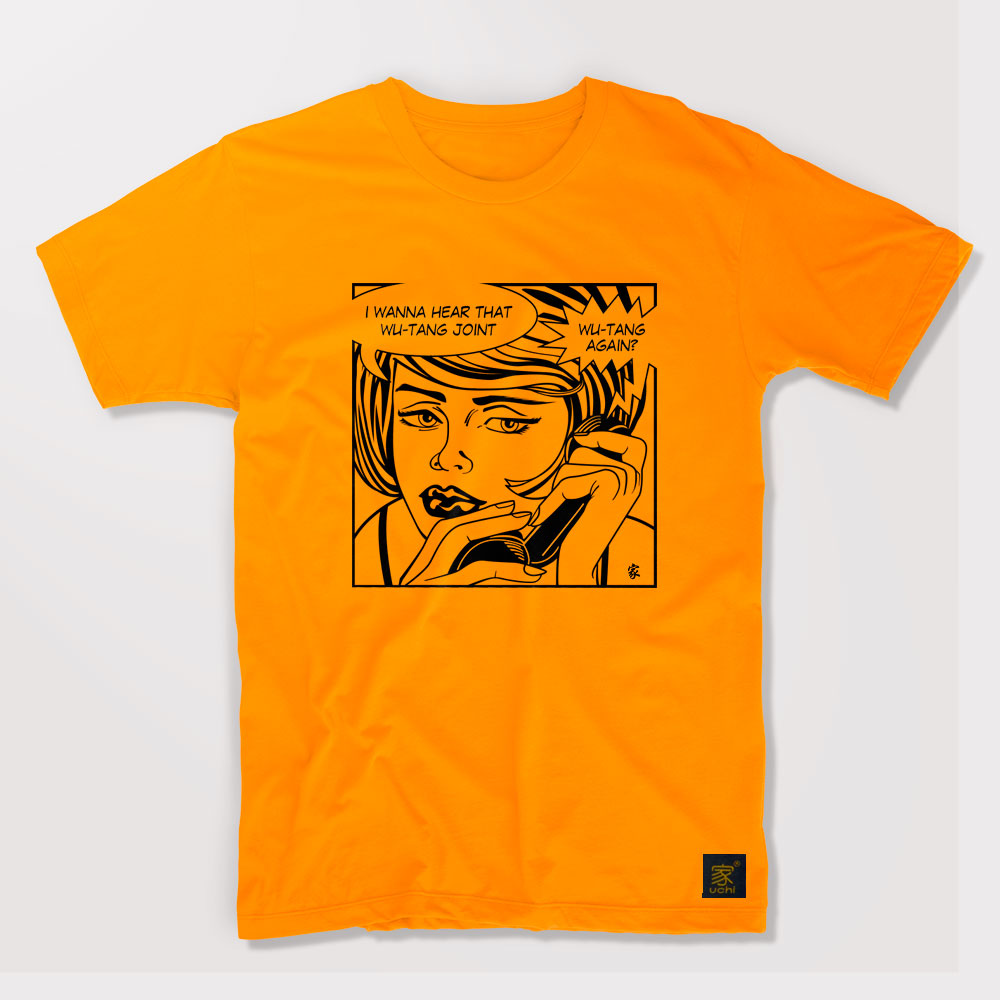
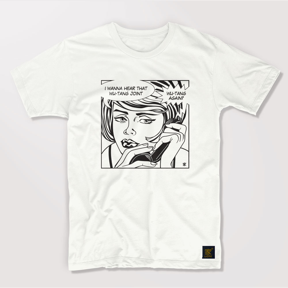
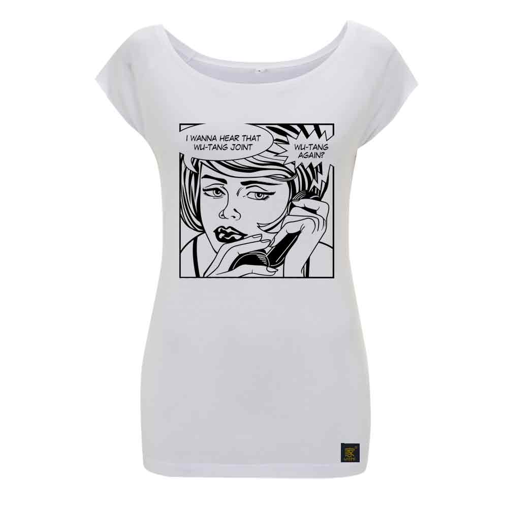
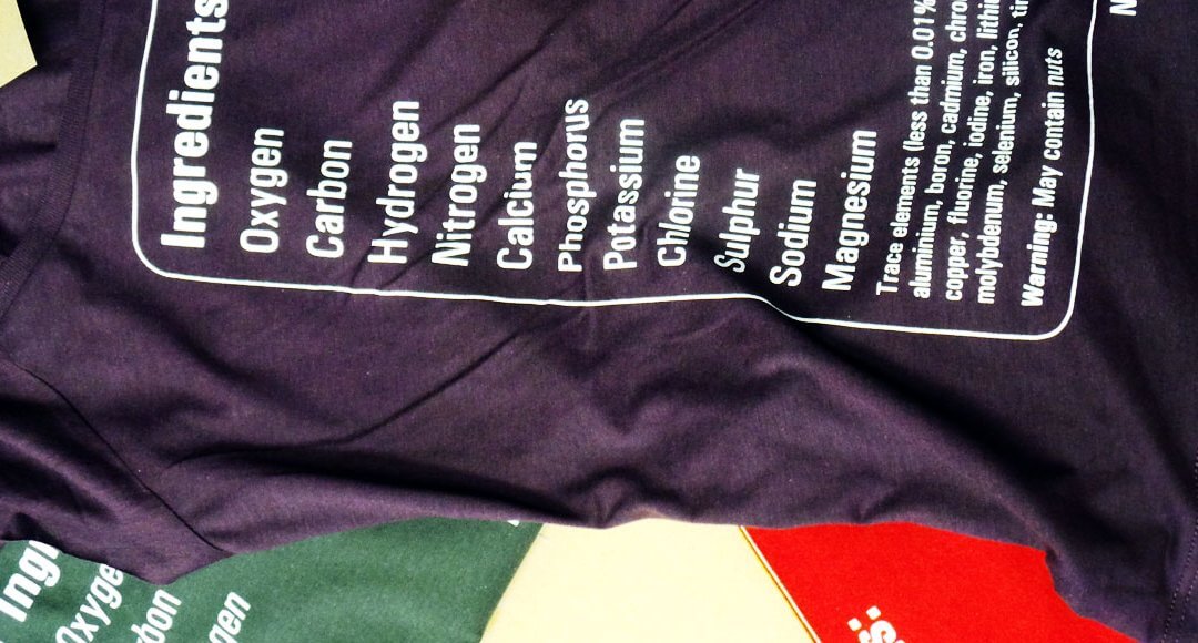
&url=https://uchi.co.uk/shop/mens-t-shirts/mens-t-shirt-protect-ya-neck-colour/&media=https://uchi.co.uk/wp-content/uploads/2019/02/track58-mens-black.jpg)
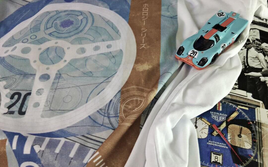
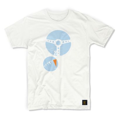
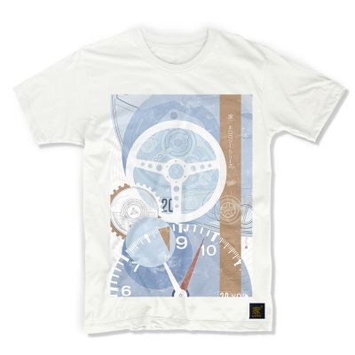
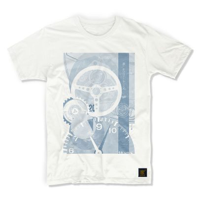
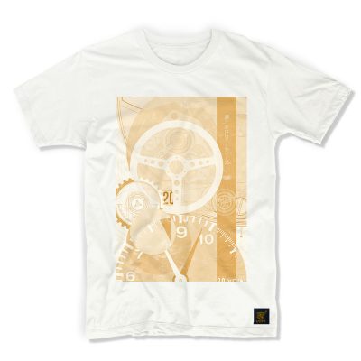
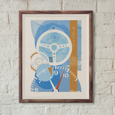
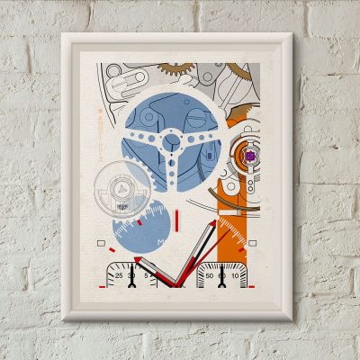
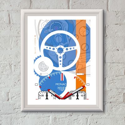
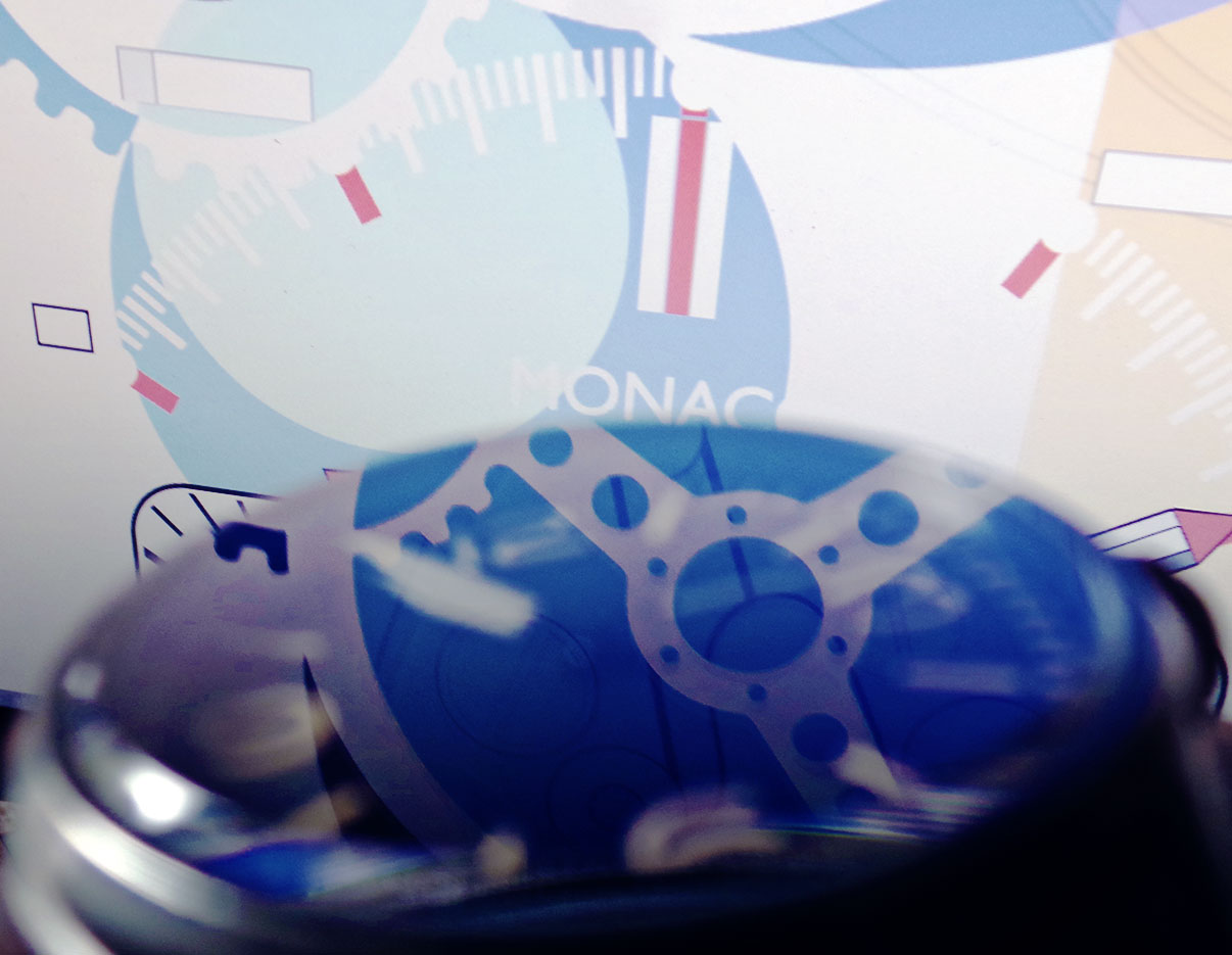
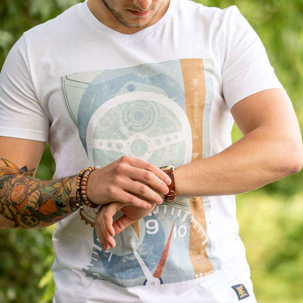
&url=https://uchi.co.uk/shop/mens-t-shirts/mens-t-shirt-tag-heuer-monaco-bauhaus-edition/&media=https://uchi.co.uk/wp-content/uploads/2018/06/mens_t_shirts_tag-bauhaus_white-1024x1024.jpg)