
Looking for the Perfect Beat – CMYK Edition T shirt and Art Print


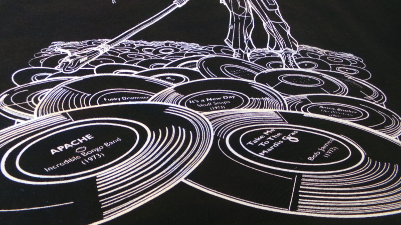
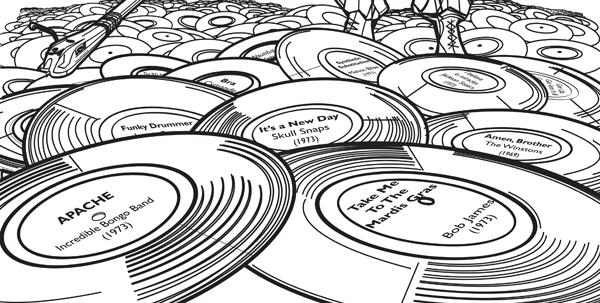


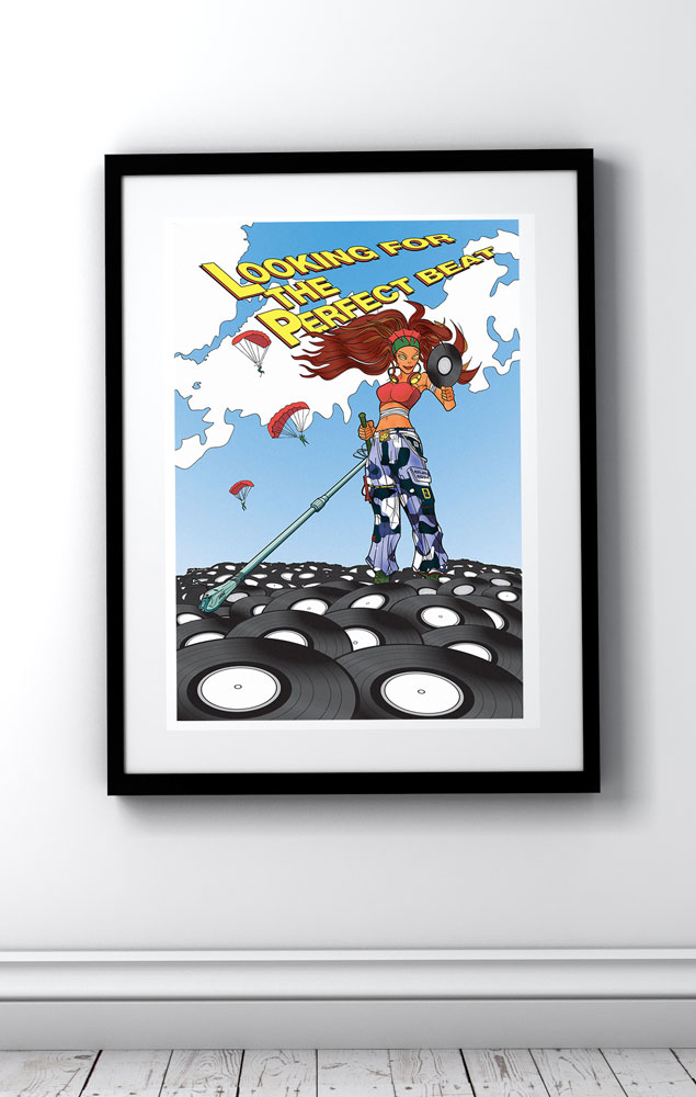
Whether diggin’ for rare grooves or breaks, for lovers of vinyl records uchi presents a full colour remix of a classic uchi T shirt. Looking for the Perfect Beat is the 34th uchi release appearing on uchi’s fourth album Soliloquy of Chaos.
The year is 2034. The last dejays on the planet search the vast wastelands of the earth’s vinyl looking for the perfect beat that will save humanity… Have you found yours?
Based on the 1983 track “Looking for the Perfect Beat” by Afrika Bambaataa & The Soul Sonic Force.
-

1000 piece jigsaw puzzle – Dogfight Over Avon Gorge
Price range: £50.00 through £65.00 -

1000 piece jigsaw puzzle – Incident at Tower Bridge
Price range: £50.00 through £65.00 -
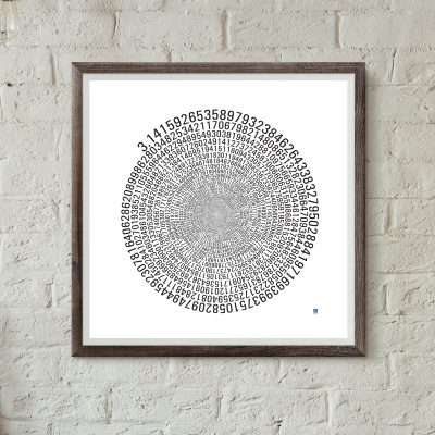
1090 Decimal Places of Pi Art Print
Price range: £15.00 through £60.00 -
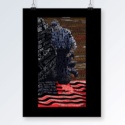
Art Print – 8:46
Price range: £20.00 through £60.00 -

Art print – An Afternoon of Dilla
£25.00 -

Art Print – Clevedon Pier
Price range: £20.00 through £60.00 -
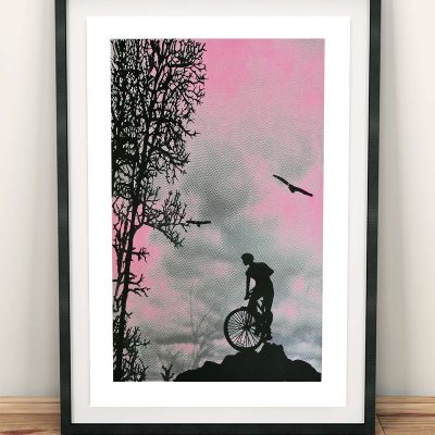
Art print – Mountain Top
Price range: £15.00 through £60.00 -
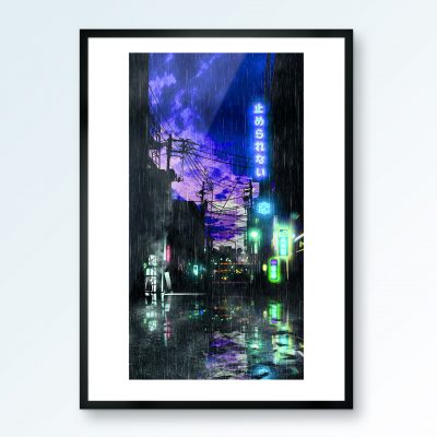
Art print – Onomichi blues
Price range: £25.00 through £55.00 -

Art Print – Red White Blue
Price range: £20.00 through £60.00 -
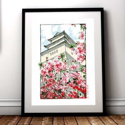
Art print – Temple on a hill where cherry blossoms bloom
Price range: £15.00 through £60.00 -

Art print – Temple on maple leaf mountain
Price range: £15.00 through £60.00 -

Art print – uchi village No 1
Price range: £20.00 through £40.00


