Track 56: The Universal Chemical Elements of the Human Body
What are we made of?
What are the elements that make up the human body?
The first question sounds a little metaphorical and will probably be addressed sometime in the future. But for now, the latest uchi track addresses the physical, or, more accurately, the chemical. I’m a science geek and a T shirt showing the chemical elements that make up the human body has been on the back burner of my mind for some time. It felt right to follow the last uchi T-shirt “Stereotype” with another typography design – contrasting, but also related. Think of it as the B Side to Stereotype.
The Brief
A T-shirt displaying the chemical elements of the human body.
The research
A bunch of stats from various academic websites to get the elements as well as each element’s mass (all with slightly varying approximations). I’ve since learnt that the exact amounts vary from person to person.
The design process
So how do you display the elements of the human body in a simplistic design? A graphical, infographic design? Maybe a pie chart or graph? Following on from ‘Stereotype‘, I thought “simple is best” and decided to rely solely on text and my typographical training to communicate the idea.
I wanted the names of each element to be printed in proportion to each other’s relative size. But this proved problematic, in terms of both design and print.
I’ve got about 99 elements but gold isn’t one of them
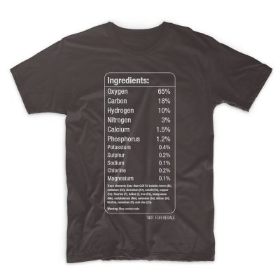
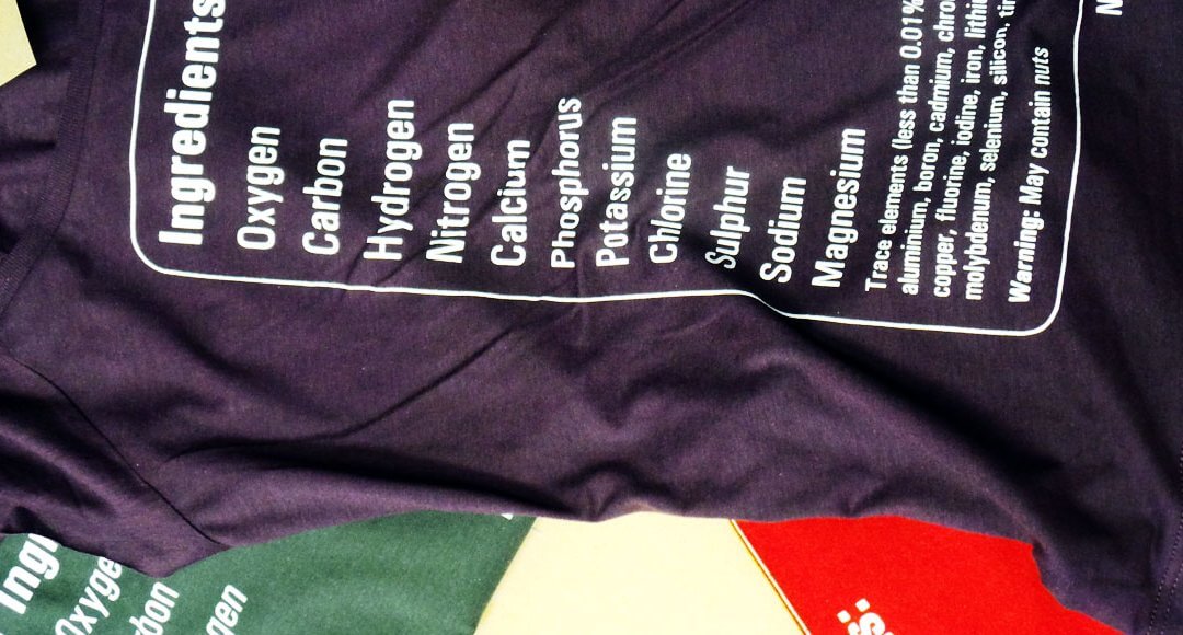
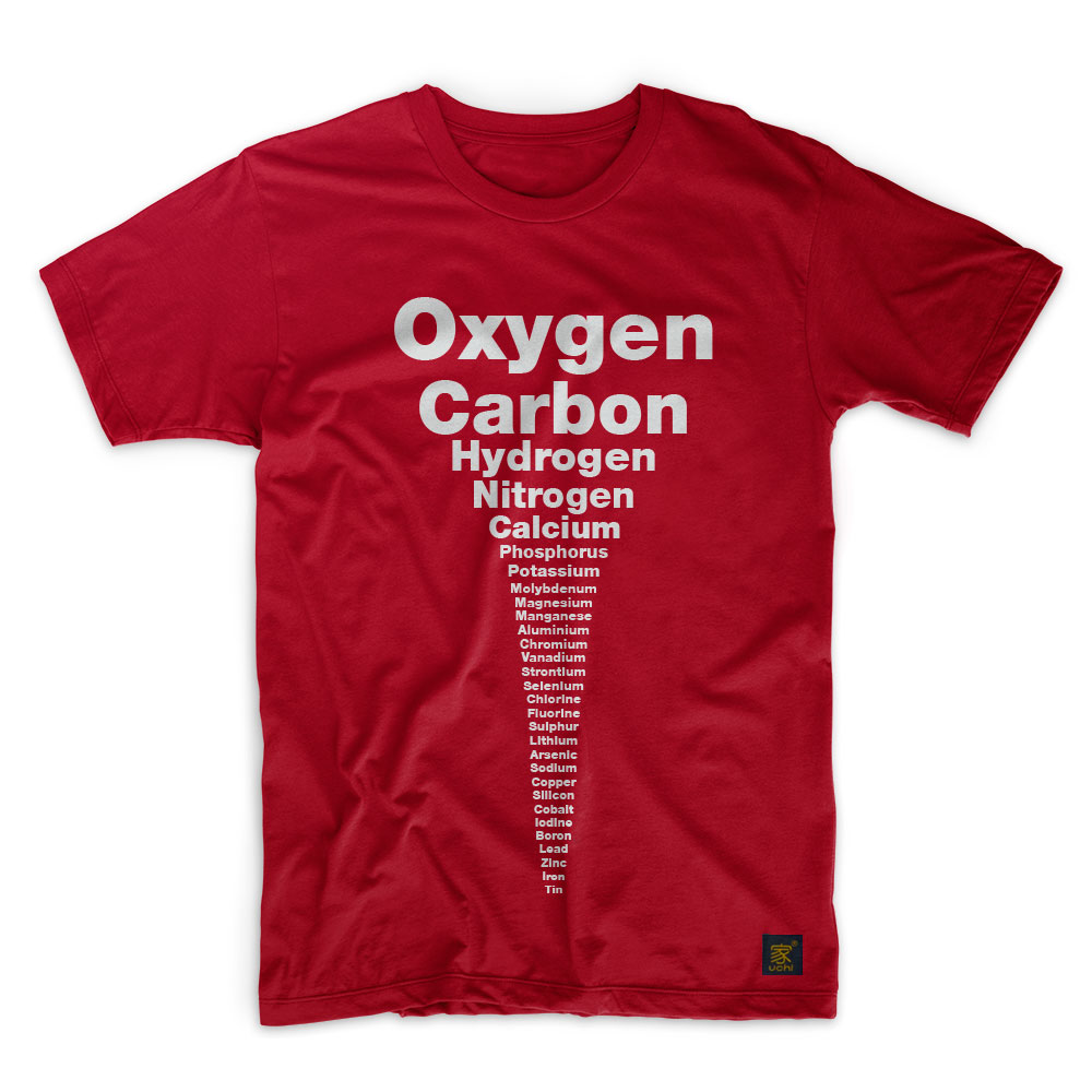
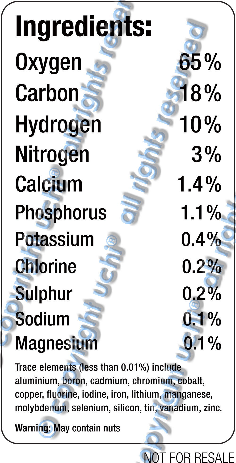
The human body is composed of 11 main elements, with six of these (oxygen, hydrogen, carbon, nitrogen, calcium and phosphorus) making up almost 99% of us. In fact we’re all mostly oxygen (65%), carbon (18%) and hydrogen (10%). The other eight elements that are vital to life, include calcium, potassium and molybdenum. But they amount to such small amounts, that by the time you reach magnesium (0.1%) the text would be unreadable on a T-shirt.
So I ditched the ratio idea in favour of a more aesthetically pleasing design. Starting with oxygen and ending with tin, each element’s representation would be slightly smaller than the one before it. I liked it. However, though simple, it wasn’t technically accurate. That was because the order of the trace elements was determined by the size of the word representing them – not by their mass. This bugged me.
Despite this, I was satisfied enough to show it to a couple of friends. Based on their well-rounded criticism (and approval), I thought about the challenge some more; that was when the ‘food label’ idea hit me.
Imagine a food ingredients label listing the constituents – the ‘ingredients’ of us. Clever and intelligent, I thought. I’ve typeset hundreds of food and drug labels in my time. So again, this should be easy enough.
Ingredients of the human body
Once the ingredients label design was finished, I still wasn’t entirely happy. Composition wise, everything was fine. All the relevant information was there and nothing more. Plus, the ingredients label premise allowed me to add a couple of extra touches that worked.
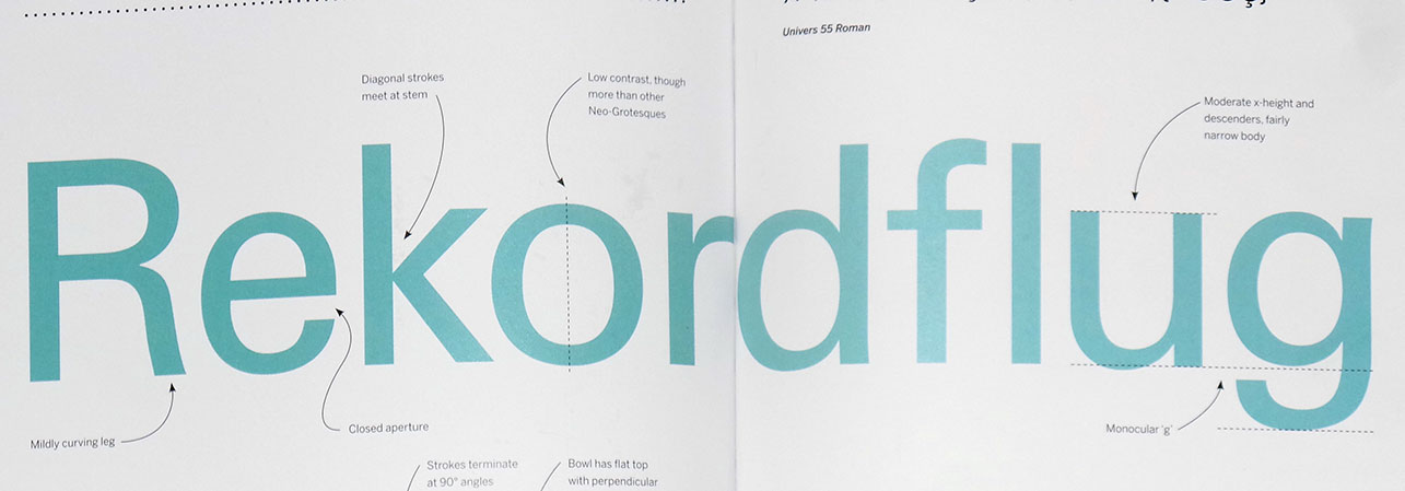
I’d used Helvetica Condensed for the ‘Stereotype’ T shirt, so it seemed right to use the same typeface on the B-side. However, at the last minute I decided to revisit my phototypesetting roots and changed the typeface from Helvetica to Univers. In doing so, I realised what had been bugging me.
About the Univers Typeface family
The Univers typeface family was developed by Adrian Frutiger for the French type foundry Deberny & Peignot. Like Helvetica, it’s based on the 1898 Akzidenz-Grotesk typeface family. However, it lacks Helvetica’s superfluous features and has a more uniform stroke and balance that makes it a perfect typeface for tabular data and forms. Univers also has cleaner lines and better legibility at great distances. On it’s release in 1957, the marketing for Univers deliberately referenced the periodic table to emphasise its scope.
Though its popularity peaked in the 60s and 70s, Univers is stll widely used. Past and present corporate IDs using it include those of General Electric, Deutsche Bank and eBay, while Audi uses a modified version of Univers called Audi Sans. Apple keyboard key-caps before 2003, Ordnance Survey maps, a host of transport systems (including Frankfurt International Airport) and Walt Disney World, are among many other high-profile users.
So, pun intended, Univers was the perfect universal typeface choice for a universal design.
For a while I’ve had an in the back of my mind an idea for a T shirt design. Many ideas roll around for months, sometimes years before they get dealt with. This is normal. Most of them never manifest into anything. This particular idea was pushed to the front of my mind by various events connected to my last project, the Stereotype T shirt. So, it felt like the right time to do it.
As it was now at the front of my mind, more ideas where coming thick and fast. It was a “now or never” type situation. I now had some solid thoughts on how it could be executed. If it’s not done now, it will slip back to the recesses that will only be used as reference for a future design at a later time. You don’t want to sleep on these moments of creativity and loose the urgency. It’s like waking from a profound dream and not writing shit down. You know it will all be forgotten by midday and only vague recollections will remain.
Like a pen and pad next to the bed, over the next few days I produced something I was happy with. I asked a couple of people for opinions, initial thoughts. Based on some feedback and with the original conception still front of mind, it was revised and improved. Two days later I was confidently sending the finished artwork off to be printed the following week. With more than a week before it would actually be produced, I had time.
I produced a mock up of the design on a T shirt and it was now online for sale. I wrote a blog – The idea behind the T shirt design; the research, background information, the process and the problems I encountered whilst working on it. I had time even to send the blog to a copywriter friend of mine for critical analysis.
Don’t believe your hype
A few days later, I was still waiting for feedback on my blog which, I believed to be about a fairly original T shirt design. There’s little point in writing for the web without doing doing some research, better late than never, so I decided to check what Google was saying. I searched the title of my blog. To my disappointment, I found a bunch of T shirts with ‘my original idea’. After my initial disappointment, the next reaction was, “I’m going to have to contact my printers and tell them to stop”, followed by more disappointment. Then, “I’ve just spent hours of work for nothing” – more disappointment and now, frustration. “And, I spent hours writing a blog about this!”. “People will think I just copied someone else’s idea!” .
And then I had a realisation. My ego and naivety believed it had an original idea. On reflection, I should have known better – especially with such an obvious subject matter. This isn’t the first time I’ve done something that I thought was unique, only to find it already out in the world, in a similar guise. I rarely take the time to look around to see if an idea has already been done. If I do, most of the time, if the subject matter is important enough, I will try and do it better. If it isn’t, I just won’t do it at all.
Believe your hype
Should I research more before I commit to a design that I feel is unique? Or, should I discover it for my self with no distractions? The most important thing is, I know why I did it. My ego and naivety created this because I wanted to express something through uchi. I didn’t need other designs to influence if and how I should do it.
It’s the end of the sixth uchi album of T shirts. All but two of the designs on this as yet untitled album are music related. I am pleased that these last two designs follow the music theme, with a particular focus on vinyl.
There are a couple of new designs that were going to be included, but were not finished in time. On reflection it worked out fine. The two unfinished pieces are very illustrative and more like designs in the pipeline than the ones recently done. So, maybe the next album will be all illustration? We’ll see.
Here are the latest two uchi vinyl-related T shirts and the stories behind them…
Founded in 1968, the British founded Trojan Records has one of the most iconic and recognisable logos and a host of equally iconic and renowned artists under its belt.
From reggae, ska, rock steady and dub, its endurance is a testament to the music and culture. We haven’t included the complete list of all the artists that appeared under Trojan Records, but hope we’ve caught a few of everybody’s favourites.
For me, growing up in a house full of reggae records has made the Trojan logo as recognisable as the Nike swoosh, but with a ton of more meaning. It’s no coincidence that they also use a heavy robust and solid typeface like Rockwell Extra Bold.
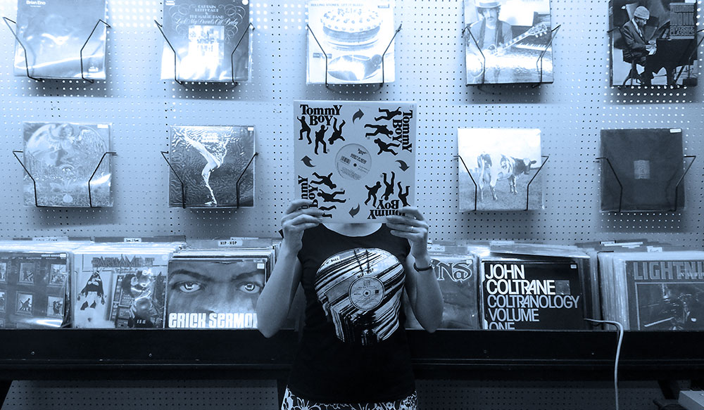
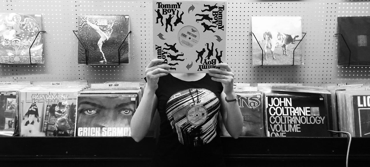
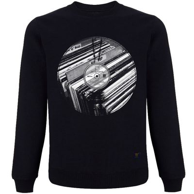
Although a reggae specialist Payback Records have a great selection of non-reggae vinyl. Their HipHop section is featured on The Big Payback T shirt. Coincidentally, the record store is named after the 1989 EPMD track of the same name; perfect uchi. I was unaware of this connection before I added the type. The Big Payback is one of my favourite EPMD tracks and is somewhere in the stack of old school vinyl in the image. In the shot, I’m actually standing in Payback Records.
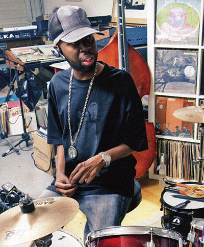
If you’re a fan of the late legendary Hip Hop/neo soul producer J Dilla, you’ll know how much he is loved around the world as a prolific producer, beat maker and musician. He has produced tracks for the likes of Slum Village, The Roots, Janet Jackson, A Tribe Called Quest, De La Soul, Busta Rhymes, Erykah Badu, The Roots, The Pharcyde… The list is as huge as his respect from fans and artists alike.
Many of my favourite Hip Hop joints have been produced by J Dilla, aka Jay Dee, despite not always being aware at the time he was the producer. Recently, I dug out some of my Erykah Badu and D’angelo albums (amongst others), just to listen closer to that ‘Dilla’ sound, the smooth breaks with that organic feel that made me instantly like them so much. That’s the beauty of true authentic art. You’re not meant to notice the technicalities or the cracks and imperfections, but it’s those things that make them so special and stand shoulders above the rest.
Legendary J Dilla
J Dilla first made his mark as a producer for Slum Village, in his home town of Detroit and in the early 2000s went on to have a solo career and collaborations. Anyone will tell you that this only skims the surface of his catalogue. I won’t go into details, I would suggest you listen to anything he was involved in and go from there. You’ll discover the enormous amount of praise and respect he receives and recognise it was all well deserved. Needless to say, his status amongst artist, fans, beat makers, vinyl seekers, musicians and those that ‘know’ is that close to a deity.
Upon his untimely death in 2006, he had already amassed a huge collection of production credits on a variety of diverse projects. He is widely regarded as “one of the most influential Hip Hop artists” and a “producers favourite producer”.
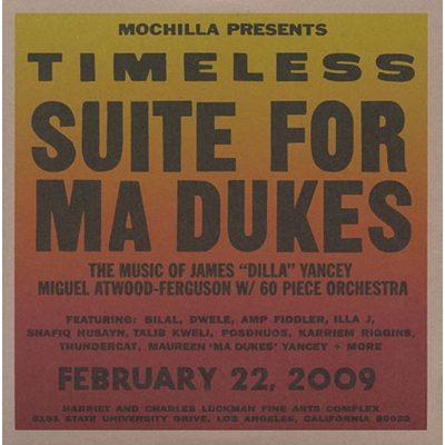
Sadly, after suffering for a long time with the blood disease thrombotic thrombocytopenic purpuran, in February 2006, J Dilla died at 32 years old. His legacy lives on. His dedication to his craft is legendary. Stories about his beat making methods, his mastery of equipment and rolling up to gigs in his wheelchair have given him cult status and inspired musicians worldwide. J Dilla underground beat tapes have being circulated and bootlegged, tribute albums have been produced and his work has been translated for a 60-piece orchestra.
Timeless – Suite for Ma Dukes
Miguel Atwood-Ferguson (Mochilla Presents): Timeless: Suite For Ma Dukes (The Music Of James “Dilla” Yancey)
This orchestrated homage to J Dilla’s work, brings me to why I’m writing this.
Timeless – Suite for Ma Dukes – composed and arranged by Miguel Atwood-Ferguson in 2009, pays tribute to Dilla, interpreting his work into sublime orchestral pieces. It features artists such as Bilal, Common, Dwele, Karriem Riggins, Posdnuos, Talib Kweli and more. Timeless – Suite for Ma Dukes is, as well as everything else Dilla put his hand to, well a worth a listen.
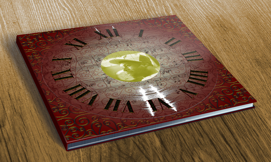
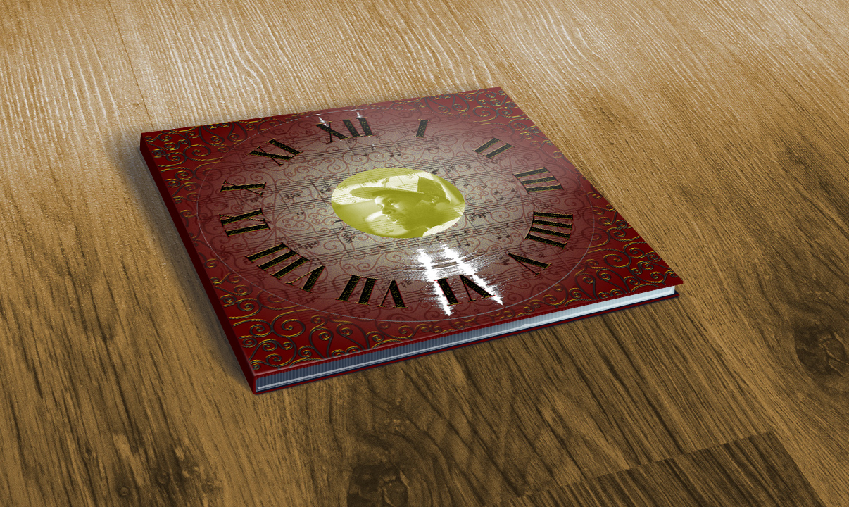
Here is a work in progress. My own version of the Timeless – Suite for Ma Dukes album cover.
I wanted to capture Dilla’s intricate style, the classical elements, his layered loops and samples. I wanted to create something that looked elegant, intricate and, well, “timeless”.
Videos:
The Pharcyde – Drop (1995)
Raekwon – House of Flying Daggers (2009)
Janet Jackson – Got ‘Til It’s Gone (Ummah Jay Dee’s Revenge Mix) (1997)
Suite For Ma Dukes Orchestra – Untitled / Fantastic (A Tribute To J Dilla) (2009)
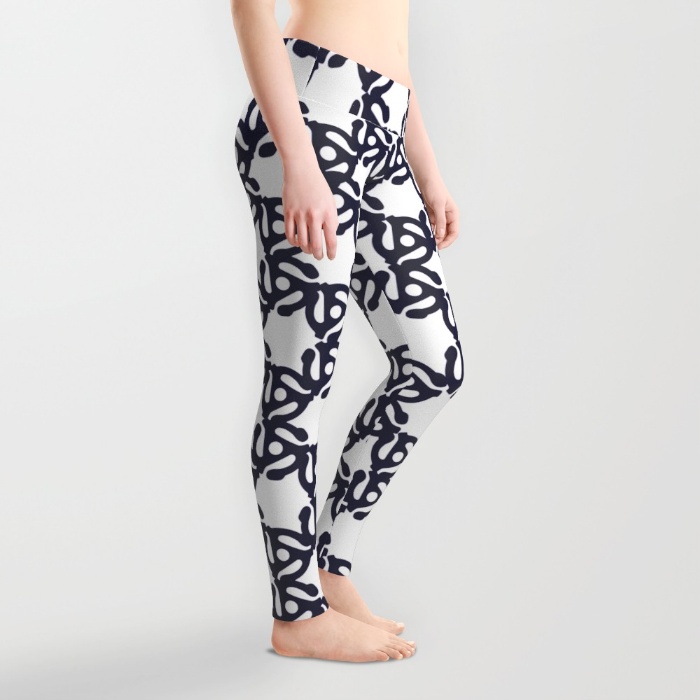
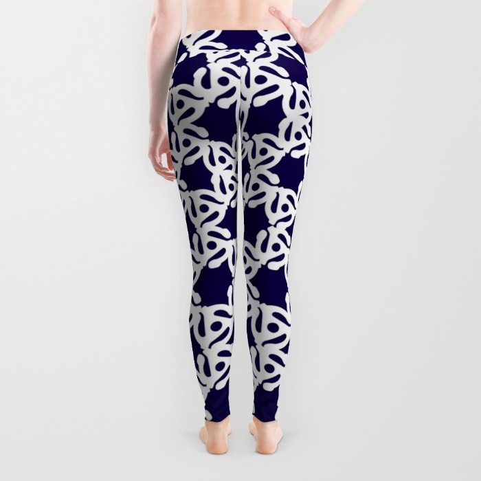
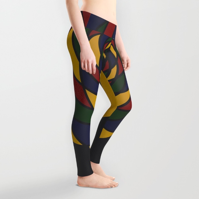
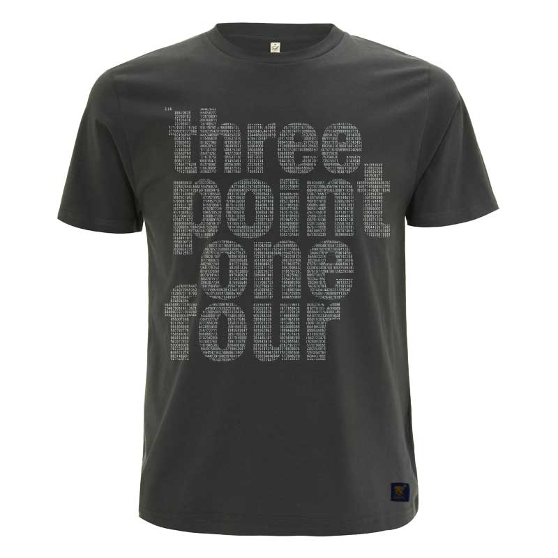
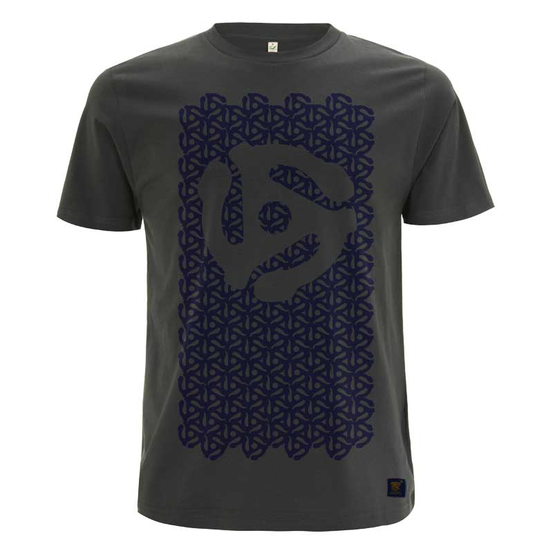
Our latest tracks are a remix of the best selling Pi T shirt and our own take on the classic 45 rpm record adapter t shirt.
I recently heard of the origins of the 45 rpm record adaptor, which explains why, growing up, it was only needed on the reggae singles in my house.
In the early days, DJ’s in Jamaica would need to turn records over quickly, attempting to keep the tempo and the party going. However, the size of the centre hole made this awkward and time consuming, especially in low light. They decided to punch out a larger hole in the 45s and add a spindle to the turntable, so that the record, with minimum interruption, could easily be flipped over with one hand, whilst still holding the microphone in the other. The record labels eventually began to manufacture all 7 inch singles without the centre piece and the RCA Corporation introduced the plastic snap-in Spider adaptor to fill in the gap. There it is.


